I mentioned in my “Best Goosebumps Cover” list that Tim Jacobus was great at making simple covers effective. As a matter of fact, most of the work that Jacobus did for the series was great, and a lot of the ones that weren’t up to the levels of some of the better work had less to do with him and more-so the fact that the premises of the book only gave him so much to work on. That’s why I didn’t want to name this a “Worst” list. Jacobus’ art wasn’t bad, it was a case of some being lesser simply for the above mentioned reasons, and because of those reasons some of the covers come off more uninspired or simple, but not in a good way.<
10: My Best Friend Is Invisible
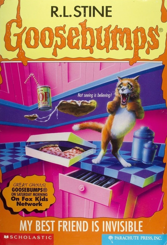 Cats are wonderful, weird as hell, fun-in-so-many-ways, balls of fluff. We’ve seen them relaxed, we’ve seen them annoyed, we’ve seen them mostly sleeping or eating… but this may single handedly be the most melodramatic cat I have ever seen in my life. And that’s saying something. It’s honestly kind of awesome, just on a cheese factor, and I debated not even having it on the list, and the more I thought about it, the more conflicted I felt. But, this being Goosebumps, I think the cover is one of the few that seem more comedic than anything else, even trying to push for some sort of creepiness or seriousness. Which is why I cut my losses and just ranked it low on the list.
Also, the invisible friend seems like a jackass. I mean, he opened the silverware drawer. For no reason. In that impeccably clean kitchen.
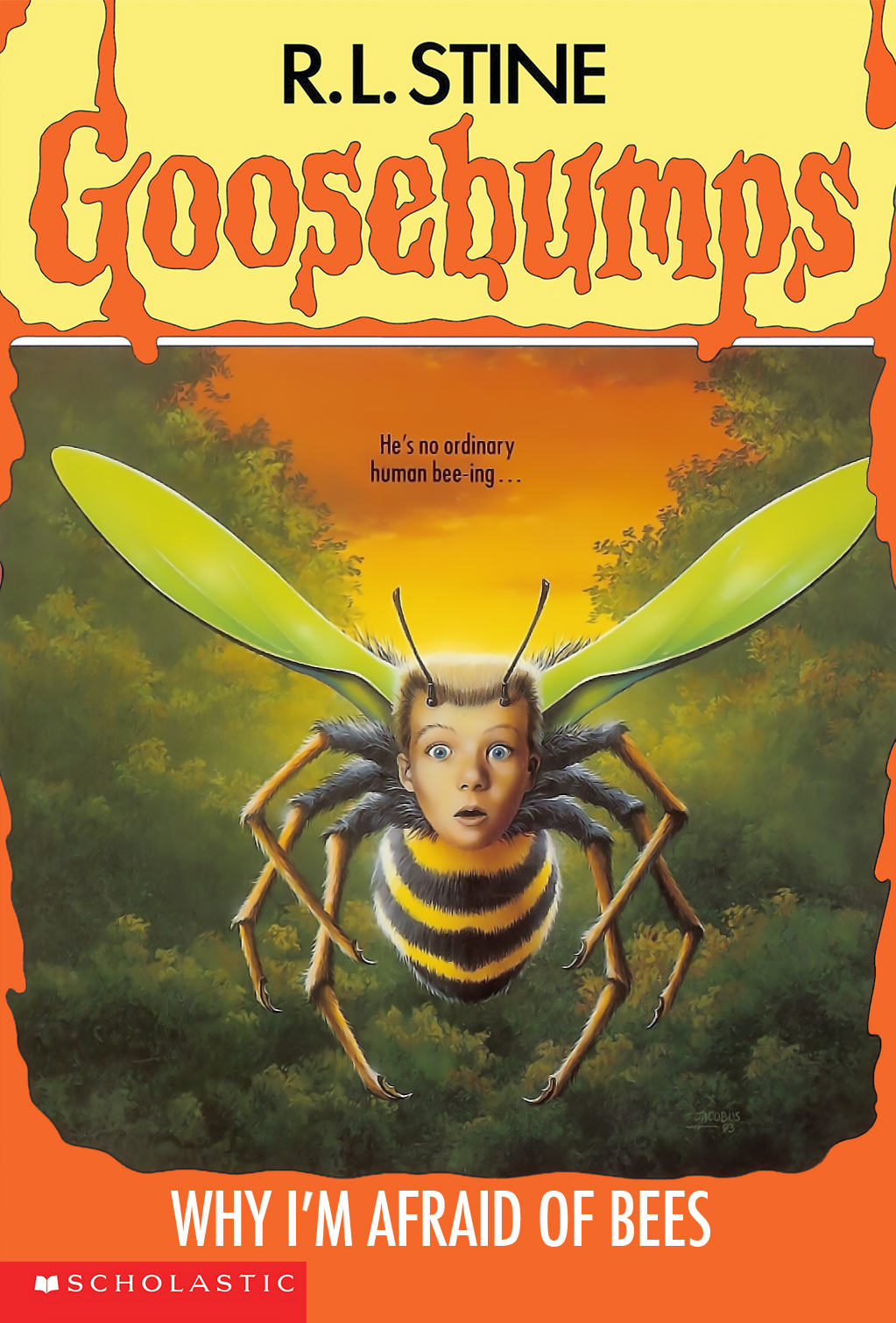 This is an early example of doing the most you can with the premise of the book. It’s a simple idea but doesn’t work as being too intriguing or pulling you into the story. We see quite a few instances of ‘child’s-head-on-body-of-something-else’, but we’ll get into that a bit more in depth later on. Though the background itself is pretty in terms of the colour used, giving it a neat sunset look, it’s also pretty bland. It’s the perfect example of what I mentioned, simple because of what could be done with the premise, but not awful in any way.
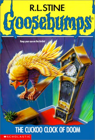 No matter how much you try, I’m not exactly sure you can actually go about making a cuckoo clock terrifying or unnerving, and instead it comes off silly. The only upside is that I would buy this cuckoo clock, simply based on the fact that I'd find the idea of someone making a 'scary' cuckoo clock hilarious.
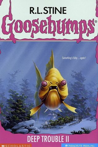 This seems like it’d be an easy idea to go for. Evil fish = Deep Trouble II. Perfect. Except the fish ends up looking a bit more dopey than menacing. It’s odd how trying to make the fish more ominous and evil has a lesser impact than the cover of the original Deep Trouble.
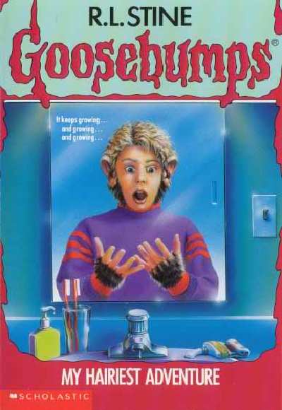 Talking about this book is… I’ll get to it, undoubtedly in the ‘Worst Twists/Endings’ list, but it’s incredibly hard to make “growing-hair-where-there-was-no-hair” look scary or unsettling. Again, this is a book that falls into goofy and silly, which I’m trying hard not to overuse, though it’s hard.
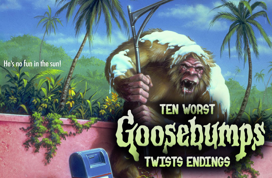
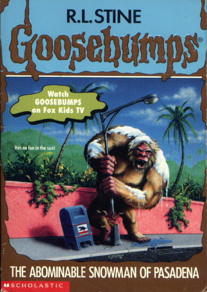 One of the rare instances where whether you laugh or not, you have the right reaction. I will give this to Jacobus, he did try to properly convey where the story goes, primarily in the last third or so. But, even with the generally good (if unoriginal) design of the ‘snowman’, it’s something you can’t quite take seriously. The snow draped over it doesn’t really help, though, again, kudos to Jacobus for attempting to work the entirety of the book into the cover. No matter how incredibly ridiculous it is.
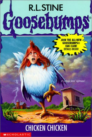 Okay, this one is a bit more of a personal choice in terms of being this high on the list. Not only does it do the ‘child’s-head-on animal-body’ thing again, but it also looks ridiculous with the fact that it’s a chicken. That is reason enough, but the fact that it’s this book does make me biased for reasons that we’ll… get to eventually.
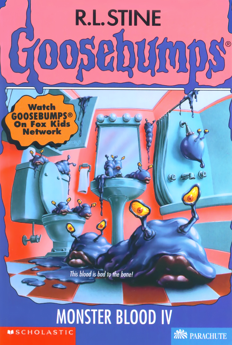 This is one of those cases where, honestly, the material presented is very hard to work with. This mostly comes from the designs of the ‘new’ monster blood that is given in the book. They look unappealing, and not the good kind of unappealing. Sometimes imagining how something looks through their description is better than getting a chance to actually see it ‘brought to life’ in front of you like this. Those lips… oy. And why is that one just staring at itself in the mirror? Is it seeing if it's pretty? Maybe it's having an existential because it knows how ridiculous it looks and how negatively Monster Blood fans are going to react.
01: TIE I am 100% completely, cross-my-heart honest here when I say I spent a solid ten damn minutes bouncing back and forth on which of these I would put above the other. Eventually I said; “Screw it”, and decided to take the cheap way out. Because I’m so good at delivering finality…
Revenge Of The Lawn Gnomes/Legend Of The Lost Legend
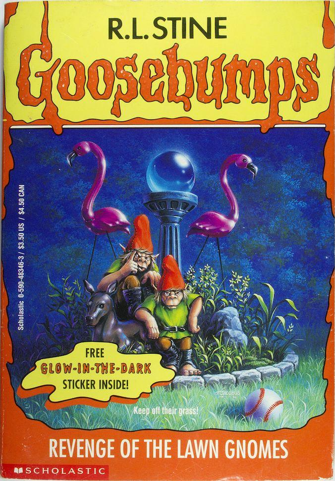
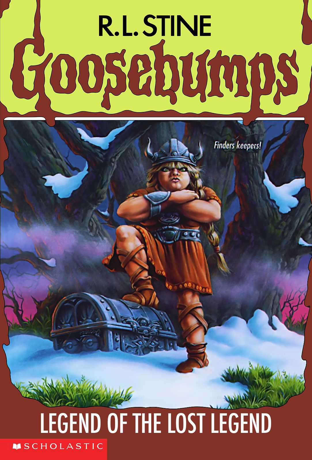 From a random, blonde, angry Viking woman to two gnomes trying to look hip, the two covers may not seem that bad at first, but stare at them for a bit. Go ahead. They’re bland. They’re boring. They border on ridiculous, which is understandable since these two books are ones that are relatively tough to look interesting. Or be interesting and not ridiculous as you read it. I also can’t shake this feeling like the cover subjects are judging or mocking me for reading the book they are in. Blah.

