Goosebumps was a massive part of my, and a lot of others, childhood, and I’m still a fan of the original series. Besides the nostalgic memories they created while growing up, the one thing that most always gets a reaction or conversation going whenever they’re brought, besides the twists, is the covers. The covers for the books were almost always great and intriguing, even the ones that don’t quite come up to the better ones in the series still doing the best they can with the subject matter at hand. The covers were the work of artist Tim Jacobus, who did the majority of the original run as well as the entirety of Goosebumps 2000. The only covers from the first Goosebumps run Jacobus didn’t do were Stay Out of the Basement and Be Careful What You Wish For… Even then, the only reason that he didn’t do SOotB was because Scholastic had two artists in mind and wanted to have each do a cover to see which artist they would eventually go with. But with the nostalgia of great work by Tim Jacobus, which ones hold up and rank amongst the best the original series had to offer? Well, now that I've given slight backstory, we can take a look for ourselves.
15: The Haunted School
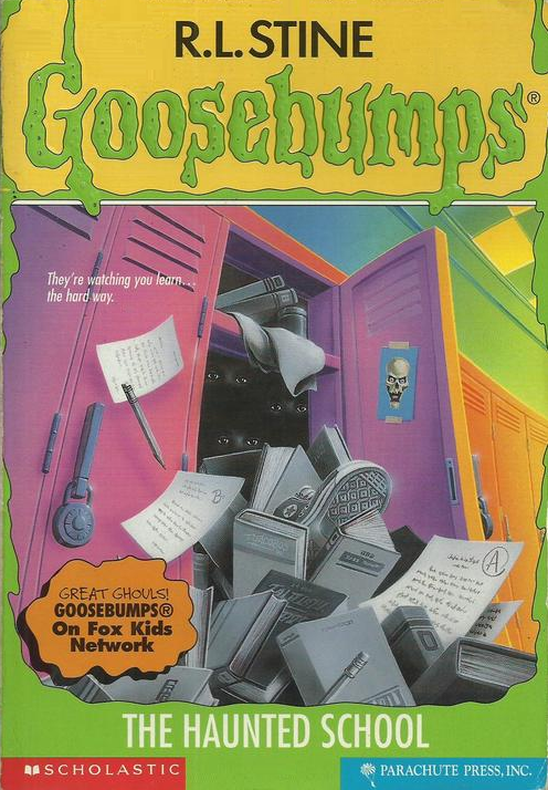 A recurring word you’re going to see used on this list is ‘simple’, as some of the best covers used in the series are so. The Haunted School falls into that category. The eyes staring out of the darkness of the locker is a neat idea, not going the route of what you would expect with anything involving ghosts, even the ones that had come before it. I could make a joking mention about there being a ridiculous amount of things falling out of that locker, but instead I’ll just use it to say that it falls in line with kids these day having to carry too much and having way too much homework.
14: It Came From Beneath The Sink
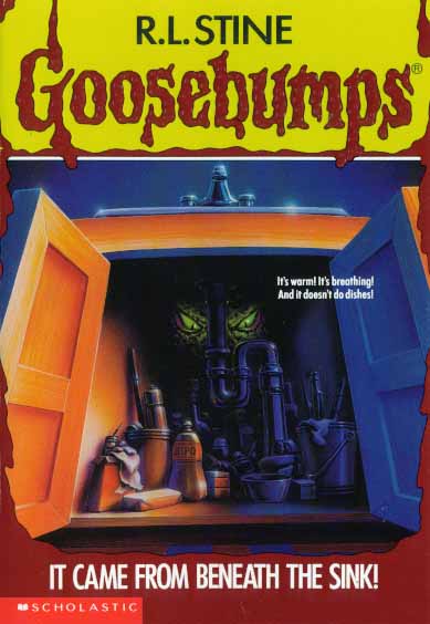 Ignoring the fact that whatever is underneath the sink looks like it shouldn’t fit, the reason this one ranks above The Haunted School, which it is actually very similar to, is that it has the added benefit of taking place in the home. Also, the fact that whatever it may be is of some sort of creature origin helps as well. The thing under the sink ends up not being like that in the actual book. At all.
13: How I Learned To Fly
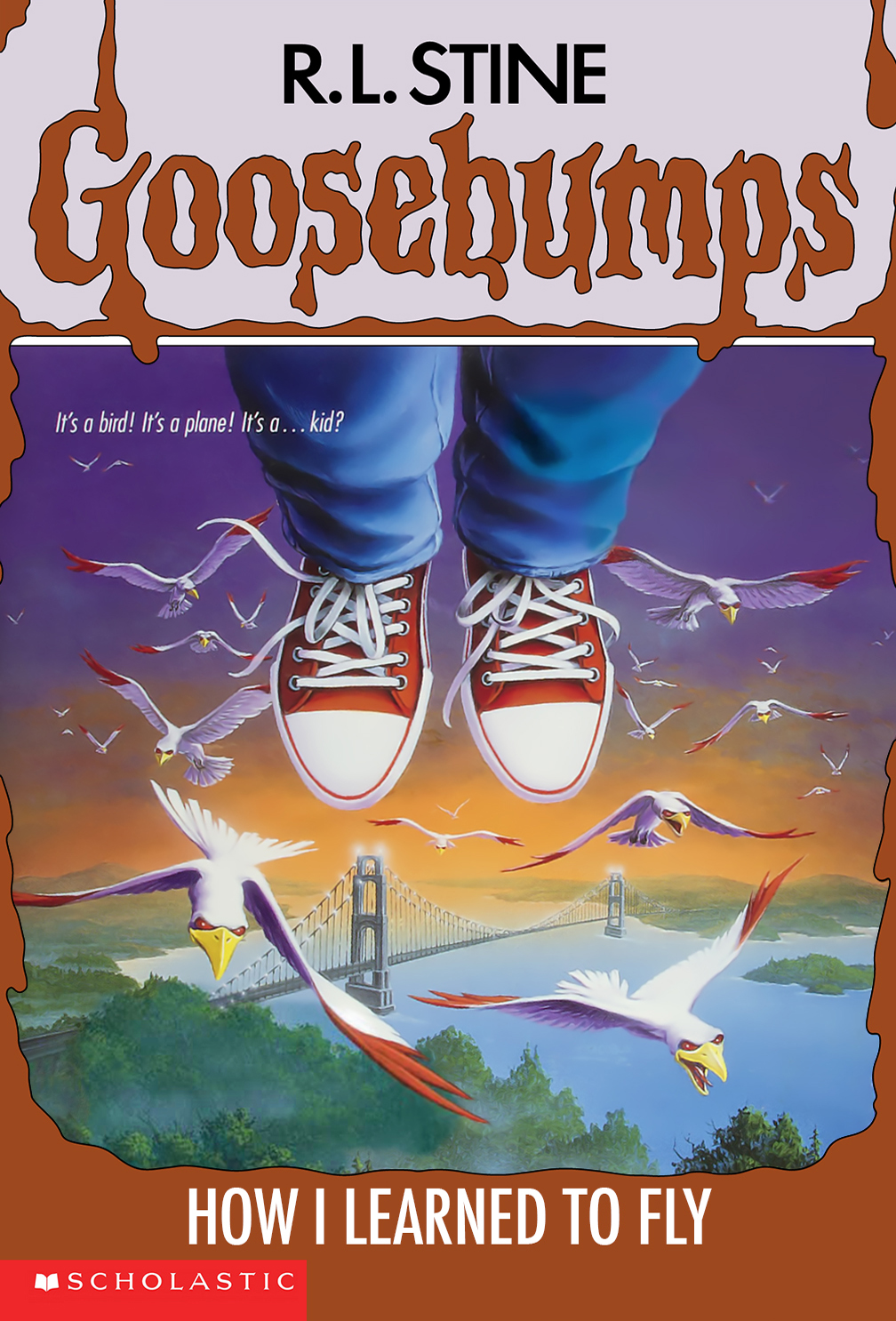 A simple, straight-forward cover that uses its perspective well. I like the touch of how little we see of the main character, as well as the use of birds. Though I have absolutely no idea why the birds are so evil. Maybe they’re just pissed the character crossed over into their air lane without signaling. No need to shame me for that non-joke joke, I’m already doing it to myself.
12: Don’t Go To Sleep
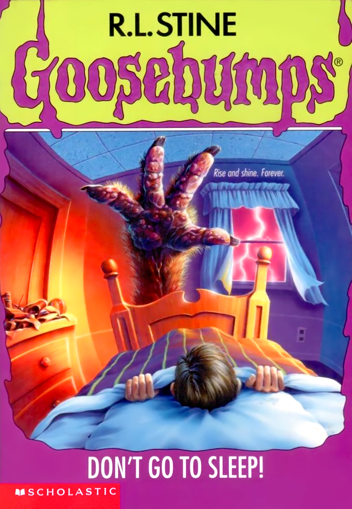 Over the top in terms of the design of the monster hand, the piece still does a great job with touching on that one fear we may have all experienced as a kid, thinking something may be under our bed or by our feet, waiting to pull us off into the darkness.
11: Werewolf Skin
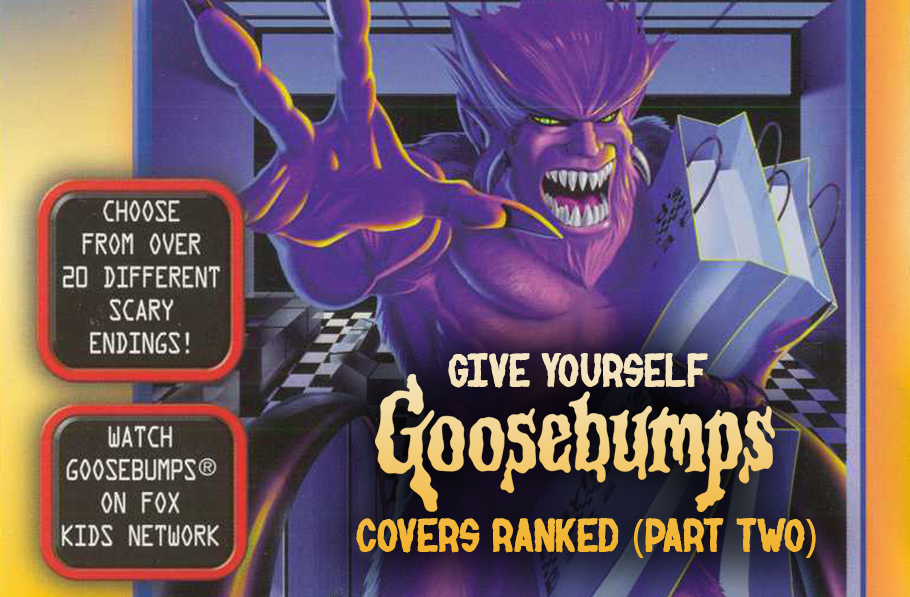
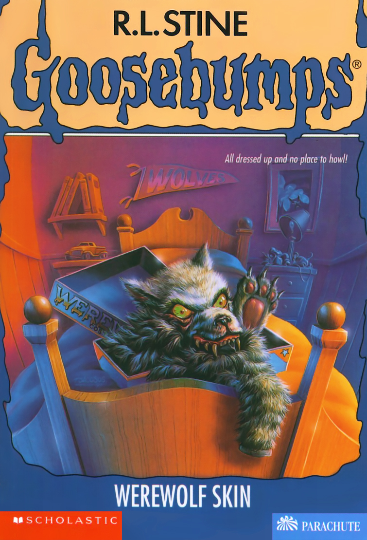 A very easy idea for the book title, it is intriguing and pulls you into wanting to know just exactly what this box of werewolf skin does or where this story may go. This one is a personal favourite, so that may add into the position it has on this list, but I feel like it’s well deserved.
10: The Headless Ghost
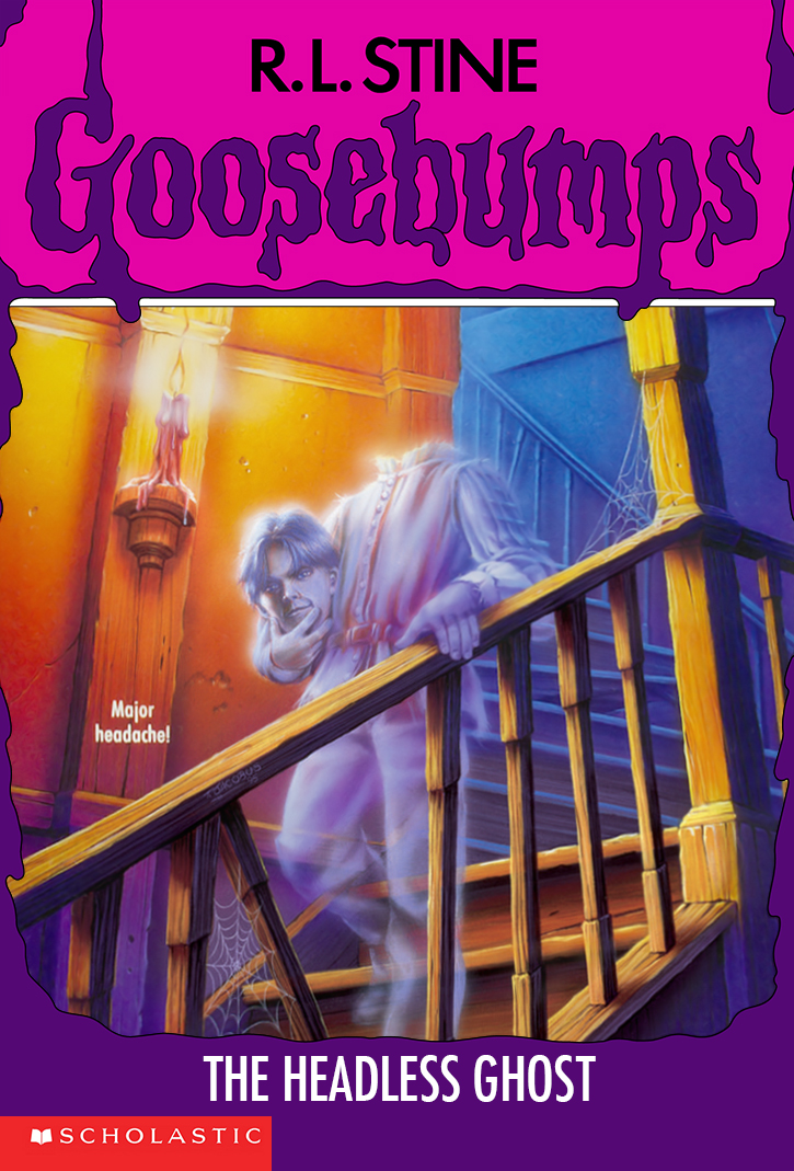 Ghosts are creepy and effective when done well. Seeing a ghost show up holding its own head in its hands is even creepier. This one lends itself more-so into a “real world” scenario because of it, it’s creepier thinking about the fact that not only a ghost may show up, but it’s unsettlingly carrying around its own body part.
09: The Ghost Next Door
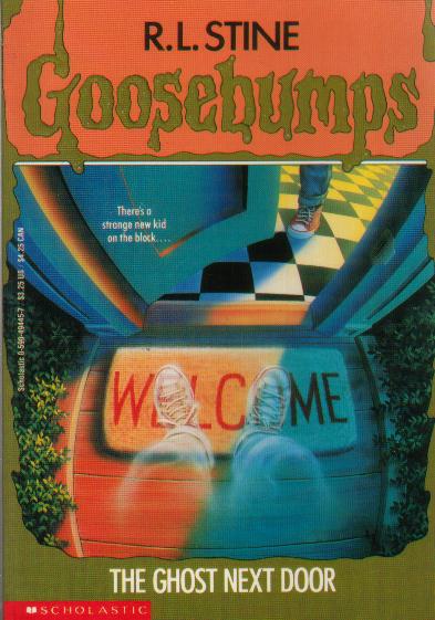 Simple, to the point, and, in my mind, the easiest way the concept of the book could have translated into an illustration. I’ve always personally liked the touch that the ghost seems to get more transparent towards the upper body, as if it’s in the middle of disappearing as the door is opening.
08: Welcome To Dead House
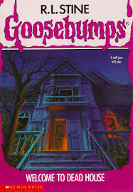 In many ways, this is perfect for the first instalment of a series that would run for decades. The cover here sets a mood and honestly comes off with more of a serious vibe than anything else, though quite a few covers would do that as time went on. Also, nice touch with the figure in the window.
07: The Scarecrow Walks At Midnight
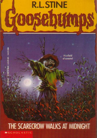 Whether or not you find scarecrows scary is a personal opinion, but the cover here is effective for its art. The design of the scarecrow is fantastic, catching the perfect middle ground of being a realistic type of scarecrow while also upping it into a more theatrical and ‘creepy’ style without going too overboard. The moon and the lighting coming across the corn is also great at mood setting. In my opinion, this is the first addition on this list that would work very well as a poster, and the rest of the list to come falls into the same category.
06: Monster Blood
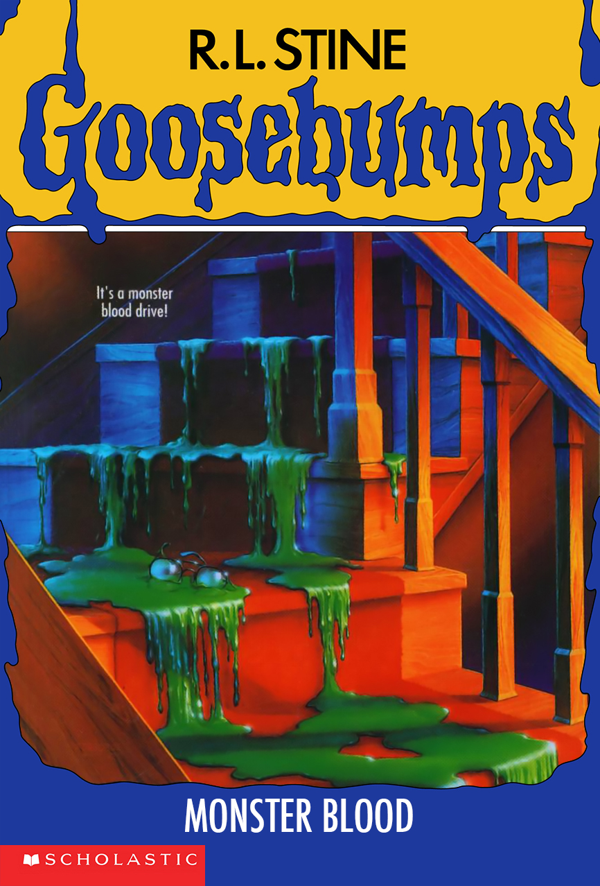 Monster Blood is easily amongst cover art for the series that I would most want hanging on my wall. The reason it's so striking is that it raises questions that pull you into wanting to read the book. What is the monster blood? I’m assuming it’s the green stuff on the cover. Where is it coming from? What does it do? Why is it ominously dripping down the stairs? Why are there glasses in it? WHat happened to the person the glasses belonged to? It raises intrigue towards the book, and is one that uses the dim lighting amazingly in setting atmosphere. Again, though, the book has very little in terms of satisfying these questions.
05: Stay Out Of The Basement
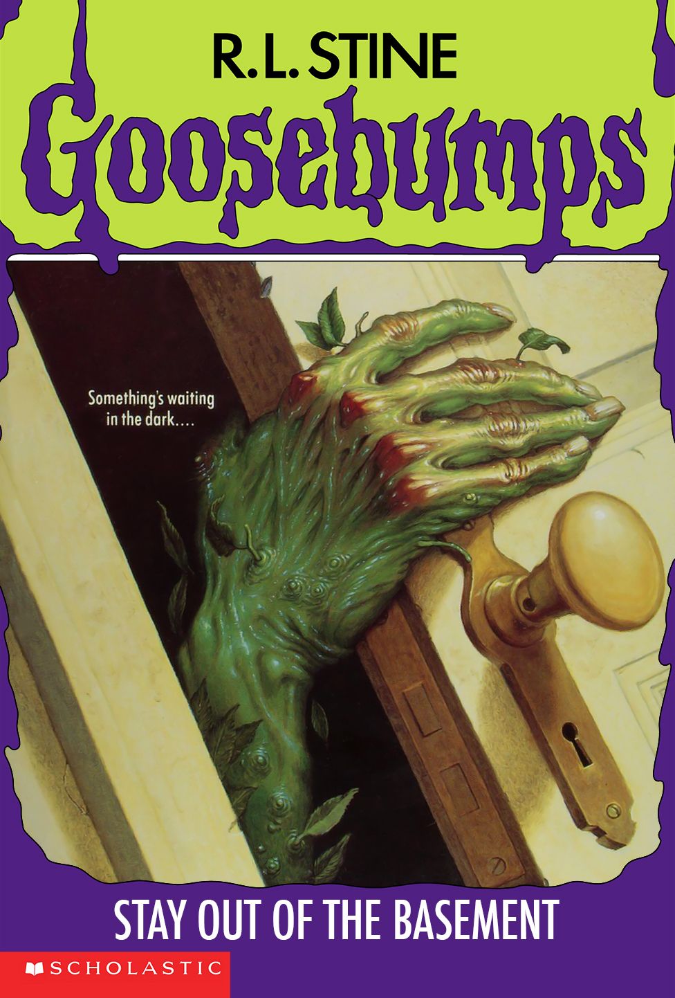 As I mentioned in the intro, this is one of two covers Tim Jacobus did not do himself, it being a piece by Jim Thiesen, and it’s excellent. I like the detail in the veins, in the fingernails, the small sprouts growing, the red on the knuckles, etc. It all comes together with the added thought of some kind of plant-person thing slowly moving its way out of your own basement. It’s incredibly effective and one of those covers that could have worked well as art for a movie, specifically.
04: You Can’t Scare Me
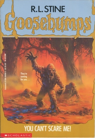 There’s the odd, unnatural colours of the woods, the slight hint of fog against the trees one would expect in the creepy part of those woods, but the real treat here is the design of the mud monsters. I enjoy the fact that it comes off as a possible homage to older style horror, with over the top creatures. I also love the fact that Jacobus decided to include three monsters, each at a different point in pulling themselves together out of the mud. There are pieces dripping off of them. You can almost hear the sound of the mud as they emerge and step towards you. Seriously though, the design of these monsters makes this easily one of my personal favourites in the series.
03: Welcome To Camp Nightmare
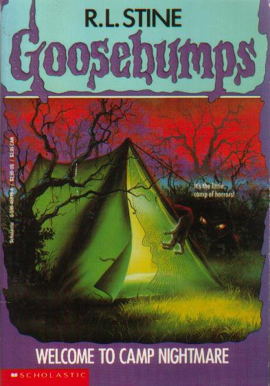 Like It Came From Beneath the Sink and Don’t Go to Sleep, Welcome to Camp Nightmare does a wonderful job in pulling from a fear that is relatable. Camping is fun, but it can also be unnerving in the middle of the night, especially if you have an overactive imagination. Who knows what could be lurking in the dark. Who knows what could be waiting for you to fall asleep or leave the tent to go to the bathroom. I love the fact that we only get a little bit of the creature outside the tent, as less is more, but we get enough to see that it is clearly not from this world. Again, like so many of these covers, the use of lighting is excellent.
02: Night Of The Living Dummy
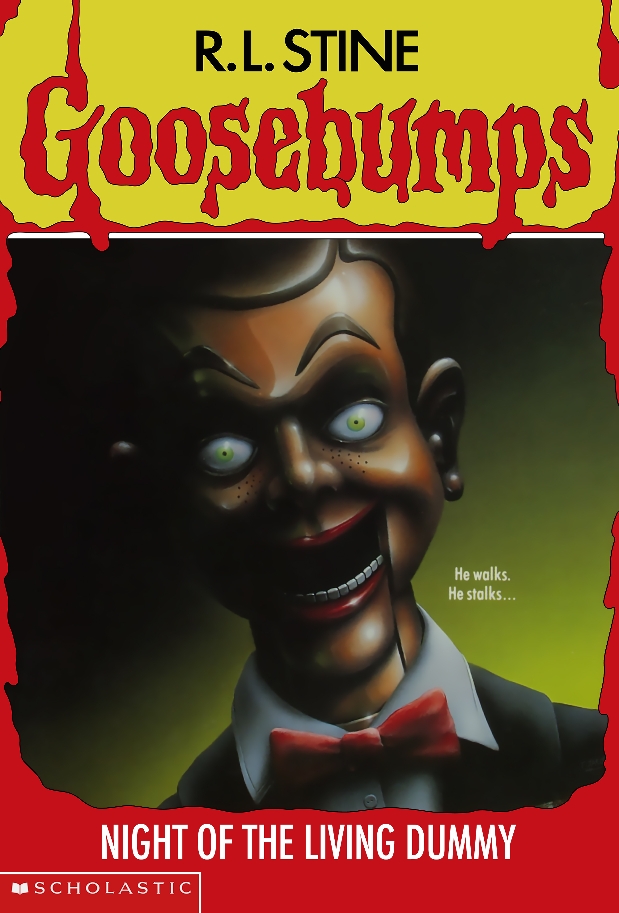 I’ve never had a personal issue with dummies and dolls, though it’s easy to see where the negative feelings towards them come from, and this cover does a great job channeling it. The unnerving, open-mouthed smile, the blank, emotionless eyes staring into you, the lighting causing the glint across the face… it all makes up one of the most simple and effective covers that the series had. The power and memorability of this cover is seen in how iconic Slappy has become in terms of Goosebumps mascots. His look sparked something inside people and made it one of the most nostalgic aspects of the series, which is funny considering he isn’t even the main antagonist of the first Living Dummy book, nor does he come to life until the very end. Er, spoilers?
01: Curse Of Camp Cold Lake
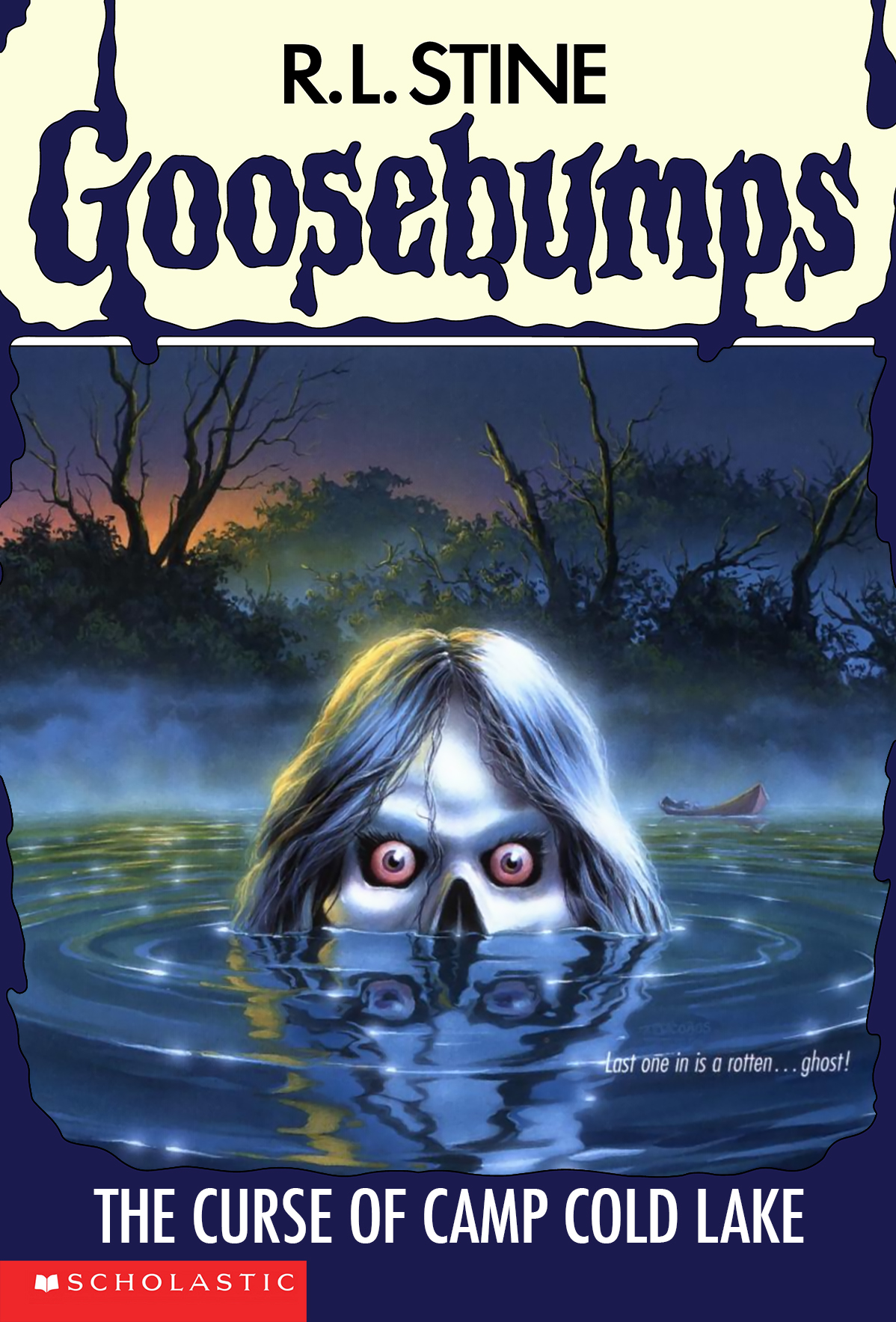 Welp. Yup. I don’t know how much I may need to say, as all the things I mentioned in the previous entries are all here in full, amazing effect. The cool colours used, the touch of light, the fog across the lake and the empty canoe in the background, the ripples in the water and, obviously, the creepy as all hell skull face emerging and staring us down with its red-ish, angry eyes. It’s creepy. It’s intriguing. It’s perfect.


January 02, 2014 at 07:39 am /
Lorem ipsum dolor sit amet, consectetuer adipiscing elit. Phasellus hendrerit. Pellentesque aliquet nibh nec urna. In nisi neque, aliquet vel, dapibus id, mattis vel, nisi. Sed pretium, ligula sollicitudin laoreet viverra, tortor libero sodales leo, eget blandit nunc tortor eu nibh. Nullam mollis. Ut justo.
January 18, 2014 at 13:29 am /
Hi There,
Donec nec justo eget felis facilisis fermentum. Aliquam porttitor mauris sit amet orci. Aenean dignissim pellentesque felis.
January 22, 2014 at 03:19 am /
Lorem ipsum dolor sit amet, consectetuer adipiscing elit. Phasellus hendrerit. Pellentesque aliquet nibh nec urna. In nisi neque, aliquet vel, dapibus id, mattis vel, nisi. Sed pretium, ligula sollicitudin laoreet viverra, tortor libero sodales leo, eget blandit nunc tortor eu nibh. Nullam mollis. Ut justo.