With Mark Nagata’s (and one Tim Jacobus) run on the Give Yourself Goosebumps finishing with book 24, Craig White took over and illustrated the rest of the series, as well as the eight special edition installments. White made his covers using computer software, making for a very different, distinct look to his run. I wasn’t a big fan of the covers when I was younger, mostly because I was a bigger fan of the hand-drawn work that had come before it in other series’. How do I feel about them now? Let’s start this other big list and take a look!
26: Elevator to Nowhere
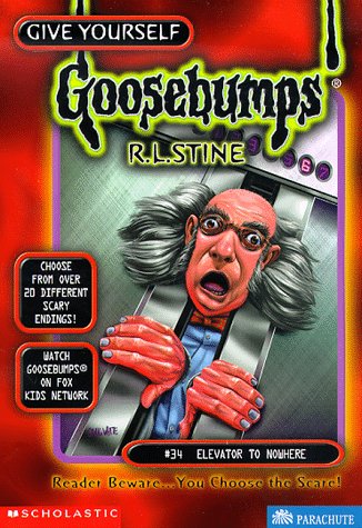 As much as this has the added benefit of the obvious decapitation of a man (wow, that’s a weird sentence), this cover has always struck me as more silly than anything else. I think it may be the design of the man and the shocked look on his face. In my mind, I feel like he’s the kind of person who would be the main character in a slapstick story, constantly having all these mishaps happening to him to the point he isn’t surprise. “Oopsie-daisie, here we go again!”
25: Into the Twister of Terror
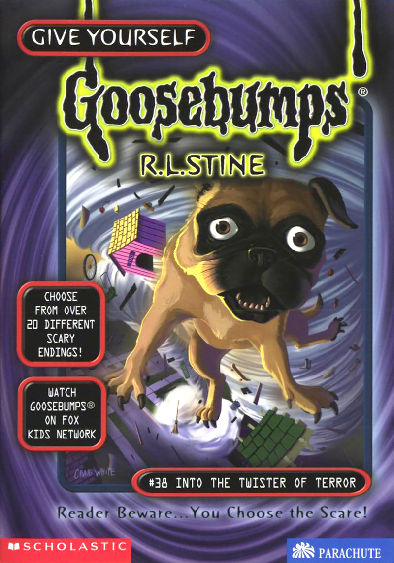 I feel bad for the dog, but even here, its facial expression makes me chuckle. It looks like it just woke up to its situation and is breaking the fourth wall like; “Can you believe this?!” I do have to say, I feel as though this is a ‘Purple Peanut Butter’ type of situation. What do you do for a ‘twister of terror?’ Any twister is already one of terror. Do you make a twister with a comical, over the top evil face inside of it? A twister with a face just hanging out, like it’s standing around, peeling the roof off a house? As stupid as those sound, I feel like they at least would have been a tad more interesting, though I don’t blame White if he was stumped here with what to really do.
24: Danger Time
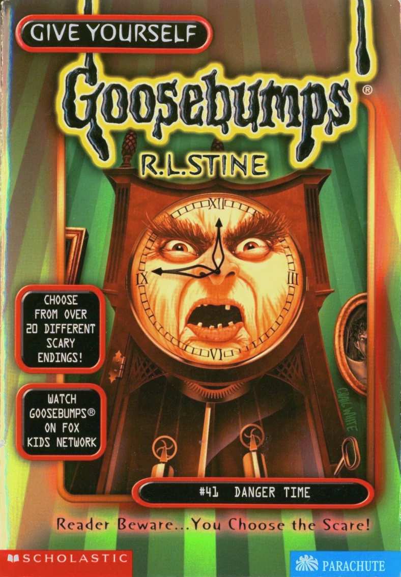 I don’t know if I should be surprised we have two books titled after something time related in one series. At least they were almost 40 books apart. This one adds a bit more character and detail to the look of the face in the clock. Unfortunately, that ends up working against it. The big bushy eyebrows and wrinkles make me think it’s more likely to yell at you to get off its damn lawn than threaten you with anything.
23: One Night in Payne House
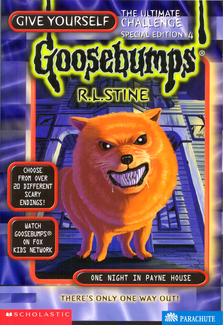 I really like the dog one this one. Evil dog is always a very simple idea, and seems to be a go-to whenever it feels like there may not be much else to do. The pooch looks less evil than just a very unfriendly canine, though I’ll say that it also looks fuzzy and soft as heck and I wouldn’t be able to help myself trying to pick it up and baby it.
22: Ship of Ghouls
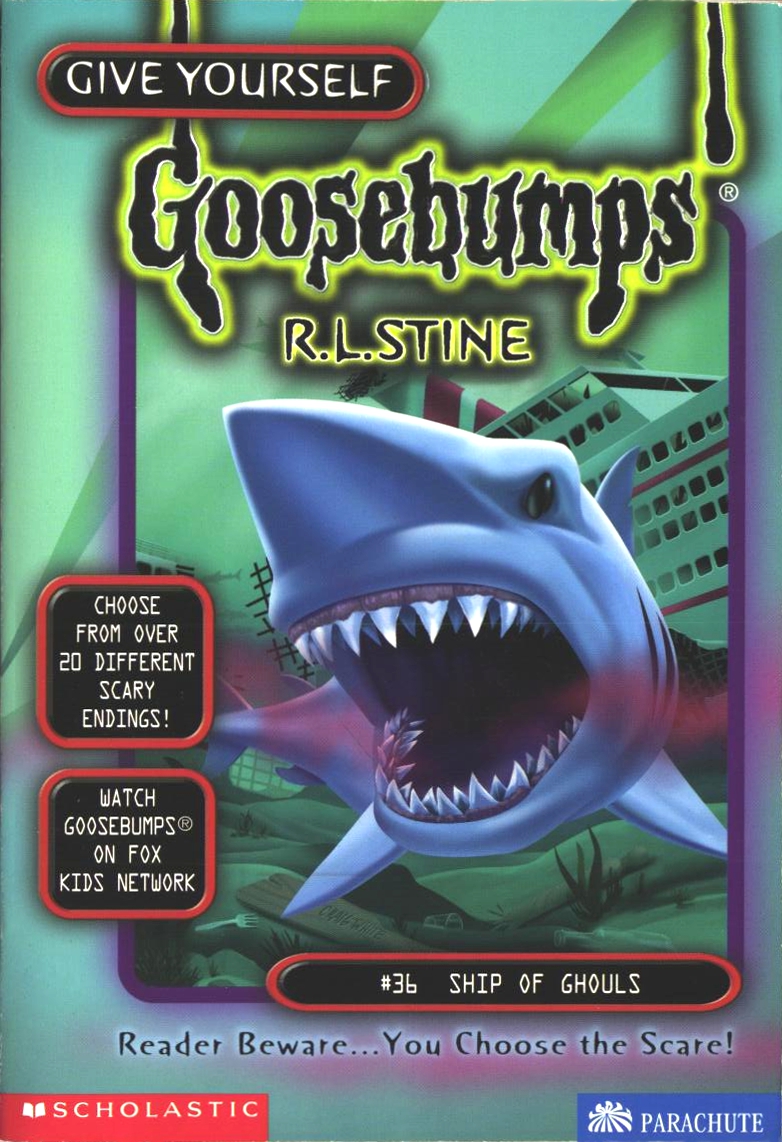 While I’m sad this didn’t in some way incorporate some ghouls on a ship, I do like the she shark, specifically the way its eye looks. It seems as realistic as it could be, showing some kind of anger towards… I don’t know, the ship sinking messing up his swim? I will say, the touch of blood there kind of took me off guard, didn’t expect it at all, so that’s an extra point. It’s not very exciting and other things could have been done with the idea of the title (like quite a few Goosebumps covers, honestly), but it isn’t anything awful.
21: Trick or… Trapped!
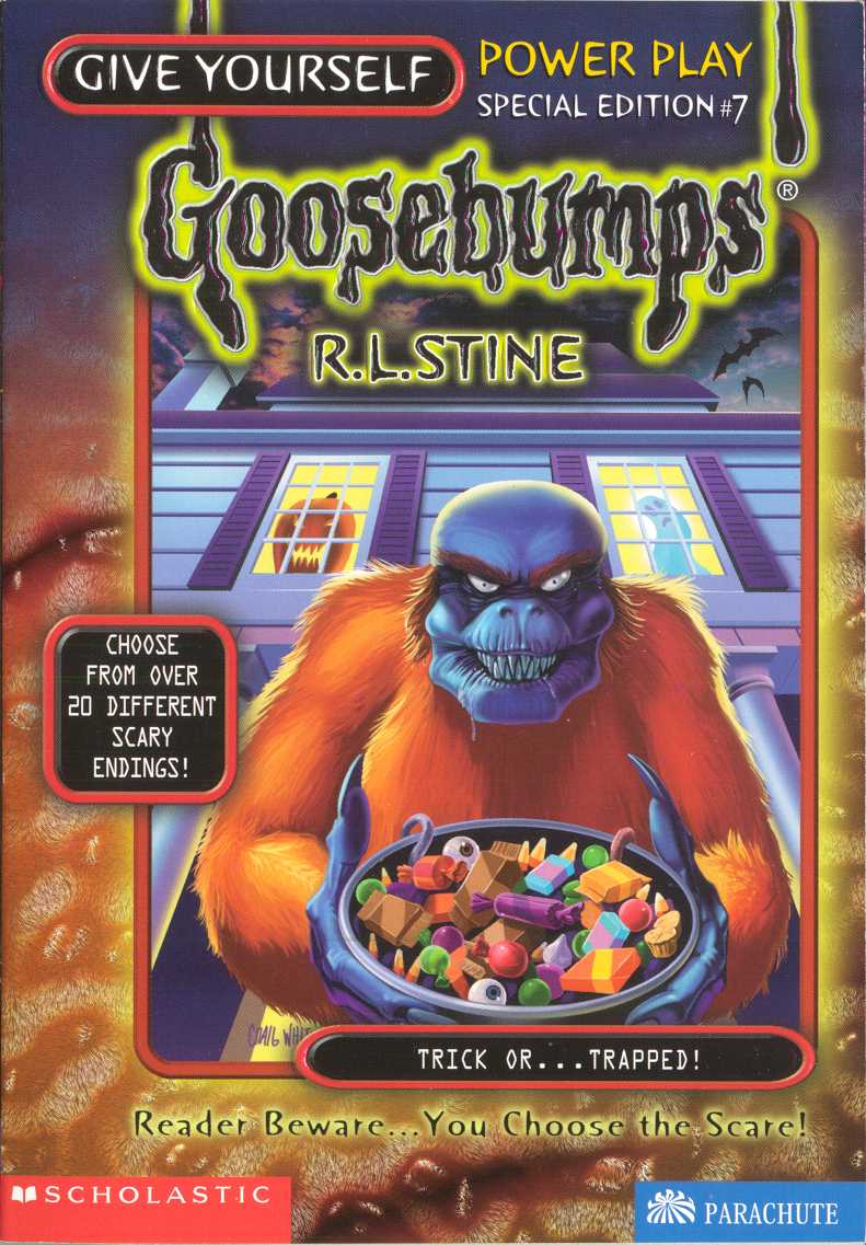 I don’t really know how to feel about this cover. I don’t really like it, but I don’t dislike it either. It’s an attempt at something different, interesting, and creepy. I’m not entirely sure it works though. Maybe I should rank it higher simply for the fact that it’s different than something that is simply a normal animal by itself on the cover (especially since we still have one of those upcoming, still), but I can’t help but feel as though this is a spot that makes me feel satisfied with it.
20: The Curse of the Cave Creatures
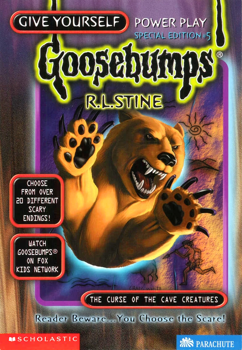 I really like the colour of the, um, light that the bear is coming out from, and I love the look of the cave wall and the petroglyphs on it. On the other hand, well, it’s a bear. It kind of makes me laugh just because it’s an animal appearing that would possibly be in the cave anyway, not so much a ‘creature’, per se.
19: Hocus-Pocus Horror
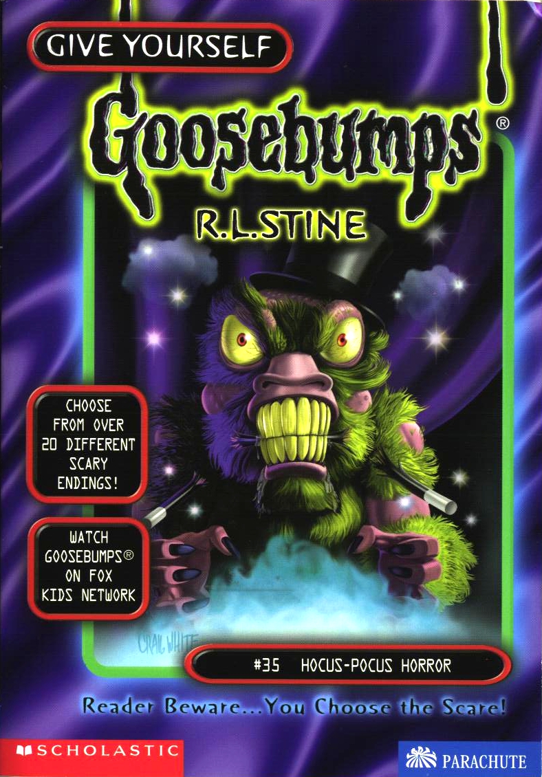 The demented, green furred creature is a good way to change things up and make it interesting (magicians in these books can be so mysterious, who knows what could be in their bag of tricks!), I’m not quite sure how well it works, though. It mostly comes down to how much you like the design yourself. But even past that, I do really like how the creature pops because of its green colours against the purple and black background. I will point out one thing that I noticed… the wand in its mouth didn’t break where it would naturally do so, if it was biting down on it.
18: Return to Terror Tower
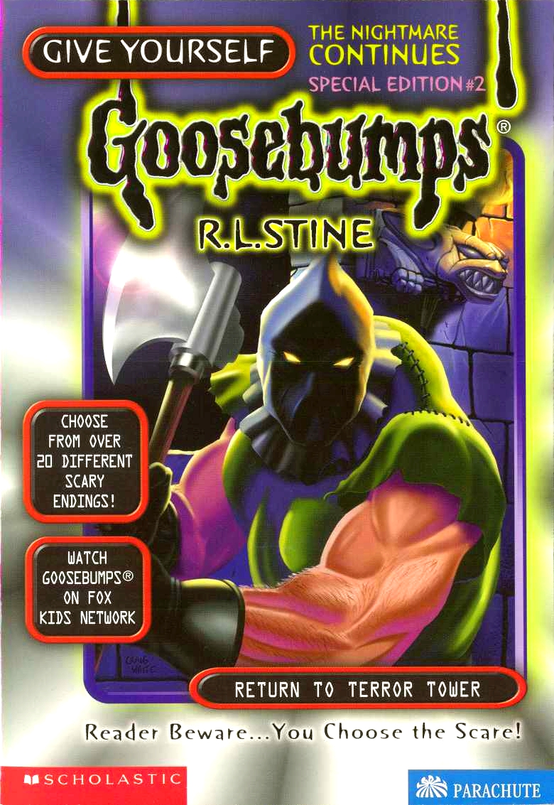 Another cover that is more uninteresting than anything else. Yes, the executioner holding his axe threateningly is good enough, but he just seems to be… there. It doesn’t help that it’s a character that has been featured before, so it would have been nice to see him doing something more exciting or interesting.
17: Return of the Body Snatchers
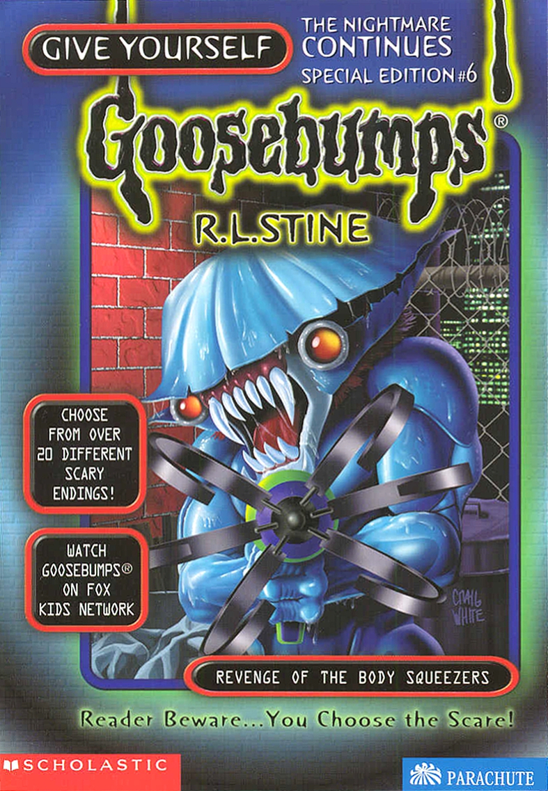 This one falls into the same category as the one before it. Focusing on a creature introduced in a prior story is fine, I just wish it was a bit more intriguing or had more to it.
16: The Werewolf of Twisted Tree Lodge
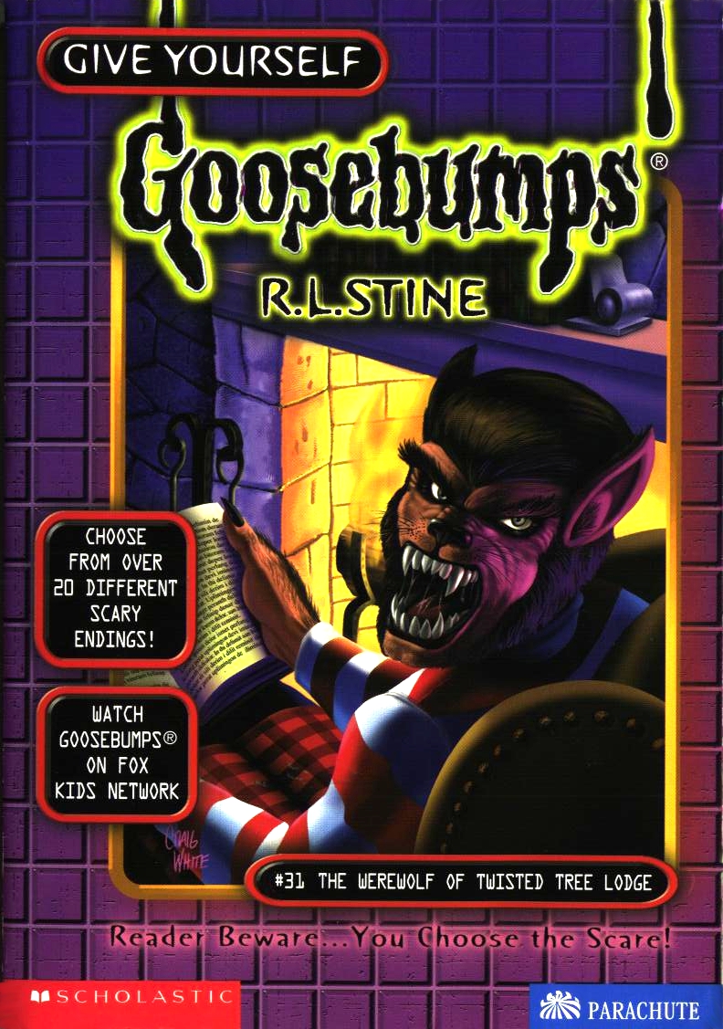 I like the slight flame of the fire against the, seemingly, unlit cabin of tree lodge, and the red and the white of the werewolf’s pajamas pop compared to the other colours. That being said, this seems less horrific, and more like someone who is very upset that you are intruding on their personal time after they’ve had an awful, awful day. I do also like the design of the werewolf face, as it’s different than what we are used to with these books.
15: Weekend at Poison Lake
 Here’s one with a creature I enjoy the design of, especially with how it’s made to seem as though it is leaping towards you to drag you away. I don’t really have much else to say. It’s at this point where I feel like I’ve seen a lot of blue and muted, cold colours. That being said, nice touch with the bright coloured frog in the corner. It’s a decent cover, but nothing that really jumps out at you. I don’t mean that as some sort of a joke, it was an accident…
14: Invaders from the Big Screen
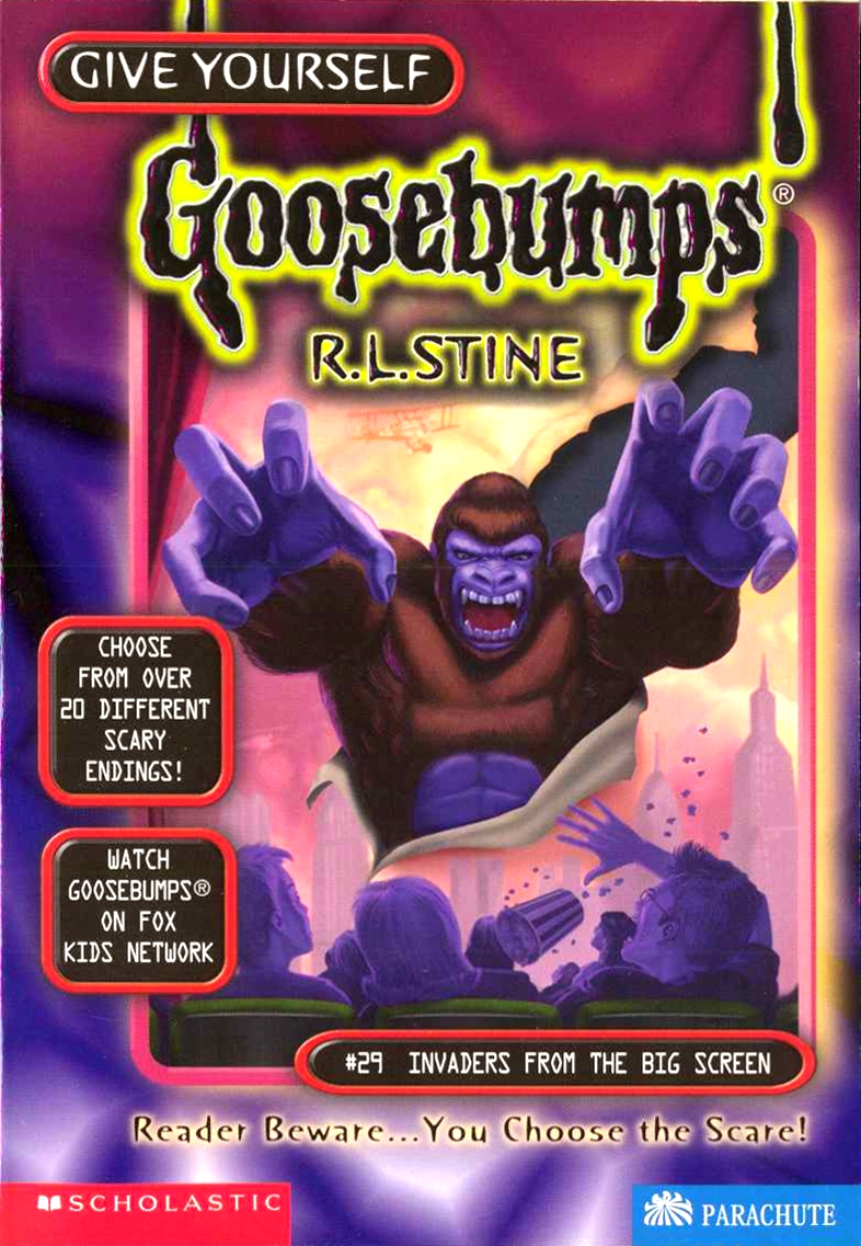 This cover really pops, giving a 3D-ish feel to it with the giant ape tearing its way through the screen. The purple touches on its body blending in with the use of the colour for the darkness across the audience also works to make the brown of its body and the softer colours of the screen stand out. I like the ode to King Kong here, though I wonder if it would have been more effective if they went with some sort of creepy creature.
13: Shop Till You Drop… Dead!
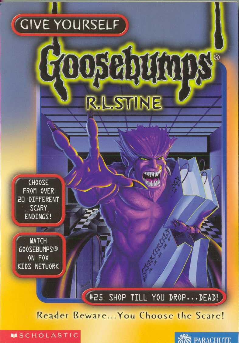 This is it. This is the cover that, for some reason, hangs in my memory the most (with Carnival of Horrors) when it comes to Give Yourself Goosebumps, especially for the latter half of the series. I’m not sure what specifically made this one stay with me all this time. It’s kind of goofy, given the fact the creature is holding some shopping bags, but I like the way it looks and how its full coloured purple body pops against the cold background. The use of green for its iris is also a nice touch, pulling your eyes to it.
12: You’re Plant Food!
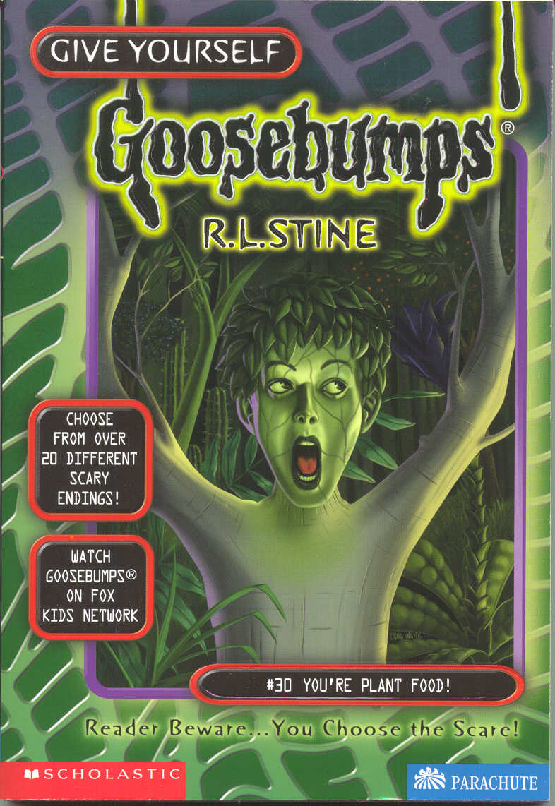 I had kind of a hard time placing this one. The idea of a character being turned into a tree or the like is really good, though I would have liked it a bit more if it wasn’t so close. Or maybe even if there were hints of other child trees in the background, furthering the horror.
11: Into the Jaws of Doom
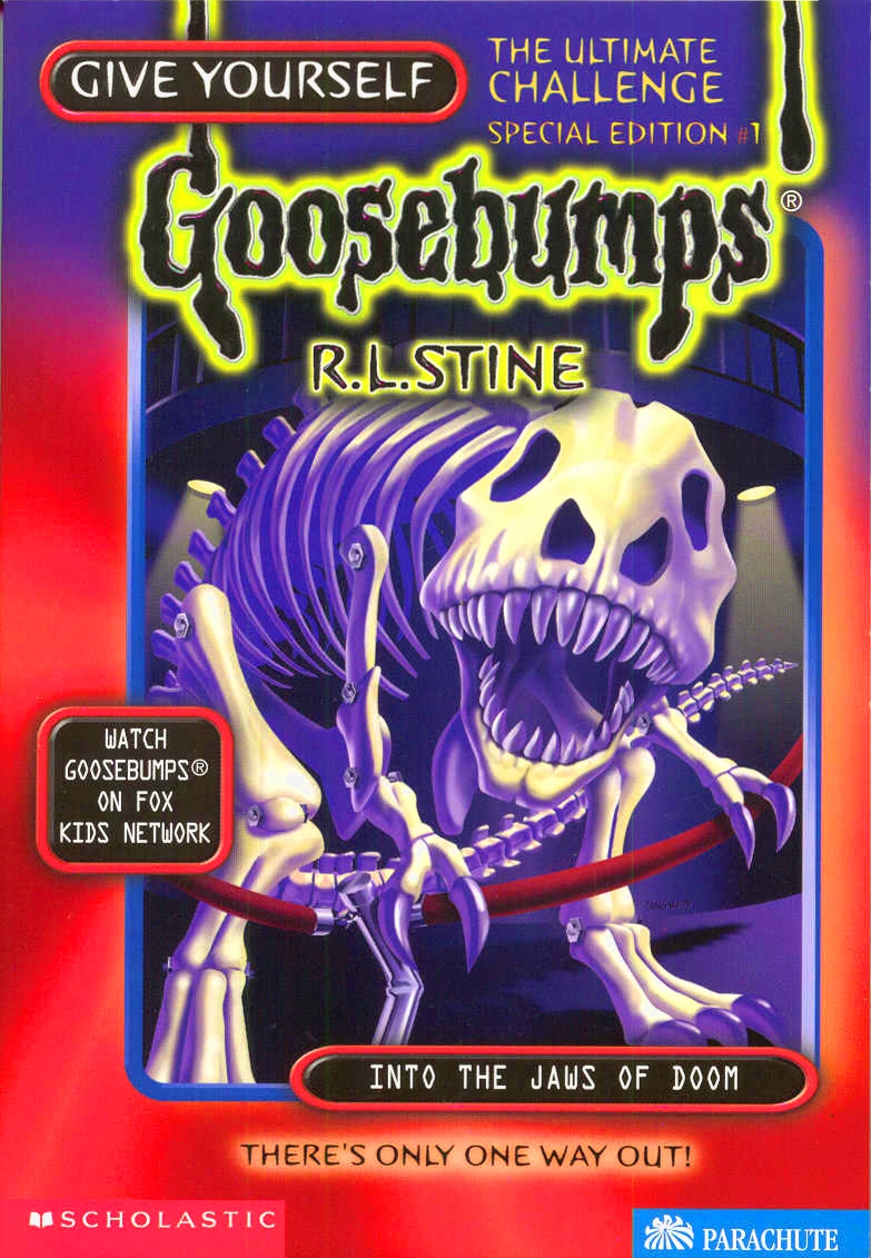 Is this an interesting cover? Not necessarily, though the choice of a T-rex skeleton coming to life is a good choice. Why so high, then? Besides the fact that I love dinosaurs, this one can’t help but have a special place in my heart primarily for the fact that the thing looks so freaking cute. Seriously, it has this look on it that makes it seem like a puppy, coming towards you just because it wants to be pet and given attention. It honestly made me go ‘awww’ when I looked at it and then just couldn’t shake the feeling or think of a better place to put it.
10: Alone in Snakebite Canyon
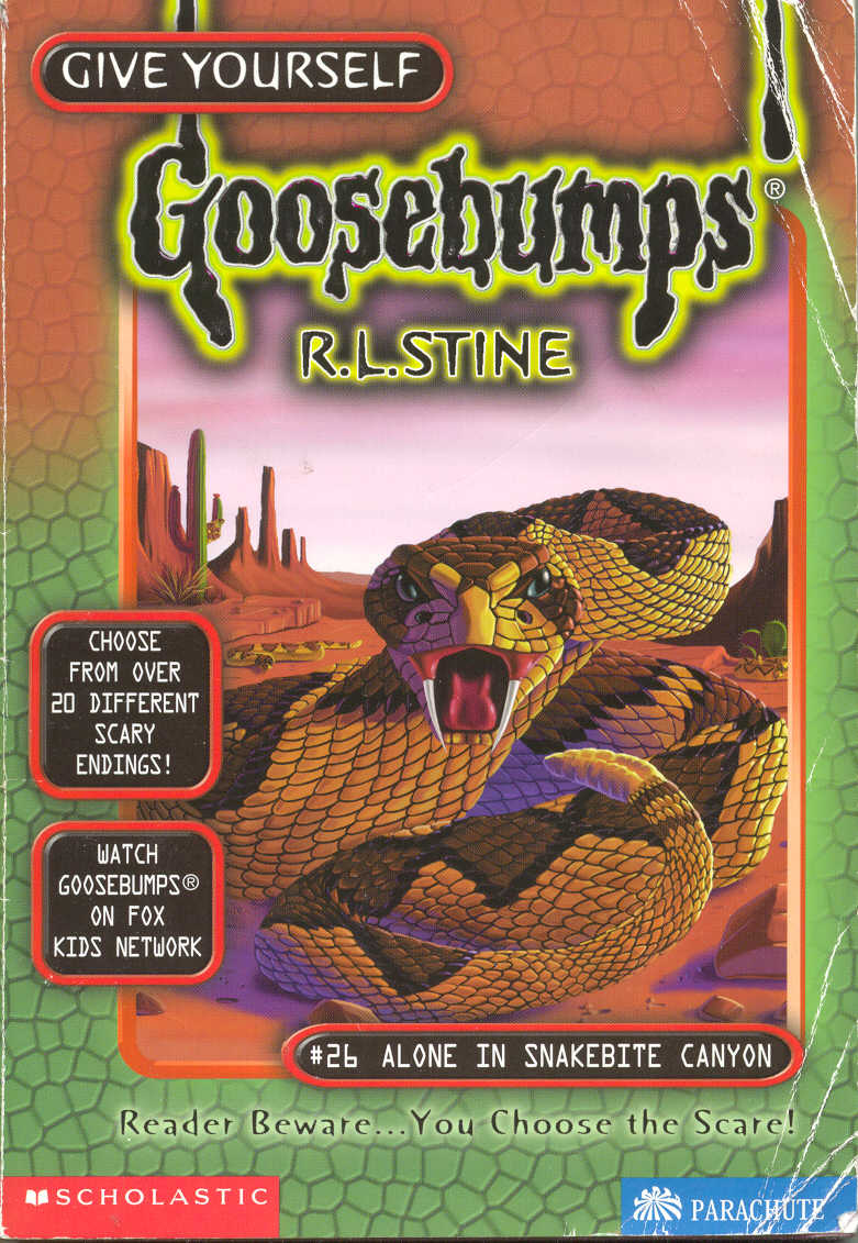 Hey! It’s that ‘normal animal by itself’ cover I mentioned a few bits back! Why is this so high? Why do I like it more than some other entries we’ve already passed that may be more interesting? I have no idea. None. This was a cover I really liked as a kid too, even though I knew it wasn’t as interesting or eye popping as others. I like the colours used, and I really like the detail in the snake. The vast, empty landscape is kind of like the opposite of covers that make you feel lost in the woods or anywhere else, as here there is nowhere to hide. Maybe that’s a big part of it, I’m so used to seeing woods and jungle on these covers that it’s nice to see something on the other end of the spectrum. I also like the fact that there isn’t any over the top venom or anything dripping from the snake’s fangs.
09: Night of A Thousand Claws
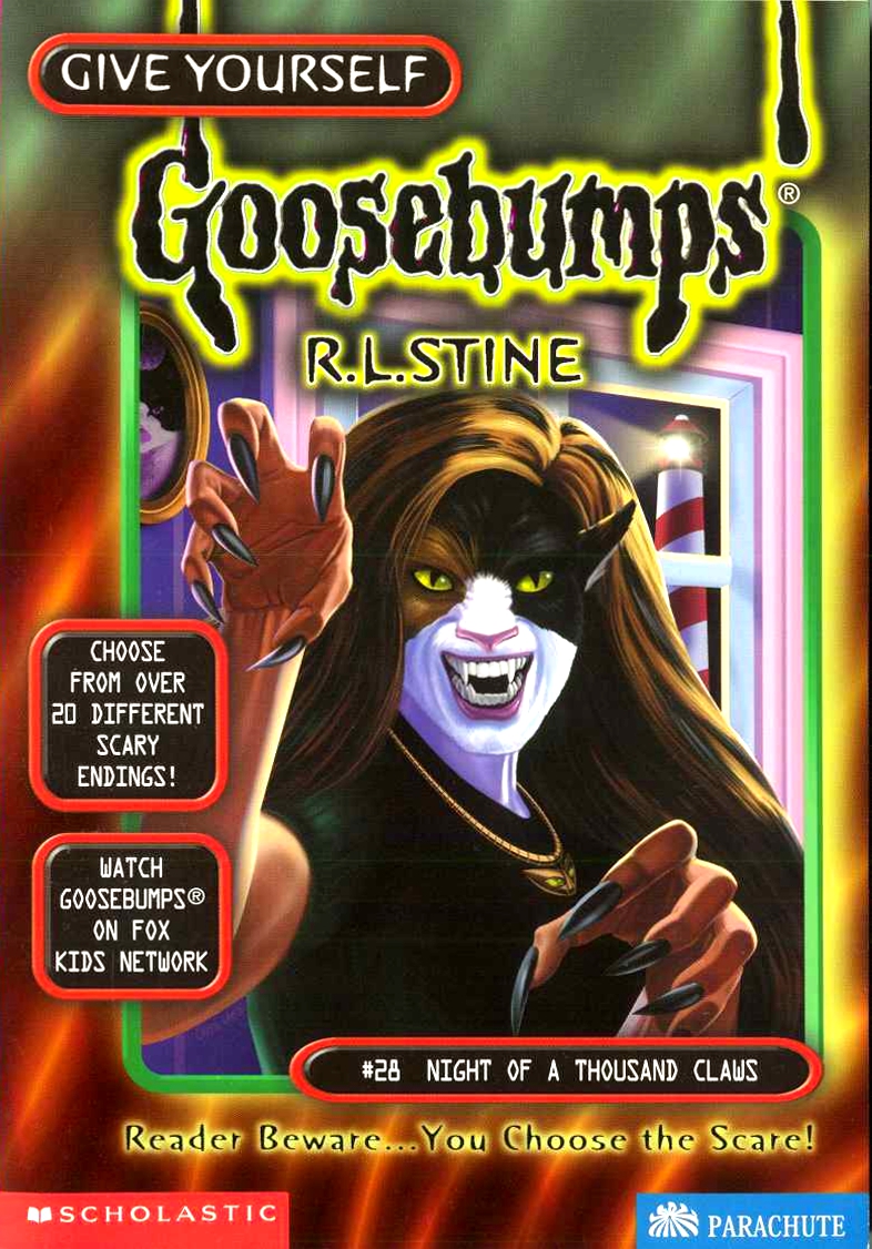 This one goes far in my mind because it isn’t a werewolf. Were-cats are always great to have, and the fact that she isn’t simply one overall colour is also great, making it interesting and breaking up any monotony that a single colour would have (and has had on multiple other covers). I really like this one, and wish I could have ranked it higher, but this is where it got a bit more difficult to rank some of these covers.
08: Zombie School
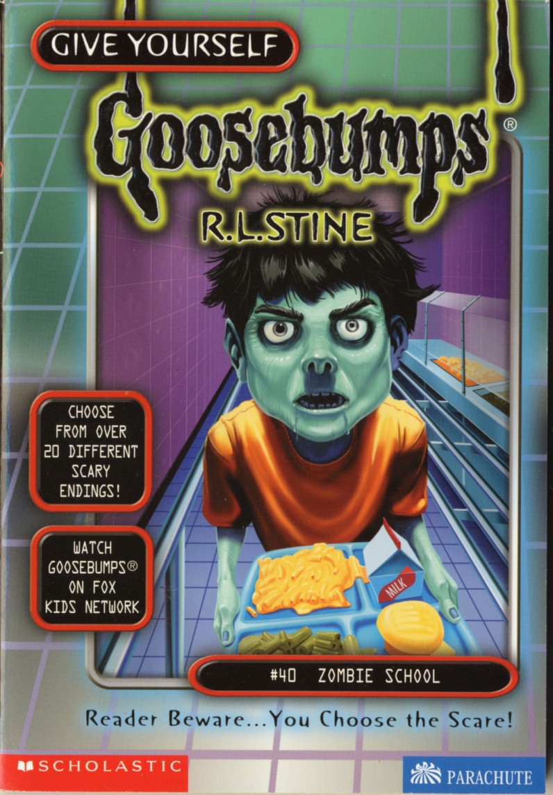 There are some obvious touches here, primarily the use of a different coloured skin. But for as obvious a choice as that would be for zombies, there are other details here that haven’t been on other covers involving zombies that I really like. The different iris is a very, very nice touch, along with the drooling and slight lean forward, like the zombie child is smelling you. A lot of these covers deal with one specific subject being up close and center, and this is a good example of how to do it well. I also like that the zombie child’s shirt isn’t the only thing with colour to make it stand out, as the food and the walls aren’t the usual blue-ish tint. This makes the floor, metals, and food tray look so much better, once again breaking up any monotony it might fall prey to.
07: It’s Only A Nightmare!
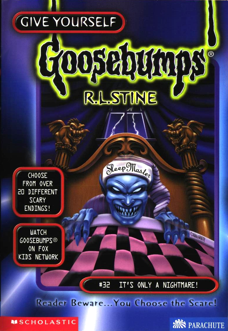 I wrote that it’s felt like there’s been a lot of blue (da-ba-dee-da-ba-da) used on these covers, but here is an example of it being used well and integrated properly. There’s enough colour to really break things up and not make it seem boring, with the bedframe, checkered blanket, and pajama hat making the blue creature look more prominent. Oh, and what a creature we have. I love this design, it looks genuinely terrifying and creepy, with its lack of pupils and legitimately demented and menacing look on its face. I just wish this had taken a ‘Don’t Go To Sleep’ approach and placed the creature at the foot of someone’s bed. Then it would have been seriously terrifying.
06: It Came from the Internet
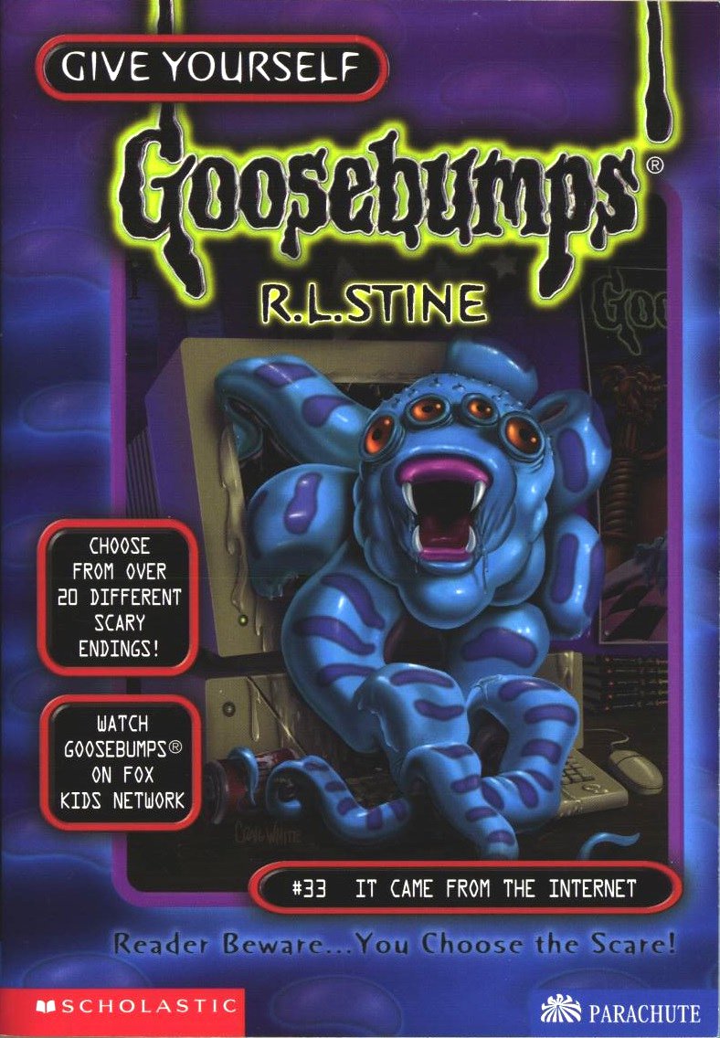 Hey. More blue. Neat. I kid, I kid (kind of). This is an example of me being able to forgive the constant usage of a single colour if the image pops on its own. The muted colours around the creature make it feel like it’s the middle of the night, the being crawling from the computer whilst you sleep, unprotected. Of course, this works only as well as it does because of the design of the creature, which I really love. Kind of like a mix between a spider and an octopus, you can just imagine it slither and crawl around, leaving its slime behind it and possibly emitting some sort of ungodly screeching noise. The colour of its eyes and slight stripes work in breaking things up enough to not make it feel like an eyesore of one primary colour.
Also, shout-out to the Goosebumps poster (for It’s Only a Nightmare!) on the side there. I love little touches like that.
05: Scary Birthday to You
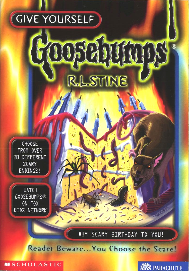 A simple cover idea that ranks high because of its foot in the real world, I absolutely adore the colours used here. It isn’t muted like others and therefore has a vibrancy to it that I feel was really missing from a lot of these. The blaze of orange fire against the white, purple and red of the cake works great, highlighting all the ickiness coming out of, and surrounding, the cake. While the last two may outrank these based on designs used for the creatures, it’s the simplicity of the piece that goes a long way for me, feeling like this could be used as a cover for a classic Goosebumps entry. Probably because it feels more hand-drawn than a lot of others.
04: Trapped in the Circus of Fear
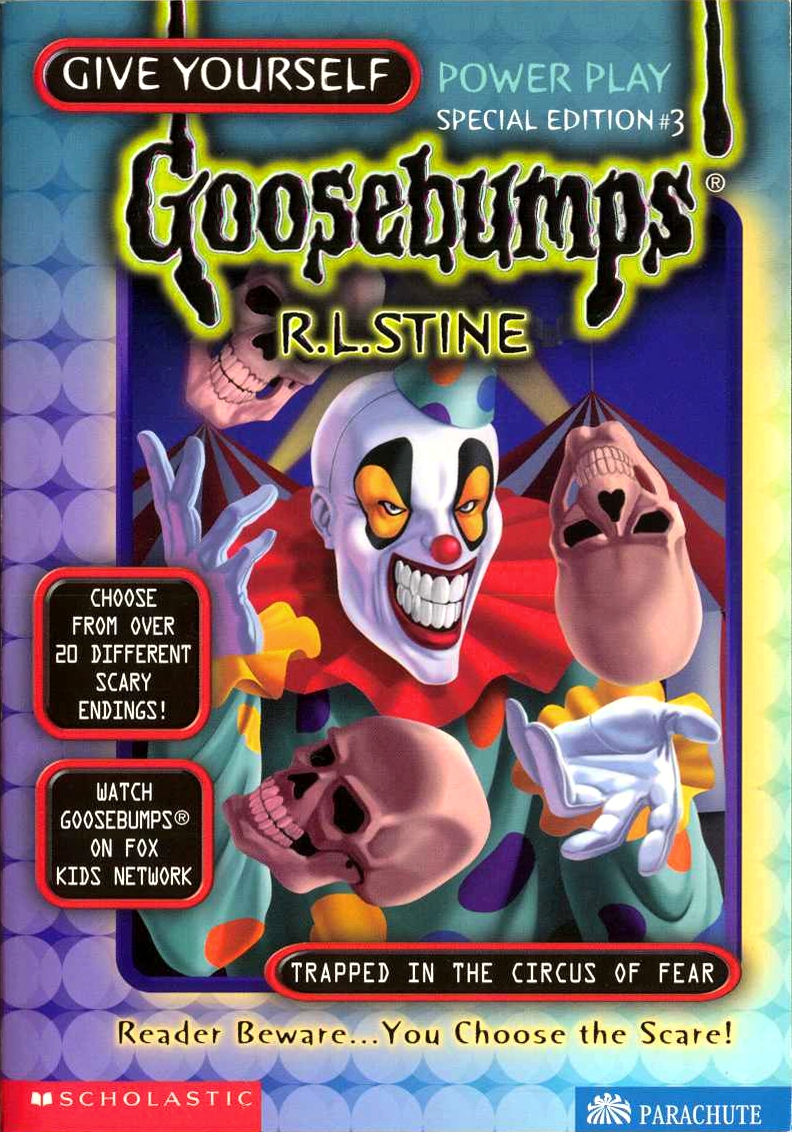 I don’t have a problem with clowns, but that is one freaky clown. The design of the clown isn’t anything too out of the ordinary, but the things around it make it work. He still looks incredibly menacing, his vibrant colours popping, especially the yellows. Plus, he’s juggling skulls. I mean, that’s enough on its own to be creepy as hell. Like some of the best covers in Goosebumps, it’s a simple idea executed very well, and the fact that it’s colourful is an added plus.
03: Checkout Time at the Dead-End Hotel
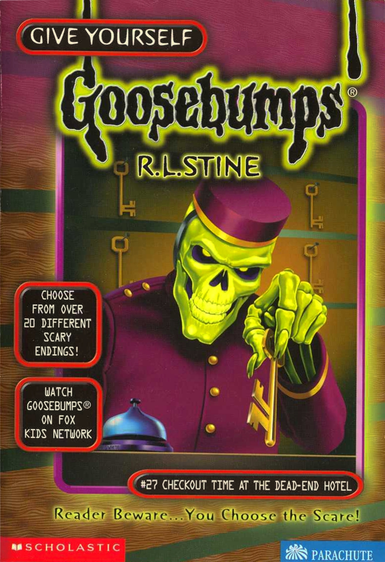 At first, I thought this would rank at the top, but the more I had to go back and forth between pictures, I found myself liking two more above it. But that doesn’t take away from how much I do like it. Skeleton people have been seen quite a bit, but the radioactive-like glowing green really adds to the figure and the atmosphere of the entire cover, especially off-set by the purple outfit it is wearing. The gold of its outfit, the key, and its eyes work nicely to break things up. It’s a playfully sinister cover in line with a lot of other good Goosebumps covers.
02: All-Day Nightmare
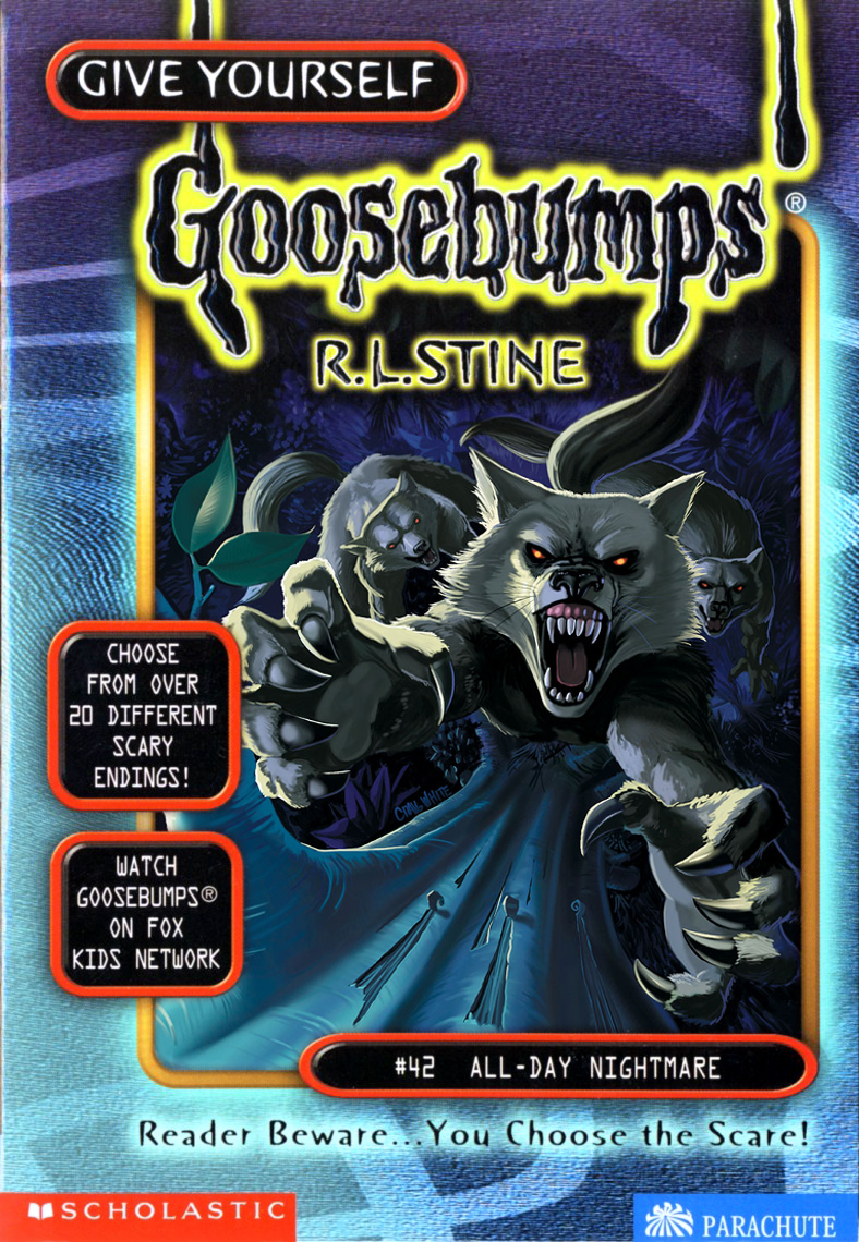 When it comes to simple ideas that don’t really change real-world subjects or include anything supernatural or other-worldly, this is the quintessential Give Yourself Goosebumps cover. I’ve fallen in love with this cover. I love that, though it’s using blues, the colours come off very cool, instead of feeling very in your face like some other usages of blue in the past. It perfectly encapsulates a cold night under a full moon. I mentioned last time that the wolves on the ‘Night in Werewolf Woods’ cover may have looked a bit off, but here they look absolutely great. Vicious, terrifying, and ready to feast on you, knowing it’s only a matter of time before they get you out of the tree. The main wolf, with its claws out, teeth bared, and eyes glowing, really works at making this cover be effective. It’s so close to getting you, and might actually reach you this time. Going in, with my memories of the series as a kid, I fully expected to mainly find the best of these covers as simply ‘okay’. I ended up finding a few I really liked, but this one honestly may have climbed into an all-around Goosebumps personal favourite of mine. The more I looked at it, the more I loved it.
All of that and I haven’t even mentioned the great added detail of the tree being clawed up from previous jumps.
01: Escape from Horror House
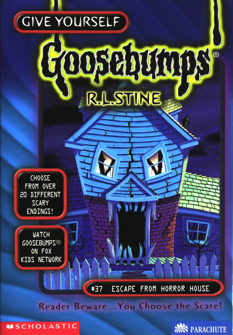 I really, genuinely love the cover for ‘All-Day Nightmare’, but felt like this one would suit the final entry a lot better. It has a bit more going on, in terms of design and idea, creating a monster face from the front of a house. Here’s the thing, I am a big fan of houses looking like evil, monstrous faces. So, yeah, may be a bit biased there. Like ‘All-Day Nightmare’, this one does a good job in creating mood and atmosphere from its blue colour, making you feel like you snuck out in the middle of the night with friends to go check out the titular Horror House. It’s still a very simple idea and design, but executed well, like all the best ones. Like ‘All-Day Nightmare’, this one feels like Goosebumps, and that, more than anything, made me feel as though it deserved to be at the top of the list.


January 02, 2014 at 07:39 am /
Lorem ipsum dolor sit amet, consectetuer adipiscing elit. Phasellus hendrerit. Pellentesque aliquet nibh nec urna. In nisi neque, aliquet vel, dapibus id, mattis vel, nisi. Sed pretium, ligula sollicitudin laoreet viverra, tortor libero sodales leo, eget blandit nunc tortor eu nibh. Nullam mollis. Ut justo.
January 18, 2014 at 13:29 am /
Hi There,
Donec nec justo eget felis facilisis fermentum. Aliquam porttitor mauris sit amet orci. Aenean dignissim pellentesque felis.
January 22, 2014 at 03:19 am /
Lorem ipsum dolor sit amet, consectetuer adipiscing elit. Phasellus hendrerit. Pellentesque aliquet nibh nec urna. In nisi neque, aliquet vel, dapibus id, mattis vel, nisi. Sed pretium, ligula sollicitudin laoreet viverra, tortor libero sodales leo, eget blandit nunc tortor eu nibh. Nullam mollis. Ut justo.