Ah, Goosebumps. How do we end up here always? Well, okay, I know how we ended up here but I didn’t expect to end up at this specific spot, necessarily. I had a few other things planned for the series, specifically the original run that I grew up loving. Then I ended up looking at Series 2000 covers and now, apparently, found it logical to cover these, erm, covers, before moving on to some other things. This entire progress I’ve made through the multiple series could be best described as laying down in your super comfy bed after a long day, before ending up somehow stuck and twisted up in your covers and then falling headfirst onto the floor while desperately attempting to get out to sweet, sweet freedom. The original series had great covers, good covers, meh covers, and bad covers. Even then, though, the bad covers still held a very tongue-in-cheek likability to them that was lost for Series 2000. With the second installment aiming to be more mature, the artwork followed suit, and I found myself only liking a handful of covers from it. It was a shame, really, as I am a fan of Tim Jacobus and what he has done for these books. Even the cover that he did here would rank pretty high if I added it into the Series 2000 chunk of art. But before we get too much more into that, let’s start the list and see why exactly this list is split into two.
Honourable Mention… kind of?
Escape From The Carnival of Horrors
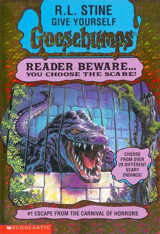 If you aren’t familiar with Goosebumps as a whole but have been following my articles on them, you may have been eagled eyed enough to notice I mentioned ‘Jacobus’ and ‘cover’ in the intro paragraph; yes, cover. Singular. Jacobus only made the initial entry of the series and it’s… okay. I genuinely really like it because of the fact that it’s good; the detail is fantastic and that purple alligator looks vicious. The saliva dripping from its mouth is a nice added touch. The problem is that people might not find it necessarily interesting. It’s slowly breaking out of its cage and… yeah, that’s all anyone can really say. Technically it’s great, and very pretty, but just nothing that may strike a lot of interest. It would still outrank a vast majority of the Series 2000 covers though, as this is the kind of “more mature” style I would have expected from them.
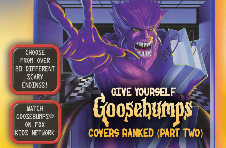
The Ranking (2-24) With that out of the way, let’s get on with the rest of the series rankings! So why is this list cut into two parts? Well, Give Yourself Goosebumps had (besides Tim Jacobus) two separate artists for their covers. Books 2-24 were illustrated by Mark Nagata, and those are the ones that will be taken a looked at here. Now, as a whole, I never really outright hated the covers for Give Yourself Goosebumps. I actually never really thought about them, which in turn is the problem. Across the entire series of books, I simply thought the covers were always unexciting. Because of this, it was a bit harder to rank things in these two articles than usual, though there are a few I found myself liking more than I remembered. So let’s dive in!
23: The Deadly Experiments of Dr. Eeek
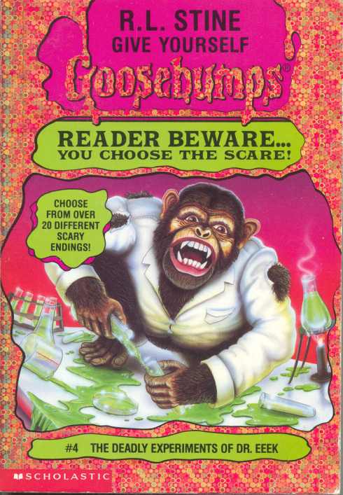 It was kind of difficult which cover to choose as the start of this list. What made me go with this one? It’s a monkey. Sure, it looks like a crazy monkey (smart-crazy, though, as he mixes his little experiments), and I’m a fan of cheeky style covers, but this one sways a bit too much into the uninteresting/too ridiculous. I don’t even know if too ridiculous is the right way to describe it, but it’s the one that I feel is the only way I can properly describe it. It’s sort of like Deep Trouble II. Just… yup. That’s an animal.
22: Beware of the Purple Peanut Butter
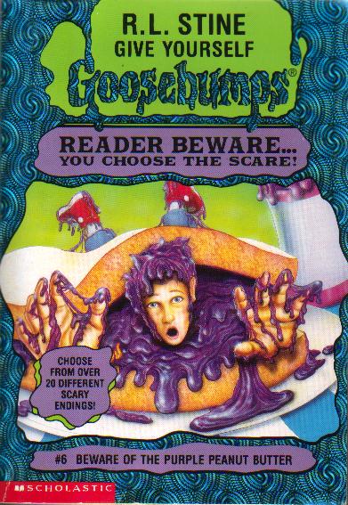 One that works more on paper than execution. I’m guessing the peanut butter (sorry, purple peanut butter. That’s important) is supposed to be overtaking him, like the blob, but the fact that he’s inside of a sandwich ends up feeling more ridiculous than anything. Yeah, there’s a slight threat of the character being eaten but still… purple peanut butter. This to me feels like a case where you can’t really work with a title like that. Purple peanut butter kind of backs you into a corner. The only other thing I could think of would be an obviously evil looking dog licking purple peanut butter in his mouth. Which would probably still end up being ranked in this spot.
21: Diary of a Mad Mummy
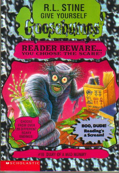 I understand what this was going for, but the mummy isn’t very creepy. Too bad, as I like some of the choices on their own; the mouth is really, really good and creepy, the wide, almost lipless smile being kind of unnerving; the wide eyes could work, too, but then we also have the addition of the hair and the green around the mouth. The hair makes it look comical, even with the obvious reasoning being it’s a mad scientist. The green on the mouth makes sense as well, indicating he’s drinking his mixtures, but it kind of ends up looking like he has some sort of gross, running nose scenario. I like to think he’s offering the vial to the monkey from Dr. Eeek, who then loses its mind because the mad mummy won’t leave it alone while it’s trying to work and proceeds to wreck everything in the lab. Possibly while throwing feces at the mummy.
20: Trapped in Bat Wing Hall
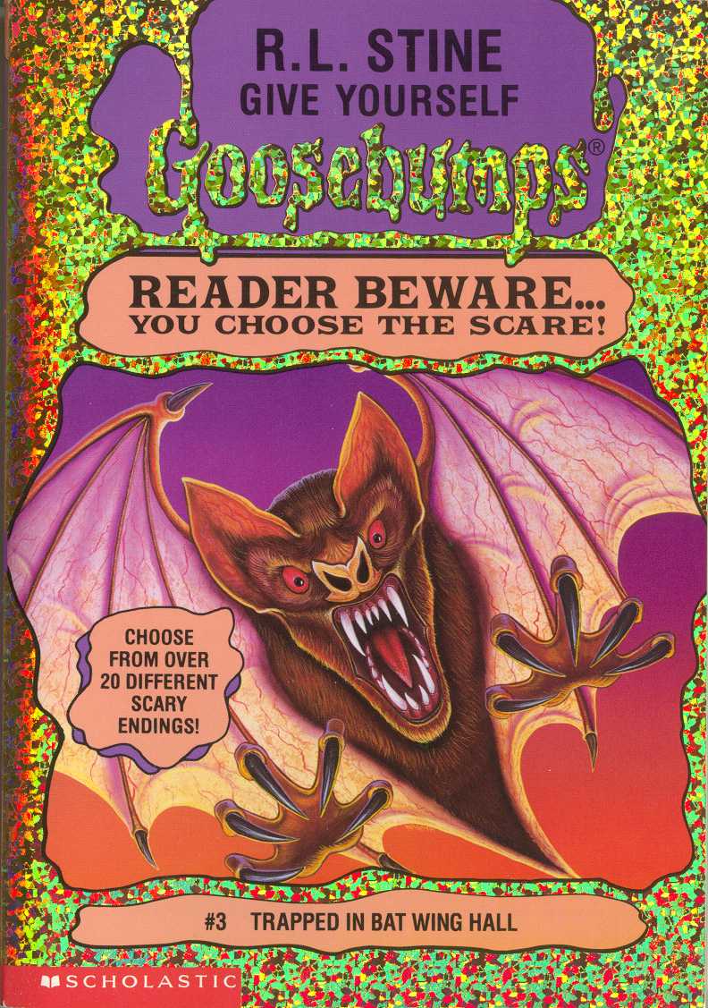 Yep, that’s a bat. It’s a well-drawn bat. Looks pretty threatening and evil. I like how fuzzy it looks, the bat.
19: Lost in Stinkeye Swamp
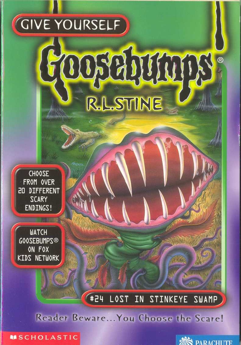 While the design for the plant is decent, albeit generic, I think the reason I rank this one lower than some others is mostly because I wishes there was a bit more too it. I like the addition of alligator in the back, but a few more evil, toothy Venus flytraps may have made it a bit better. Oooh, or maybe even a shoe in its mouth, having just eaten some poor traveller.
18: Zapped in Space
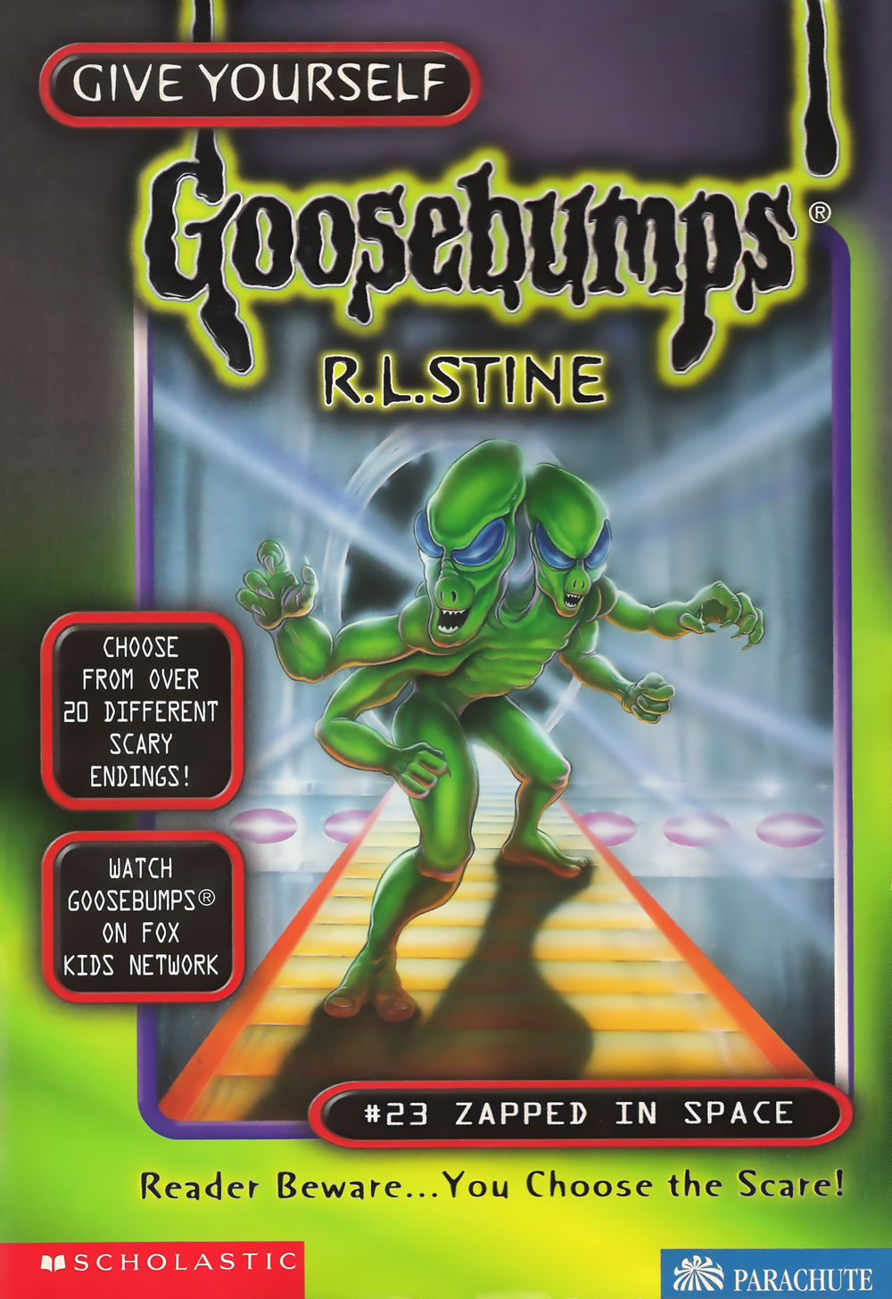 While the design of the alien is kind of interesting, it’s a lot of ‘taking a normal look and just tossing two aliens in a fusion machine together.’ It does look threatening, though, and I like the shining light coming out from behind it.
17: Please Don’t Feed The Vampire!
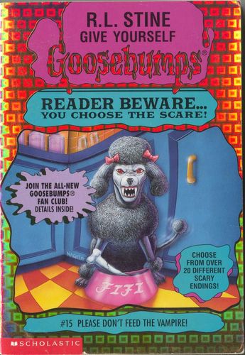 Poodles aren’t scary, especially ones that have the name Fifi. Here, though, something makes it work kind of decently. Nagata did a good job in making a ridiculous idea work, the poodle looking legitimately threatening and deadly. I like the cracked bone in its dish, making it feel like its jaws are so powerful it cracked it itself. Also, is… is this the same kitchen from the Egg Monsters From Mars cover?
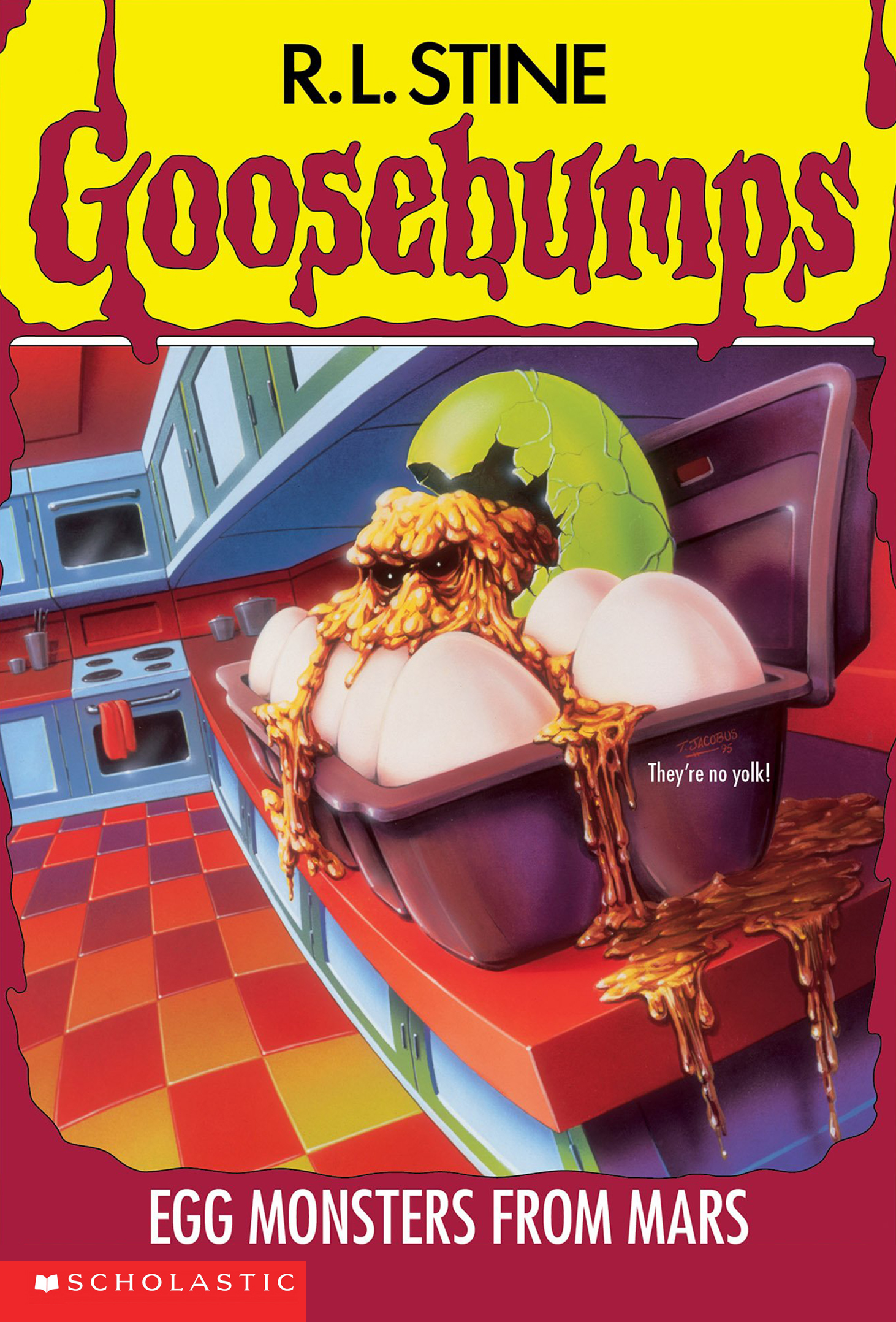 Jesus, that family has awful, awful luck.
16: The Creepy Creations of Professor Shock
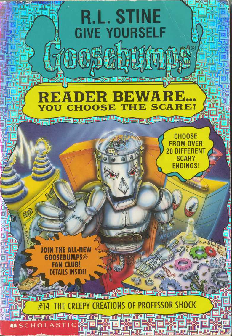 The fact that the majority of the colours here are silver and metallic, the few other colours end up popping against it. There are also some touches that I really like, all centered around the robot figure that we are supposed to focus on; I like that it isn’t completely finished; I like the fact that it’s reaching out towards us; I like how there are wires hanging from its torso like they’re innards; and I really like the fact that it has a clear dome on its head, like we see what is, essentially, its brain. It’s simple, but well executed when taken together.
15: The Twisted Tale of Tiki Island
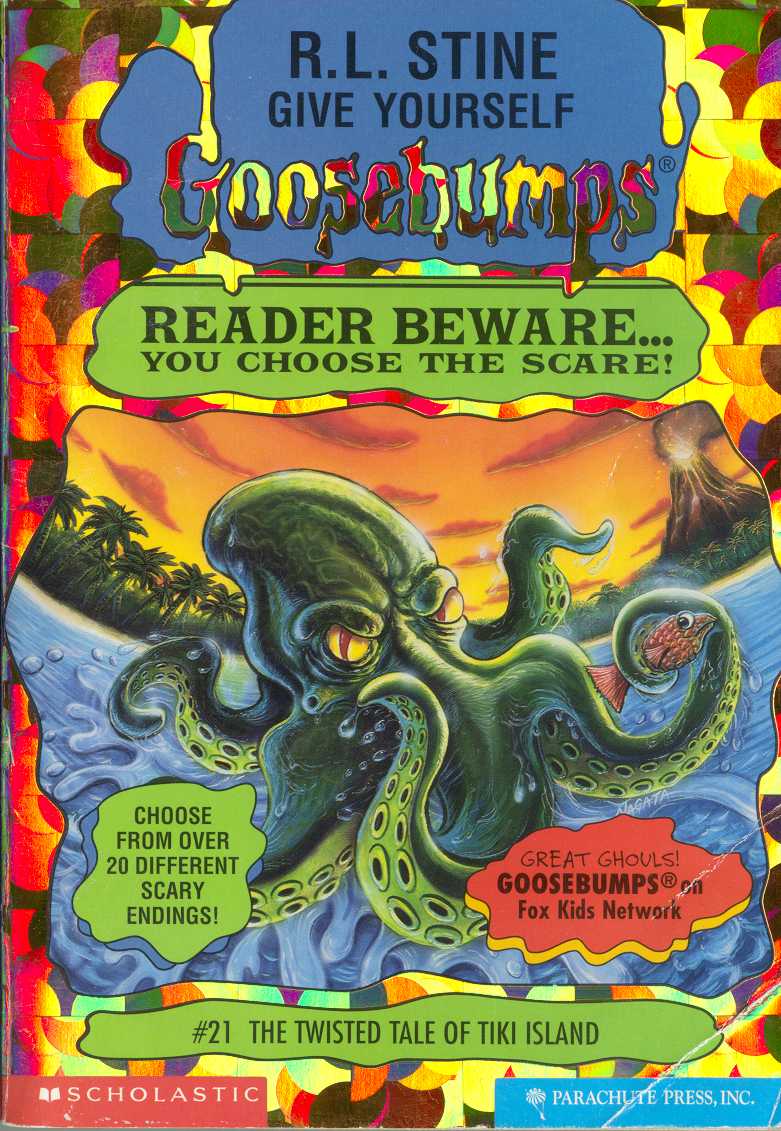 Yes, there isn’t much at all happening on the cover; and yes, I may sound hypocritical here since I mention that whenever things are just sort of there aren’t that exciting. But I like the design of the evil looking octopus (looking like it could legit kill you, and is thinking about it); I like the dark green of the animal at the forefront mixed with the warm sky colour and beautiful blue of the water; and I like the volcano in the distances amidst the trees. I also feel bad for the fish the octopus is holding. It knows it’s dinner.
14: Secret Agent Grandma
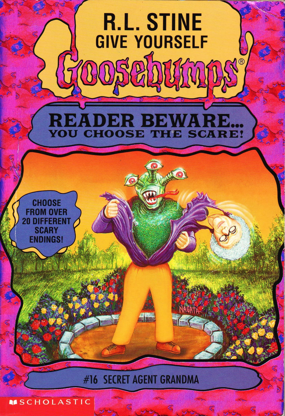 I had no idea where to rank this. Absolutely none. As a kid I hated this cover. Then enjoyed it for its ridiculousness. Then disliked it. Then went back to liking it for its ridiculousness. I couldn’t make up my mind about how I felt concerning it and now, a decade and a half later, here we are, back at the same damn problem. I think I’ve come to a point where I enjoy it for its ridiculousness. It’s an alien pulling off its old lady costume. Doesn’t that mean the Grandma is less a secret agent than an undercover alien? Yes, but who cares. This is just such an odd image that I’m still not sure if I’m ranking it properly. This alien also, at least, has a slightly more interesting design than the one from Zapped in Space.
13: Return to the Carnival of Horrors
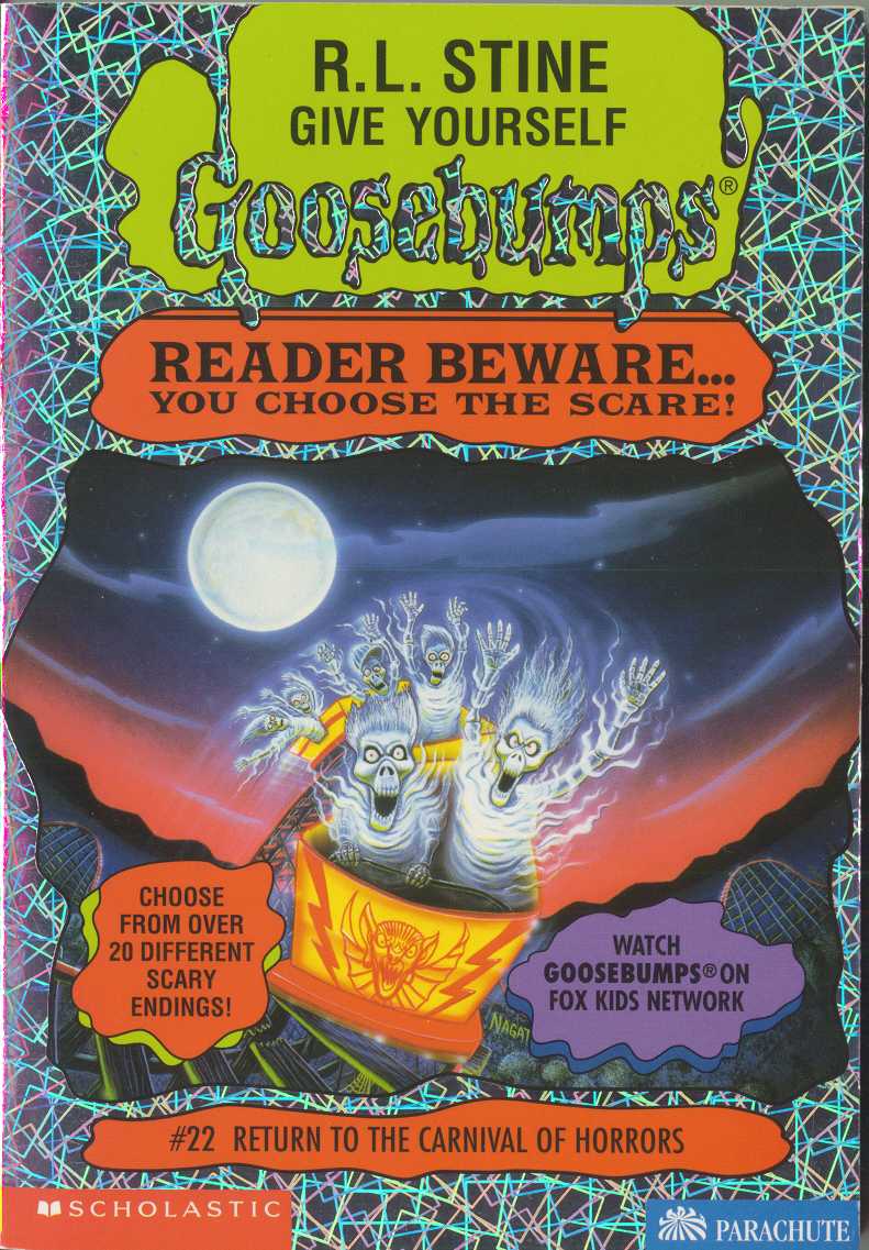 I like the idea behind this, but feel it would have been better had there been an actual alive person included in the front seat along with the ghosts. As it is, it’s a neat idea drawn well, even if some of the ghosts seem more goofy than creepy. I will say, I love the colours in the sky, the moon beautifully bright above the warm coloured sunset.
12: Tick Tock, You’re Dead!
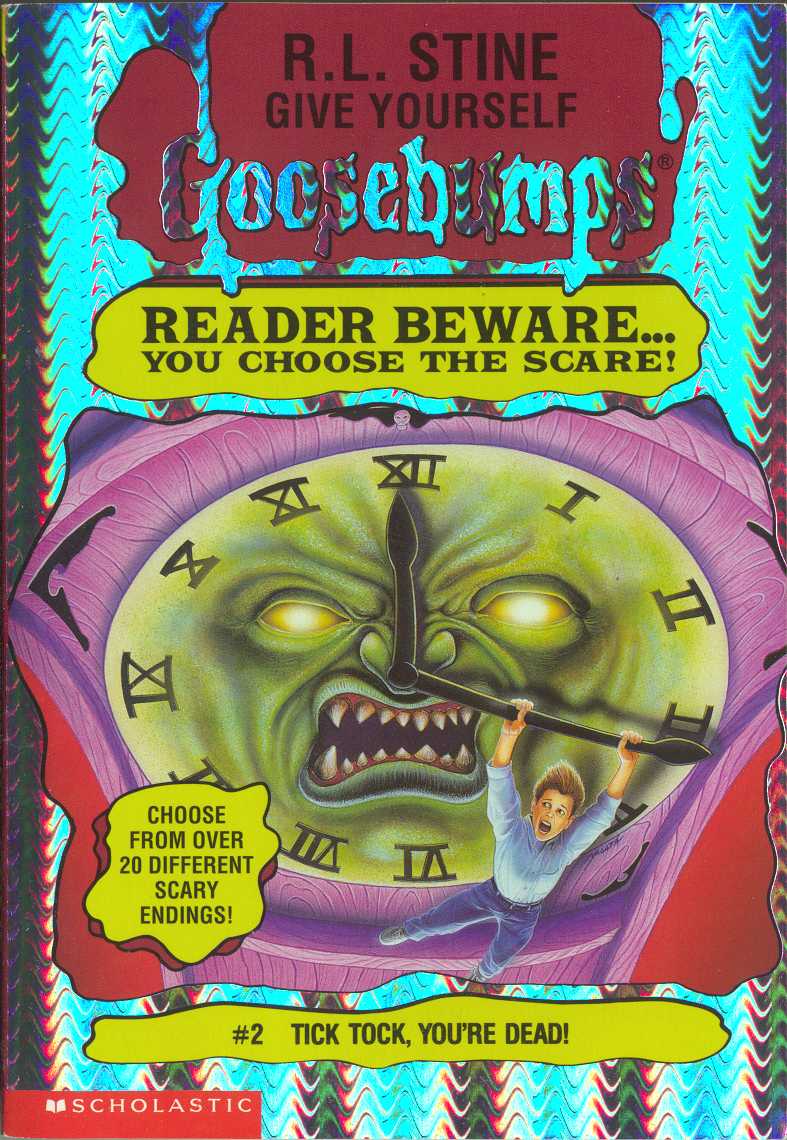 I have to give credit to Nagata for making a clock look threatening and angry. I like the idea of the character hanging onto its hand trying not to fall. It’s okay, though not necessarily as memorable as some of these covers tend to get.
11: Under the Magician’s Spell
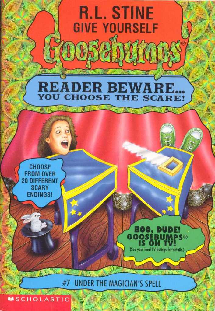 I had a tough time placing this one. Like most covers, it’s okay, but there’s not much else to say. I like that it has a bit going on, using the ‘cutting in half’ trick as its focal point. It’s almost too obvious, but hey, it works. I absolutely love the cute, real bunny in the corner; I like to think it’s looking up at the events confused and concerned. Like Tick Tock, You’re Dead, it’s okay, though nothing to really remember.
10: Night in Werewolf Woods
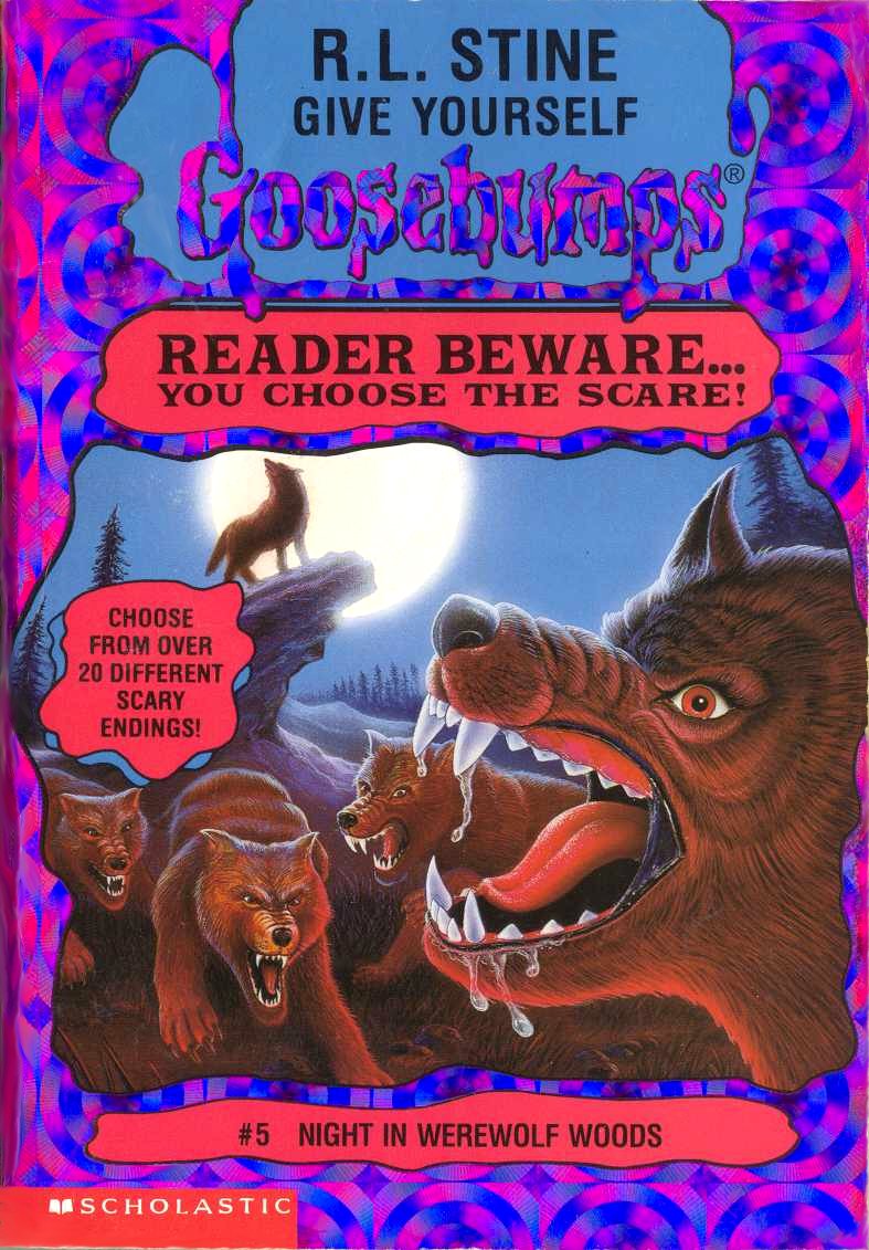 Simple? Yes. Do some of the wolves look kind of off? Yes. But this is a cover that works simply because it leans more into the ‘real-world’ fears than anything. The pack of wolves look vicious and angry, and the full moon and dark of the night makes you think of being lost in the woods with nothing to fight anything off with. So while simple, it works at being decently effective enough to rank as high as it does, even if it isn’t as memorable or worthwhile as others.
09: Escape from Camp Run-For-Your-Life
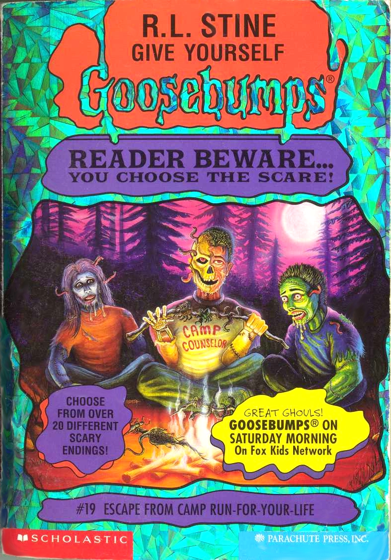 The purple of the sky mixed with the warmth of the foreground fire is great! While this cover goes for a more ‘horror’ approach than some of the other ones we have seen here so far, it’s odd how the two individuals seem so cartoon-y compared to the one in the middle. With the different coloured skin and odd expression on their face, they seem silly sitting next to the third. That’s where a lot of the reason for this covers high ranking comes from. The figure in the middle is unnerving, mostly because it still has a leg in the real world. There’s no different coloured skin, just a man with half of his face torn off, worms wriggling from his skull. The flesh of his face seem to be in a confused shock, possibly from the moment it was turn at, but the skull side seems so sinister; so threatening. That face in the middle almost distracts you from realizing the fact that the man is mixing the flesh and meat from one hand and his other is stitched up.
08: Attack of the Beastly Babysitter
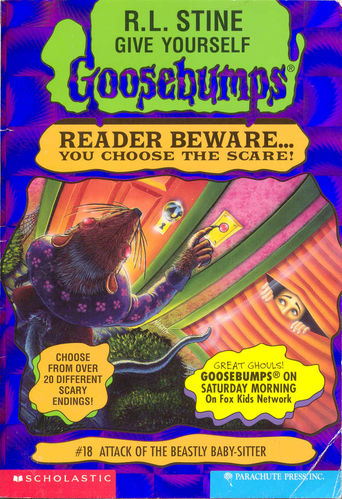 Okay, bear me with here; this cover is absolutely ridiculous. Hilariously kind of ridiculous. But it’s so ridiculous that it swings around and makes it enjoyable to me. What I love in particular about it is that it really does remind me of Goosebumps. Unless you’ve read them recently, you do not know how many times the main characters from these books mistake something normal for being some kind of otherworldly, life threatening thing in between chapters. And this is exactly what that feels like. “I looked out the window and my babysitter was a giant RAT! Except, no, she’s just wearing a furry coat.” I get such a kick out of it, it makes me laugh.
07: Toy Terror: Batteries Included
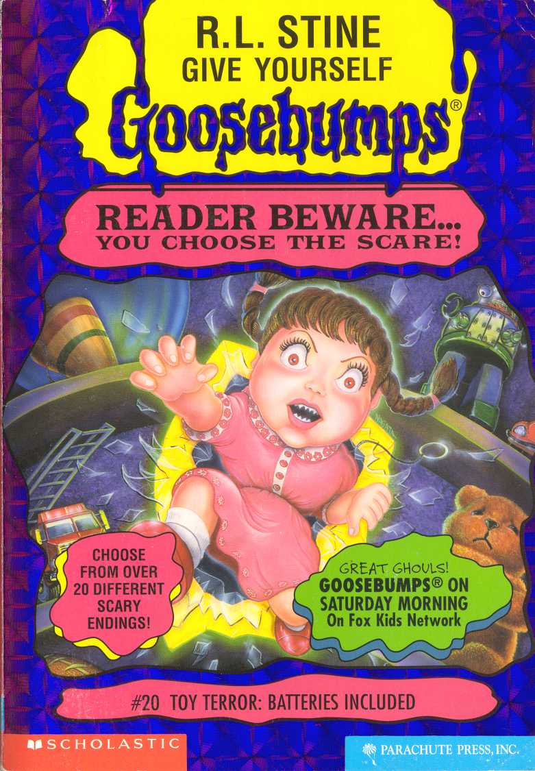 *sigh* I’m a sucker for evil dolls, especially evil dolls that wouldn’t seem really threatening normally. That’s one thing I hate in a lot of doll-oriented horror films; the doll always looks evil before it starts acting evil. They’re dolls that make you question if the parents hate their kid and decided to haunt them with a gift. So kudos on making it seem like, if the doll weren’t bursting from its case, it would look relatively normal. Extra points for the small touches of the pull-string and sharp teeth. This one actually was originally ranked lower but the more I looked at it the more it grew on me.
06: Welcome to the Wicked Wax Museum
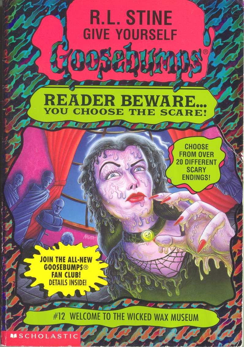 This is the turning point for the level of covers, as I had a hard time ranking things from this point forward. So as much as I talked about how many covers were ‘okay’, on my re-visit for this, I did end up genuinely really loving quite more than I thought I would coming into it.
I love the design of the character coming at you, kind of giving me some Vampira vibes in her look; I like her hand in the foreground, giving us a focus on her nails; the choice of lightening in the back; and I also really like the various mix of colours here. I also like the added touch of her melting, though I’m not sure why her clothes are melting.
05: Deep in the Jungle of Doom
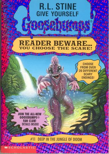 As straightforward and obvious as it may be, I still like the design of the fish-man. I love the colour of it and the sun glistening of its scales and water on it, adding into the all-around vibrant colours on the cover. While, like the design, the idea of it walking towards you is pretty straightforward and obvious, it still works here. It’s an example of how a simple, obvious idea for a cover can be done well enough to be one of the best of the set.
04: Little Comic Shop of Horrors
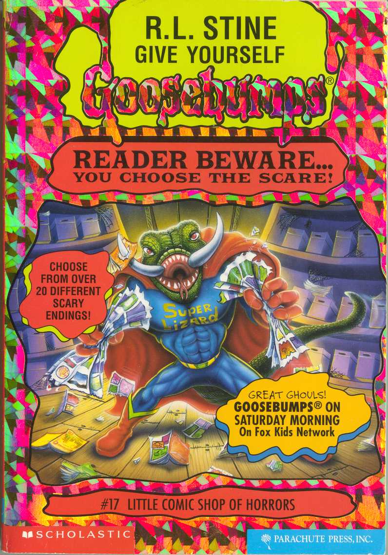 I love this cover, I really do. While I enjoy the cheekiness of the design of the Super Lizard (the comic impaled on its tusk is a neat touch), and it may be considered simple and unexciting, I really like it for the fact that it feels like it could go hand in hand with the original series’ Attack of the Mutant. I totally see this creature living in the same universe as that one. That reason may not seem like enough to rank something like this so high, this cover, above all, makes this book seem fun. It’s one that works perfectly with its title.
03: The Knight in Screaming Armor
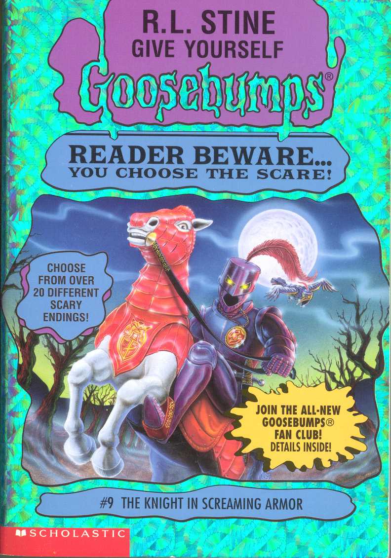 This cover is ridiculous, but it’s a great ridiculous. I love the colours; I love the use of fog working hand in hand with the dead trees and night sky to create atmosphere; I love the way the armor of the knight is made to look evil, with its glowing eyes; and the metal bird behind it deserves a mention just because it’s easy to miss. I can’t help but like it, making me feel like I am in for a ridiculous Goosebumps journey.
02: Scream of the Evil Genie
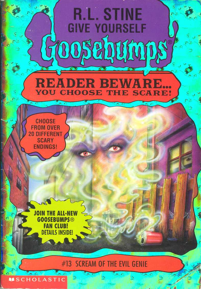 It’s simple, and the use of a pop can doesn’t really fit the tone of the piece, but I still adore the design and look of the genie floating out into the alley. Like usual, the use of colours is really great, particularly the deep red eyes glaring at you from the purple around it. It’s another cover where its simplicity works in its favour, as the design is still effective and well done.
01: The Curse of the Creeping Coffin
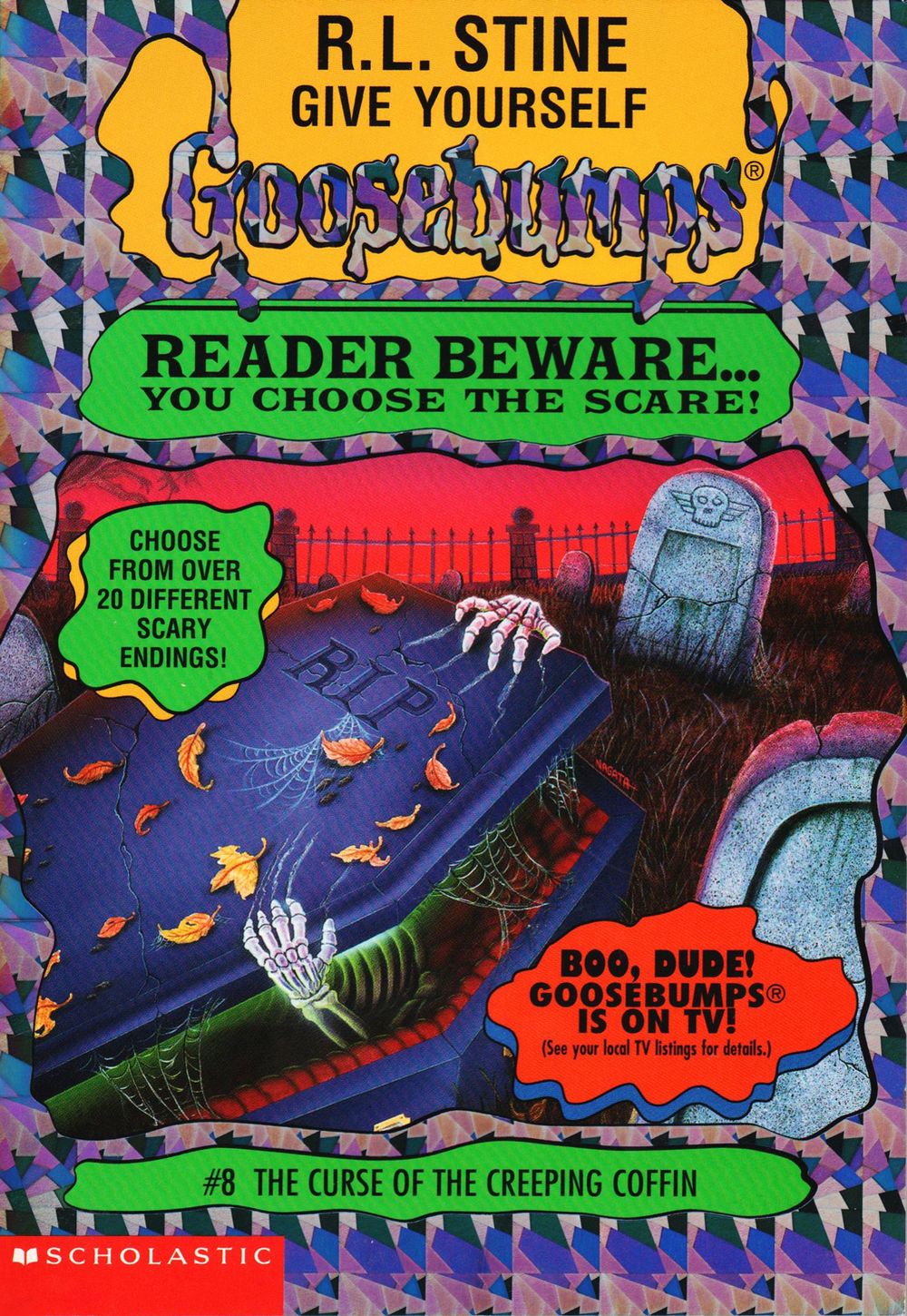 This cover, like the handful above it, just feels like Goosebumps. The red of the sky in the background; the glowing green light from within, the skeleton emerging without seeing much; one of its hands clawing into the stone lid; the beautiful touch of detail that is the fall leaves on the blue… it all just works. This one, like Scream of the Evil Genie, could have been used for any other Goosebumps book, and I think that’s the highest compliment I can give it.


January 02, 2014 at 07:39 am /
Lorem ipsum dolor sit amet, consectetuer adipiscing elit. Phasellus hendrerit. Pellentesque aliquet nibh nec urna. In nisi neque, aliquet vel, dapibus id, mattis vel, nisi. Sed pretium, ligula sollicitudin laoreet viverra, tortor libero sodales leo, eget blandit nunc tortor eu nibh. Nullam mollis. Ut justo.
January 18, 2014 at 13:29 am /
Hi There,
Donec nec justo eget felis facilisis fermentum. Aliquam porttitor mauris sit amet orci. Aenean dignissim pellentesque felis.
January 22, 2014 at 03:19 am /
Lorem ipsum dolor sit amet, consectetuer adipiscing elit. Phasellus hendrerit. Pellentesque aliquet nibh nec urna. In nisi neque, aliquet vel, dapibus id, mattis vel, nisi. Sed pretium, ligula sollicitudin laoreet viverra, tortor libero sodales leo, eget blandit nunc tortor eu nibh. Nullam mollis. Ut justo.