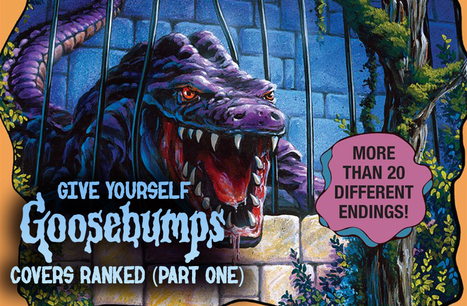
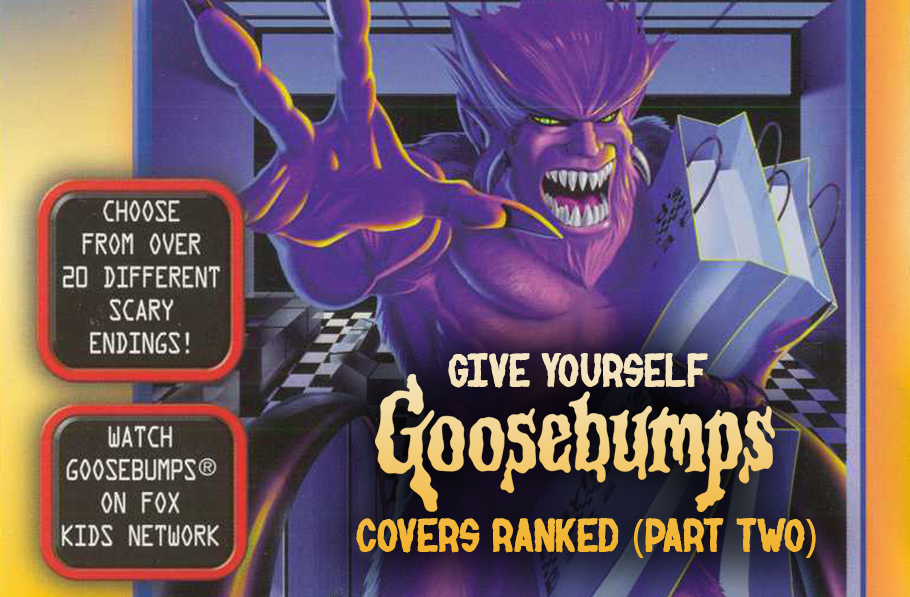
To be completely honest, I really didn’t want to write about ‘Series 2000’ for… ever. I mean, I knew I would get to it eventually, but I thought I’d probably put it off for a while, at least longer than 13 months and yet here we are. It could be worse. I could be covering the books themselves. I will down the line but this is enough for now. Yeah, in case I’ve been too subtle, I’m not the biggest fan of ‘Series 2000’, even when it came out originally. I’m not exactly sure why. I think the fact that it tried to be more serious in its horror made it lose a lot of the charm that people fell in love with that original 62 run. Plus, as cheesy as the original series can get, it still had some genuinely creepy moments within some of its entries. Looking back at it, I wish we got Goosebumps Gold instead. I really like the two art pieces that we were shown as having been completed before the series was cancelled. I think that sums up what a major problem you will see diving into the list here. The art is once again made by Tim Jacobus, but working off the content of some of the books… man… I don’t even really know what happened here. I remember really not being a fan of the art of this run but, revisiting it, it’s all just so uninteresting. And yet, it’s not all a loss. I ended up feeling kinder towards a lot more covers than I thought I would, even going so far as to say that the top four or five are ones I would easily admit to loving. But still, a vast majority of them still feel as though they are just… there. Nothing that would really be considered awful, just unmemorable. It makes me sad to say that as Jacobus’ work is still really good here, but there’s only so much you can do with what you are given, especially when the aim is to be more series than before. It makes it worse for me considering this turned out to be the real last work that Jacobus did for the series, besides the inaugural Choose Your Own Adventure book (which I will do, too. Maybe sooner to cheer me up) along with a few other side Goosebumps projects.
So here we go, let’s rank the covers of all 25 of the Goosebumps 2000 series!
25: Slappy’s Nightmare
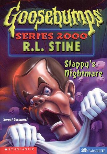 The major problem with this cover is simply the fact of it being a case of taking the title literally making it ridiculous. Slappy in bed gripping the sheets, being horrified. The look on Slappy’s face alone is ridiculous, just feels weird to me for some reason. At least the sheep on the sheets have a bit of tongue in cheek quality to it. Like so many of these covers end up, it’s not necessarily awful, mostly thanks to Jacobus’ talent, but it has no long-term impact or memorability.
24: Earth Geeks Must Go!
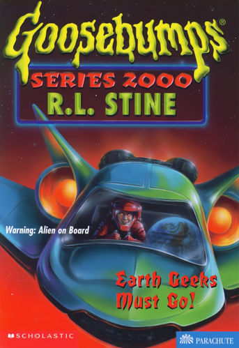 This is a scenario where I feel like Jacobus looked at the title and, after a few minutes of silence, went “what.” Even then, you have to give it to him in that, as little as there is to work with, he did what he could. I like the choice of the red suit and demonic eyes; I like the reflection of Earth; and the colours are very warm and vibrant, even if there isn’t anything that really strikes out about it.
23: The Mummy Walks
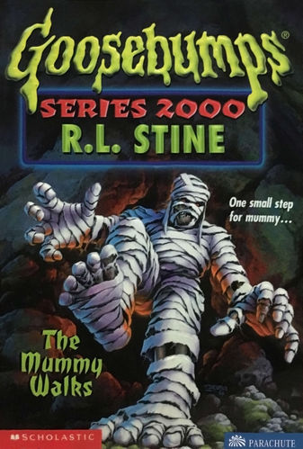 I wouldn’t be really shocked if some people are surprised that this, and some of the other covers coming up, aren’t closer to the bottom of the list than they actually are, based purely on the fact that there isn’t much going on at all. It mostly all just boils down to personal preference, as I really just don’t like the previous two entries here. But The Mummy Walks has a few things going for it. I like the pieces of visible, decomposed body; I like the small semblance of eyes you can make out; I like how it tries to make the mummy seem threatening. I even like the unexplained orange glow of light coming from the cave behind him. Seriously, where is it coming from?
22: Scream School
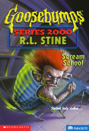 I believe this one hinges mostly on your thoughts on the design of the focal character here. Personally, I am not. I’m not 100% sure why, I can’t put it into words, it just hasn’t ever really caught me as a catching design. But there are catching things here. The use of the orange for the hair is striking, especially against the cooler colours, along with the light coming across his back. I also really like the fact that he’s drawing a skull on his paper (a really damn good one, if I may say so). Though with all that, I’m not sure what the perspective is supposed to be. I think it’s supposed to be unsettling, with the way it feels like it curves, but it leaves me more confused.
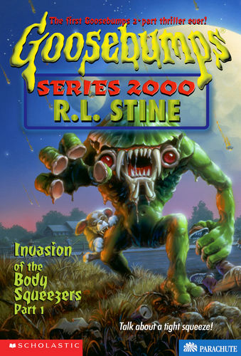
21: Invasion of the Body Snatchers Pt. 2
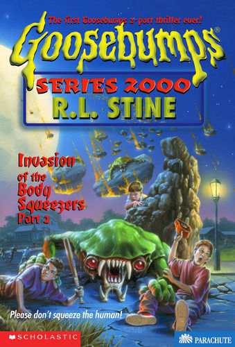 This was originally ranked a bit higher, but the more I thought about it, the more I realized that I had a few issues with it. The big saving grace of this cover is the alien. I really like its design, as well as the fire and the meteorites coming in from the sky. Unfortunately, that’s where it ended with me, and even more unfortunately, this is a continuation, so we already saw the alien design on the cover of ‘Part 1’. What really made it drop for me, though, was that kid on the right. That stupid kid and his stupid face. It just gets to me. I think I know what was supposed to be going on (him being… controlled? Hurt? Overpowered?), but I just can’t get past that face. It annoys me so much that for the longest time I missed the fact that the kid on the right looks pretty calm considering he’s possibly very close to death.
That damn kid…
This was originally ranked a bit higher, but the more I thought about it, the more I realized that I had a few issues with it. The big saving grace of this cover is the alien. I really like its design, as well as the fire and the meteorites coming in from the sky. Unfortunately, that’s where it ended with me, and even more unfortunately, this is a continuation, so we already saw the alien design on the cover of ‘Part 1’. What really made it drop for me, though, was that kid on the right. That stupid kid and his stupid face. It just gets to me. I think I know what was supposed to be going on (him being… controlled? Hurt? Overpowered?), but I just can’t get past that face. It annoys me so much that for the longest time I missed the fact that the kid on the right looks pretty calm considering he’s possibly very close to death.
That damn kid…
20: Fright Camp
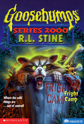 Yup. This is another one that I wouldn’t be surprised would rank lower on other people’s list but it just kind of got bumped up a spot or two as I realized I had more problems with some other covers, and then it just kind of grew on me. As always, the use of colours are great, especially that blast of almost glowing green coming from behind the raccoon. Plus, I’m a sucker for animals that are made to seem incredibly dangerous on these covers. It’s an easy choice to go with, but it works because Jacobus’ is able to make you think about that thing leaping out at you while retaining a charming, tongue-in-cheek quality to it.
Also, bonus point for the fact that the title is written on the side of the trashcan. That’s a nice touch. Still, even with all those points towards it, it’s still a pretty straightforward cover.
Yup. This is another one that I wouldn’t be surprised would rank lower on other people’s list but it just kind of got bumped up a spot or two as I realized I had more problems with some other covers, and then it just kind of grew on me. As always, the use of colours are great, especially that blast of almost glowing green coming from behind the raccoon. Plus, I’m a sucker for animals that are made to seem incredibly dangerous on these covers. It’s an easy choice to go with, but it works because Jacobus’ is able to make you think about that thing leaping out at you while retaining a charming, tongue-in-cheek quality to it.
Also, bonus point for the fact that the title is written on the side of the trashcan. That’s a nice touch. Still, even with all those points towards it, it’s still a pretty straightforward cover.
19: The Haunted Car
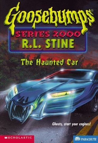 Hey, another cover that actually moved up the list a spot or two. This was one of those covers that I actually remembered for the series, one of maybe a handful. I remembered it feeling kind of ridiculous, and I felt that same way towards it while initially working out this list. But the more and more I looked at it and passed it by and actually gave it attention, it kind of grew on me. The big reason I thought about this as being possibly lower was because, well, for a haunted car, it’s what you’d expect. What made it bump up a spot or two was the details. Not just the details of the colour or the shimmer of the metal, but the fact that the demonic aspect of the car seems to be very snakelike, with the slit iris, the fangs and ‘nostrils’. It’s giving that extra push to a concept that’s been done plenty of times before.
18: Bride of the Living Dummy
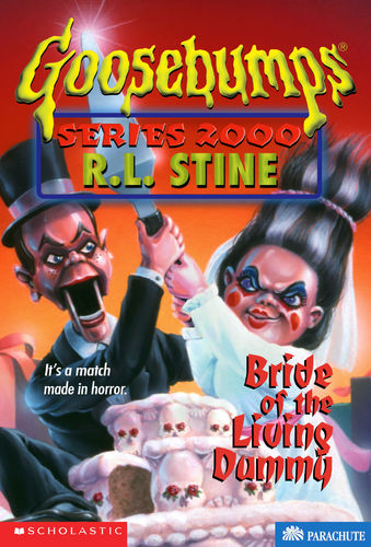 There isn’t much going on in the upper third of the cover, but there is still plenty to enjoy in the details here. I like the Bride of Frankenstein hair on Mary-Ellen, which comes directly from the book, and the fact the she seems so much more malicious than Slappy. She genuinely looks like she would kill you. I also get a kick out of the skulls on the cake.
17: Be Afraid-Be Very Afraid!
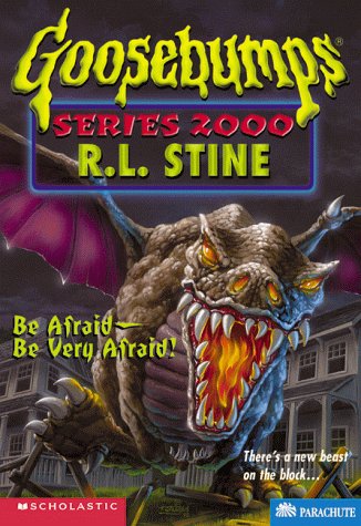 Dragons are always neat, even if you may feel like certain designs aren’t too original. That’s the case here, but the colours of the dragon’s wings, eyes, nostrils and mouth work well against the more washed out background. An easy cover that may fall victim more towards being unmemorable or boring. It’s passable, mostly because of Jacobus’ usually great work and detail. It’s not awful or amazing, but also not one that really sticks out among the crowd.
16: Revenge R Us
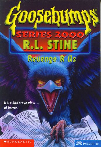 This is a very simple cover, but like I mentioned with Fright Camp, I am a sucker for ‘evil animals that can/will attack’. There isn’t much I honestly have to say, I just love the crow, and its colours, that much. And this is another cover that incorporates the title of the book into its art.
15: Return to HorrorLand
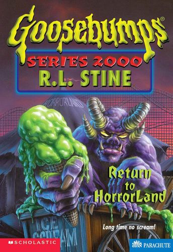 Yes, this has the great use of colour, both in the ominous background purple and striking green of the ice cream, but it’s the design of the Horror here that is the most obvious focal point, and it works. For what touted to be an update to the series for a new time/age, with more serious emphasis on the scares, the newly reworked version of the Horror monster here works well. The neatest touch here is the glow across the horns that are coming from its yellow eyes.
14: Jekyll and Heidi
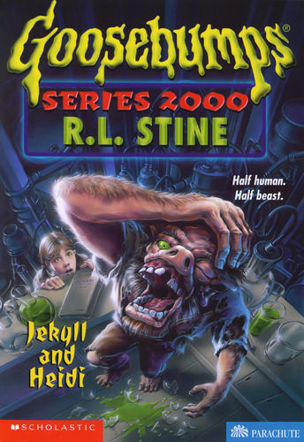 For some reason, this design always makes me think of the Hunchback. Huh. Anyways, I like the horrific-ness of the design, along with the creature putting its hand across its forehead. It may seem comical at first but it becomes more obvious. You can almost hear a scream of anguish coming with it. I like the addition of the girl, shocked at what she sees, but also possibly putting her in danger in the reader’s eyes. The colours here also make it feels very much like a basement laboratory, conveying a very specific feeling that would be acquainted to it; cold and artificial.
13: Creature Teacher
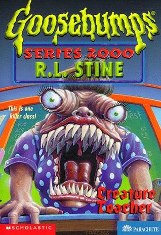 This is probably the one cover that people remember the most, and for good reason. Though there isn’t as much of a set mood or atmosphere through the use of colours or lighting, it’s the striking design of the Creature Teacher herself that really made it stand out to people, with those rows and rows of teeth and her eyes staring you down. It’s incredibly simple, but a memorable design gets you very far.
12: Werewolf in the Living Room
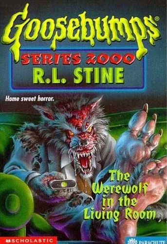 The fact that the werewolf has a remote and is watching TV is silly, yes, but it ends up this high for one reason that may be just as silly as that; I like the design of the werewolf that much. Werewolves are a dime a dozen, but the small detail here of making it look as though it is missing hair on its body due to, possibly, some sort of injury, is great. It looks diseased and beaten and angry from its experiences, giving it that extra something that a regular werewolf would be missing.
11: Cry of the Cat
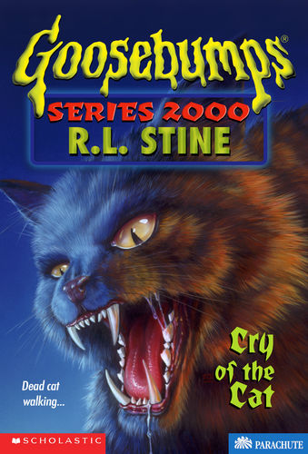 Is this just a cover with a cat? Yes. Is there nothing much going on with it? Yes. Is there more that could have been done with it? Possibly, but the fact of the matter is that, after all these years of this being one of the few covers I actively remember, I still feel the exact same towards it as I did so long ago…
This cat looks like it can single-handedly beat the ever loving crap out of you. There is a simple but effective ferocity to it. This cat will eat your face. And probably the rest of you too.
Is this just a cover with a cat? Yes. Is there nothing much going on with it? Yes. Is there more that could have been done with it? Possibly, but the fact of the matter is that, after all these years of this being one of the few covers I actively remember, I still feel the exact same towards it as I did so long ago…
This cat looks like it can single-handedly beat the ever loving crap out of you. There is a simple but effective ferocity to it. This cat will eat your face. And probably the rest of you too.
10: Invasion of the Body Snatchers Pt. 1
 Speaking of design, I really like the design of the Body Snatchers here. They’re aliens but could also understandably pass as some sort of mutated plant monsters. The fact that they’re coming at us and reaching out make it striking, even if the dog biting its leg may seem a bit comedic. The scene being awash with moonlight is great, too, as well as the soft glow above the trees. I’m also a bigger fan of the meteors with aliens coming down farther in the background.
Now, I know that this cover pairs up with Pt. 2 to make one whole image. This is what leads to the mildly annoyed boy on the left on the second cover, as this alien is the one grabbing him. That makes this cover lose a bit of its power, as the halfway-off-the-cover body is enough to really push the danger of these aliens, since we don’t know if that body is alive or dead. As a standalone, this one works better than the second, and it’s the better half of the two.
It also doesn’t have that stupid kid… that damn kid.
Speaking of design, I really like the design of the Body Snatchers here. They’re aliens but could also understandably pass as some sort of mutated plant monsters. The fact that they’re coming at us and reaching out make it striking, even if the dog biting its leg may seem a bit comedic. The scene being awash with moonlight is great, too, as well as the soft glow above the trees. I’m also a bigger fan of the meteors with aliens coming down farther in the background.
Now, I know that this cover pairs up with Pt. 2 to make one whole image. This is what leads to the mildly annoyed boy on the left on the second cover, as this alien is the one grabbing him. That makes this cover lose a bit of its power, as the halfway-off-the-cover body is enough to really push the danger of these aliens, since we don’t know if that body is alive or dead. As a standalone, this one works better than the second, and it’s the better half of the two.
It also doesn’t have that stupid kid… that damn kid.
09: Are You Terrified Yet?
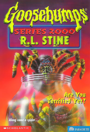 There may be something you might have realized by now, which is that there isn’t a whole lot going on in some of the backgrounds of these covers. That’s the case here, but at least we get something appealing enough to not completely distract you. Spiders are always a good idea to go with, especially in a book with this title, and the look of the spider here is great. The hair, the colours, the eyes, the green… saliva or venom? It all comes together well, if obvious. It’s enough to make anyone who dislikes the little ones be creeped out, and the jar full of them would probably push that over the edge.
08: Headless Halloween
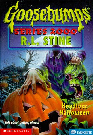 The way the elements mix and blend together are great; the purple shirt, pumpkin, bright green head, the skin of the hands and the soft blue of the sky really capturing the essence of a cool, Halloween night. There’s a lot going on here, and it’s a good example of many intriguing elements that aren’t really striking out at you, instead feeling more subtle in its execution.
07: Brain Juice
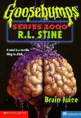 This one is a great example of how an image with little happening (in terms of background activity) doesn’t always hurt. This art is simple, but the level of detail in the brain and the contrast of it with the purple liquid being poured on it against the black background is visually striking and unsettling. A simple idea can have incredible staying power with its execution.
06: Full Moon Fever
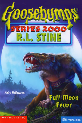 With that title, you may think this is about werewolves. Surprisingly, it isn’t! The book revolves more-so around unspecified beasts, which I only touch on to kind of draw that line. I love the blocking of this cover, with the pose in which the character sits (and snarls) more interesting than if they were just sitting or standing there, not to mention the fact that they are positioned to be in the middle of the moon.
The pose lends towards my thought that this is a mid-transformation shot, given the way the chest looks more normal than beastly. The colours may be cooler all around, but it’s the best choice for this cover, with the woods in the background making it seem as though this person may have ran off into the countryside to keep others safe.
With that title, you may think this is about werewolves. Surprisingly, it isn’t! The book revolves more-so around unspecified beasts, which I only touch on to kind of draw that line. I love the blocking of this cover, with the pose in which the character sits (and snarls) more interesting than if they were just sitting or standing there, not to mention the fact that they are positioned to be in the middle of the moon.
The pose lends towards my thought that this is a mid-transformation shot, given the way the chest looks more normal than beastly. The colours may be cooler all around, but it’s the best choice for this cover, with the woods in the background making it seem as though this person may have ran off into the countryside to keep others safe.
05: Attack of the Graveyard Ghouls
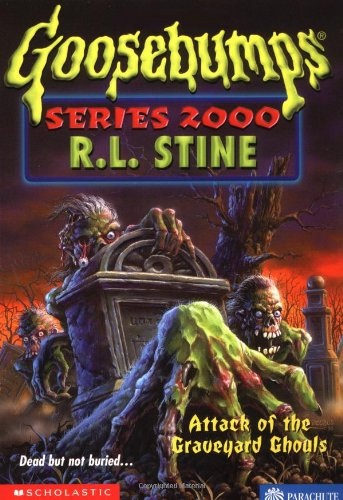 The green of the ghouls’ skin against the warm colours of the background. The details of the bodies falling apart, with that fantastic design of the hand in the foreground missing skin and revealing bone. The one in the background is losing its eye and brains while the other has a dead eye and more of a shot of its missing nose. It reminds me of the ‘You Can’t Scare Me’ cover from the original series. While that one could work as a poster for a 50’s-esque B-movie, this is a cover that looks as though it would work great as a poster for a late 70’s/early 80’s Italian zombie film. It’s just great, moody fun with creepy, horror-ific detal.
04: Ghost in the Mirror
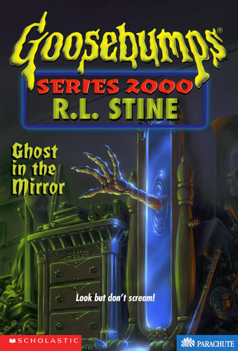 A lot of what I like about Jacobus’ artwork is that the stuff I really like, I really, really like. There are so many covers he’s done that would work as great posters. That’s the way I felt about Attack of the Graveyard Ghouls, that’s the way I feel here and, spoilers, that’s the way I feel about the next three as well.
Ghost in the Mirror is a fantastic simple but memorable idea. The creepy, almost demonic hand coming out of the mirror would be great enough, but the slight transparency of it closer to the mirror gives a wonderful sense of the being coming out of its own world through this mirror-based gateway, almost as if it takes a few seconds to fully become real in our world. The colour of the mirror is relaxing, while the clashing green light against it makes the entire situation unnerving. I also like the small detail of the hand only having four fingers. It’s a great cover that reminds me of something like The Gate, or even Demons.
Also, the person this room belongs to really needs to tidy up.
A lot of what I like about Jacobus’ artwork is that the stuff I really like, I really, really like. There are so many covers he’s done that would work as great posters. That’s the way I felt about Attack of the Graveyard Ghouls, that’s the way I feel here and, spoilers, that’s the way I feel about the next three as well.
Ghost in the Mirror is a fantastic simple but memorable idea. The creepy, almost demonic hand coming out of the mirror would be great enough, but the slight transparency of it closer to the mirror gives a wonderful sense of the being coming out of its own world through this mirror-based gateway, almost as if it takes a few seconds to fully become real in our world. The colour of the mirror is relaxing, while the clashing green light against it makes the entire situation unnerving. I also like the small detail of the hand only having four fingers. It’s a great cover that reminds me of something like The Gate, or even Demons.
Also, the person this room belongs to really needs to tidy up.
03: Horrors of the Black Ring
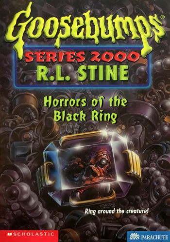 The shimmer of the ring and the gold on black of the jewel, and the background detail, really pops, but this cover is all about the face in the ring. Whatever it is is terrifying and unnerving, staring out at you, undoubtedly waiting to get out. It’s a genuinely creepy cover that is a great idea pulled from the title.
02: I Am Your Evil Twin
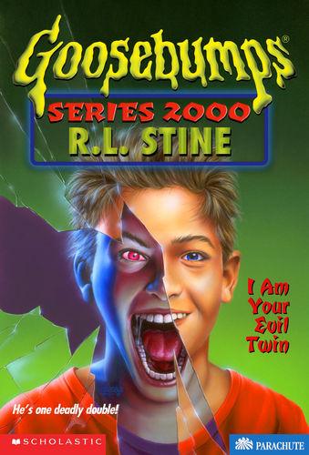 I love this cover, I do. The motif of a mirror cracking and good/evil personas has been done a ton, but it works so well here. The use of the colours is magnificent, as well as the difference in the way the characters are portrayed. It would have been easy to make the evil version of the character simply smirk or be given enough detail to be designated the ‘evil one’, but Jacobus really gives the piece energy with the maniacally screaming evil twin. I find it endlessly charming; a perfect, simple idea executed to its fullest extent.
01: Return to Ghost Camp
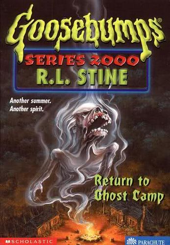 The greatest compliment I can give this cover is that I want to write about it the same way I did my #1 on the Original Series Best Cover list.
Just look at it. The colours, the detail, the absolutely unnerving horror aspect, it all works in every way. If this was a cover where the ghost from the campfire was just a normal, human ghost, it wouldn’t have gotten the number one (though it still would have probably been pretty close), but the simple decision to have the spirit look like that is one that really makes this cover stand out. The cabin at the bottom being joined by a complete cover full of trees works in making this feel really isolated. There is a creepy, unsettling vibe here, as though these people aren’t safe, yet the cover is also incredibly intriguing. This falls into the category of being the kind of cover that would definitely work as a horror film poster. It is so great.
The greatest compliment I can give this cover is that I want to write about it the same way I did my #1 on the Original Series Best Cover list.
Just look at it. The colours, the detail, the absolutely unnerving horror aspect, it all works in every way. If this was a cover where the ghost from the campfire was just a normal, human ghost, it wouldn’t have gotten the number one (though it still would have probably been pretty close), but the simple decision to have the spirit look like that is one that really makes this cover stand out. The cabin at the bottom being joined by a complete cover full of trees works in making this feel really isolated. There is a creepy, unsettling vibe here, as though these people aren’t safe, yet the cover is also incredibly intriguing. This falls into the category of being the kind of cover that would definitely work as a horror film poster. It is so great.