Over a year ago we explored a handful of horror posters we loved (which you can read here). Needless to say, it was harder to write than I thought. I knew that I would have follow ups of the list but it was still hard to figure out which ten posters I would choose for that inaugural list. There are just so many horror posters to love, and though it's taken longer to get back to it than I thought it would, let's take a look at ten more random posters that we do.
10: The Howling (1981)
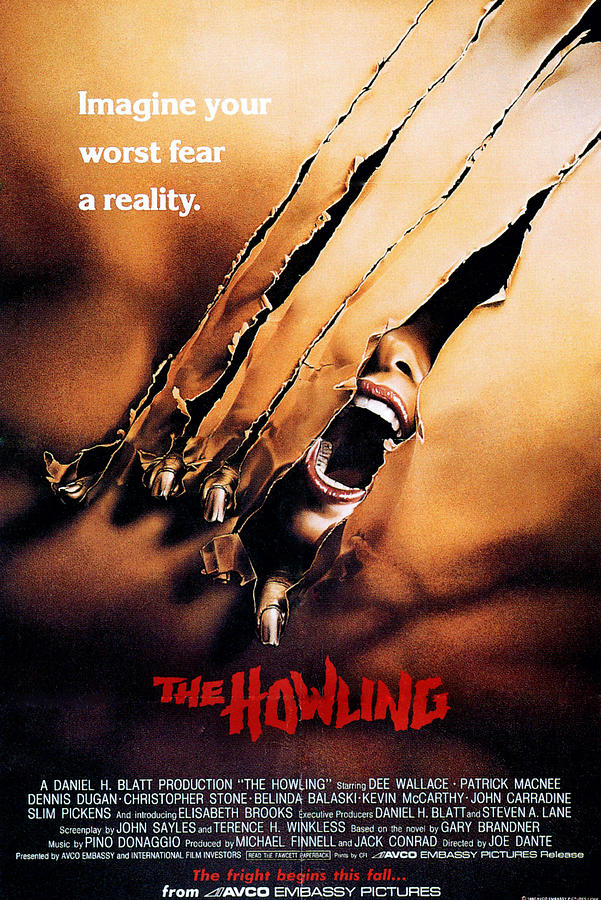
Starting us off is a film that has an anniversary coming up on April 10th, The Howling still stands as one of the best werewolf films ever made, a classic deserving of its status. The poster is a great example of a simple idea that is executed well and immediately pulls you in. The simple sheet, the woman's face (with her slightly muted red lipstick mixing well with the title to break up the brown tone), and the obvious 'monster' fingers visciously ripping through the sheet itself. Is the woman transforming and she's screaming in agony? Is something in the middle of attacking her and that's what's clawing it's way through? It's fantastic in how it captures your attention.
And that's not even mentioning the beautiful detail in the tears of the sheet.
09: Creepshow (1982)
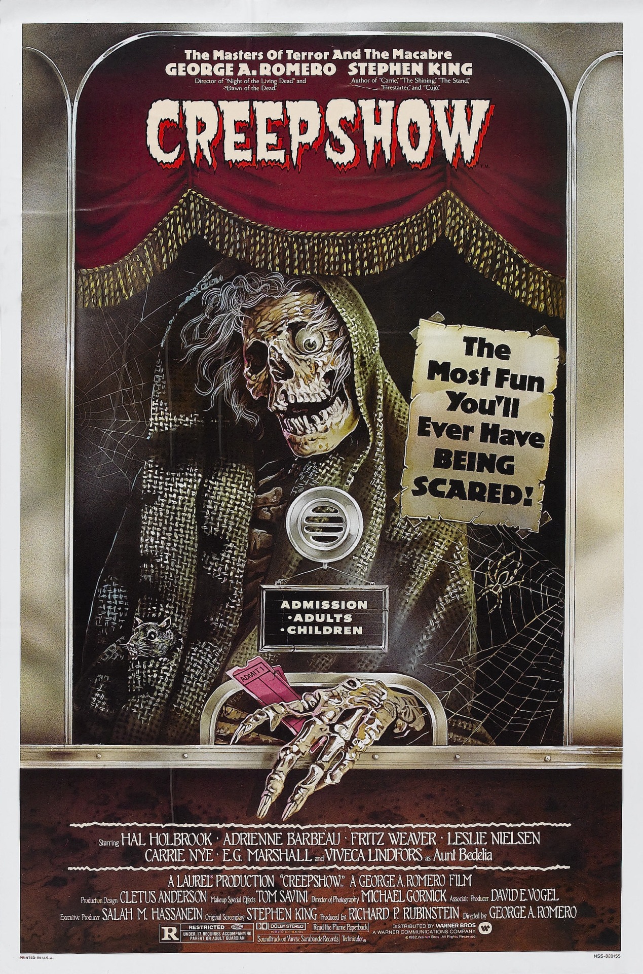
God, I love me some Creepshow. It's just such a great way to spend a night. Get some friends, some snacks, and have a great, fun time; a great, fun time that is perfectly encapsulated in this poster.
I mean, the tagline is 'The Most Fun You'll Ever Have BEING SCARED!' From the use of the theater theme and the great design of the ticket-selling ghoul, you just know what you're getting yourself into. Is that all there is to it? Of course not. The colours used for the curtain and sheet over the ghoul are great, feeling warm and somewhat inviting, and the design of the ghoul itself is exceptional. It has all the elements of being creepy, but its presented in such a tongue-in-cheek way that it can't help but make you smile. And honestly, I think that's what I like about the poster the most. It's been used for the DVD cover (which we need a new release of with awesome features *cough cough*) and whenever I see it I can't help but be in a good mood, and that alone makes it a success.
08: Fright Night (1985)
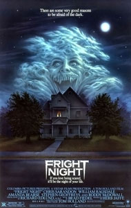
Cutting to the chase, the cloud design is very obviously why this poster is so, so great. The colours of the piece are warm and soft and the overall idea for the entire work is simple. A normal house with an evil, vampire cloud over top. But damn, that cloud is fantastic. It reminds me a lot of the Creepshow poster. The vampire face in the cloud gives you a very good indication of what you're into. It lets you know what the threat of the film is, but it doesn't necessarily present it as menacing. Like the ghoul in the Creepshow poster, it has a very tongue-in-cheek feel to it that represents the overall horror-comedy tone of Fright Night perfectly.
07: Alice, Sweet Alice (1976)
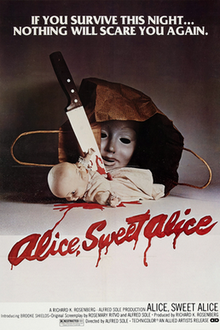
I think it's safe to say that I have an affinity for simplistic designs. It mostly comes from the fact that simple designs are sometimes really hard to get perfect, especially ones that do a really good job capturing the feel of your film.
Though Alice, Sweet Alice has a simple look to it, it also does a fantastic job in including multiple things that are pretty much great horror fodder. Creepy mask that is unsettling? Check. Doll? Check. Blood coming from places there shouldn't be blood coming from? Check. The mask being hidden in a bag is an added plus, creating a sort of mystery to the entire piece while adding a layer of horror to it, like you stumbled upon something you weren't supposed to. The red and the brown, even the black of the knife handle, do a good job breaking up the white that dominates the piece, and the blood from the doll leaking down and writing out the title is a great added touch.
06: Garden of the Dead (1972)
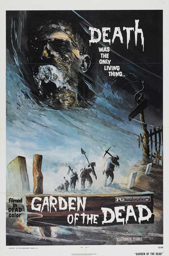
Garden of the Dead is one that does a phenomenal job in sucking you into its world and atmosphere, at least the one presented on the poster. The muted blues and browns and the obvious paintbrushes give the piece a classy look that immediately fills you with a sense of dread in the best possible way. The characters at the bottom adding to the mystery and intrigue. Are they dead? Some sort of zombies with pickaxes and shovels? It's legitimately a great piece of art that does a lot in pulling you into its world. The world of the poster, at least.
Unfortunately this is undone by the cheesy-ness of the 'filmed in DEAD color' to the left of the title. So prominent. So, so noticeable and so, so unfortunate.
05: The Legend of Boggy Creek (1972)
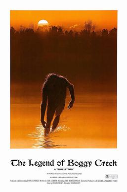
Simplicity! Mood and atmosphere! Intrigue! Another example of a greatest hits of everything I've mentioned so far.
On a serious note, the poster for The Legend of Boggy Creek is great in its execution, and presents a poster that, to me, is able to somehow conjure the "feel" of an urban legend in painted form. The monster kept in shadows, with the pose it has implying it staggering (or running) from the waters, lends a level of horror to it. We see enough of the beast to be frightened but not too much that we know what it fully looks like. Mixed with the warm orange glow of the sunset really makes the dark of the shadows more ominous, as night is falling and who knows if you'll be safe.
04: Dorian Gray (1970)
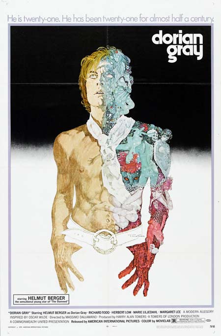
The story of Oscar Wilde's The Picture of Dorian Gray is incredibly well known, and this poster utilizes the knowledge of the source material wonderfully, mixing the eternal youthfulness of the character with whatever decaying mess he may actually be.
Though the background is simple, I really like the choice of having Gray's bottom half blend into the white of the poster. The colours are fantastic and the detail on his left side exquisite. You could lose some time staring at the details of all that is used to make up his opposite side (including a cat!), and anything that draws your attention to a poster even more is always good.
03: The Man Who Laughs (1928)
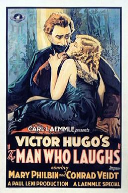
To mention right off the bat, The Man Who Laughs isn't really a horror film, though in some circles it has been classified as such for reasons I'll explore elsewhere some other time. But this is a classic poster for a classic film, one I couldn't ignore that is a great example of the art working hand in hand with the title to lure you in.
The embrace that is supposed to be romantic is weighed with fear. She reaches up for him but he has stopped her hand from, presumably, going to the piece covering his face. There is worry and fear in his eyes. Why? What is he hiding? What would make him so scared of her full embrace? It's wonderful.
02: Inferno (1980)
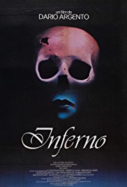
Though I put these posters in no particular order and the numberings are only here for fun, the placement of this one being near the "top" does come from some bias, as I have always loved this piece immensely. Possibly the simplest poster on the list, Dario Argento's Inferno is greatly represented with it. There is mystery and intrigue to it, the simplicity of the design drawing you into it. The skull/woman's lips combination mixed with the colours chosen washed over it captures the style of Argento's film to a T. Almost too well, in my opinion. I look at this and I'm immediately reminded of certain scenes and set pieces from it, it's that good.
01: The House of Usher (1960)
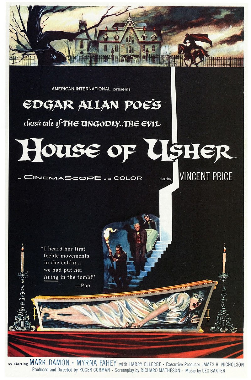
We ended the first list with Vincent Price, we may as well end this list with Vincent Price. Unlike the other posters that have come before it here, and like the poster for The House on Haunted Hill, there is a bit more going on here, yet it never feels cluttered. The use of black for the majority of the piece that holds the important written information being used as a way to symbolize the basement of the house is genius. It makes it feel as though the characters are entering the deepest, most unnerving of depths. Add onto that the shockingimage of the woman trapped, alive, in the coffin at the bottom.
What also works well is the woman trapped in the coffin being wonderfully complementary to the image at the top of the poster. It builds on the atmosphere created by the colours, the ominous feel of the house and the dead trees (not to mention the man desperately riding towards the house on horseback). It does such a fantastic job in giving you so much but still maintaining the intrigue that would pull you in. You want to know just what is going on, or how they got to where they are. It's a wonderful piece of work.

January 02, 2014 at 07:39 am /
Lorem ipsum dolor sit amet, consectetuer adipiscing elit. Phasellus hendrerit. Pellentesque aliquet nibh nec urna. In nisi neque, aliquet vel, dapibus id, mattis vel, nisi. Sed pretium, ligula sollicitudin laoreet viverra, tortor libero sodales leo, eget blandit nunc tortor eu nibh. Nullam mollis. Ut justo.
January 18, 2014 at 13:29 am /
Hi There,
Donec nec justo eget felis facilisis fermentum. Aliquam porttitor mauris sit amet orci. Aenean dignissim pellentesque felis.
January 22, 2014 at 03:19 am /
Lorem ipsum dolor sit amet, consectetuer adipiscing elit. Phasellus hendrerit. Pellentesque aliquet nibh nec urna. In nisi neque, aliquet vel, dapibus id, mattis vel, nisi. Sed pretium, ligula sollicitudin laoreet viverra, tortor libero sodales leo, eget blandit nunc tortor eu nibh. Nullam mollis. Ut justo.