Old-school horror films have amongst some of the greatest titles ever christened to pieces of entertainment. But that’s a list for another day.
Horror films have always had some of my favourite pieces of art for cinema, ever. They can be haunting, fun, creepy, weird, or all of the above; but they always had an extra spark of imagination to them. Not to take away from film posters of other kind, but the context of horror movies lends them to being more open to play around with, sometimes. This isn’t a list of my favourites, period. There are some I love more than these, and way more than ten altogether. I just thought it would be neat to dive into a random batch, and did my best to pick a few that some of the folks that may be reading the site in its early days may not have stumbled across previously.
Let’s look at some art that could easily look good on anyone’s wall.
08: Bunny Lake Is Missing (1962)
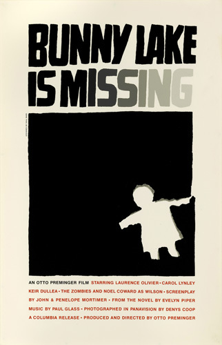
I’m starting the list off with Bunny Lake is Missing on the simple fact that it is a psychological-thriller and not a horror, but there was absolutely no way I could not have it make an appearance. In terms of impact, it would have landed way higher on any other list.
The story follows a woman on a hunt to find her missing daughter, the preschooler, Bunny, of the title.
Created by the legendary Saul Bass, this is an incredibly striking and haunting – in a real-world way- poster. Your eyes immediately draw to the piece cut out from the paper, in the shape of a child. But don’t let that detail cause you to not notice the wonderful touch of the word 'missing' slowly fading away into nothing, as if our hopes and luck of finding the little girl are going with it. Everything you need to know concerning what the movie is about is there in the art; it’s one of the finest examples of simplicity ever created.
07: Planet of the Vampires (1965)
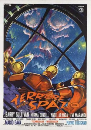
You know, usually I’d say don’t go towards anything that looks like a skull, but given the fact that they’re astronauts and I doubt their spaceship can so easily make a U-turn at the drop of a hat, there isn’t much hope for these folks.
The illustrated style is beautiful, the colours warmer on the astronauts’ suits than it is outside, and the fact that their destination doesn’t just look like a skull but a skull on fire or glowing come together to make this an intriguing poster.
06: Superstition (1982)
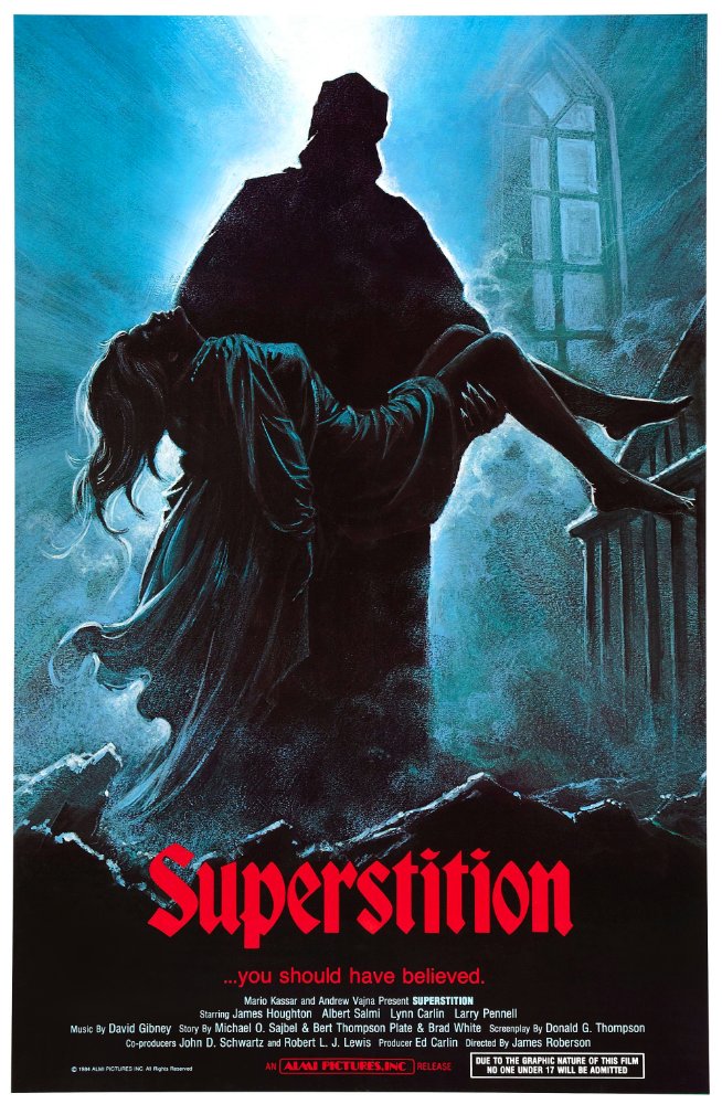
There’s a lot of beauty in the use of cool colours here, be it the blues or the soft tinge of blonde of the woman’s hair and white of her clothing. The bright light being mostly blocked by the figure in the dark cloak, illuminating the fog, are a nice off-set to everything else. Many of the best posters, many you’ll see here, work best when it comes to their simplicity, with the extra detail popping so much more because of it.
05: Dracula Has Risen From The Grave (1968)
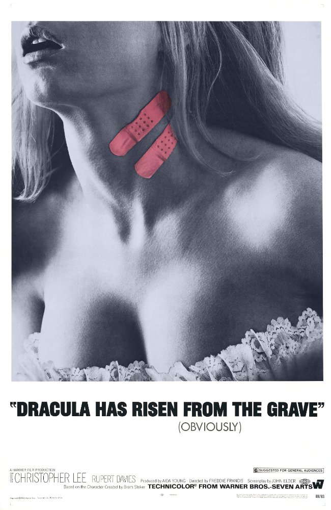
There are a multitude of reasons I absolutely adore this poster. It is quite possibly the simplest of simple you can go, and it is a showcase to the fact that even the easiest, most straightforward, of ideas are exceptional, and have just as much, if not more, power to be memorable as anything else more detailed.
The piece itself, I feel, perfectly encapsulates so much about horror involving vampires, at least classic ideas of vampires; the strong sensuality/sexuality mixed with a sort-of tongue-in-cheek taste to it all. The band-aids lead to this slight comic feel to it, along with the great ‘tagline’ underneath the title. The fact that the band-aids happen to be in colour is also a beautiful touch that gives it an easy ‘pop’. It’s hard not to be taken in by it, and it makes you smile when you take it in as a whole.
04: Black Sunday (1960)
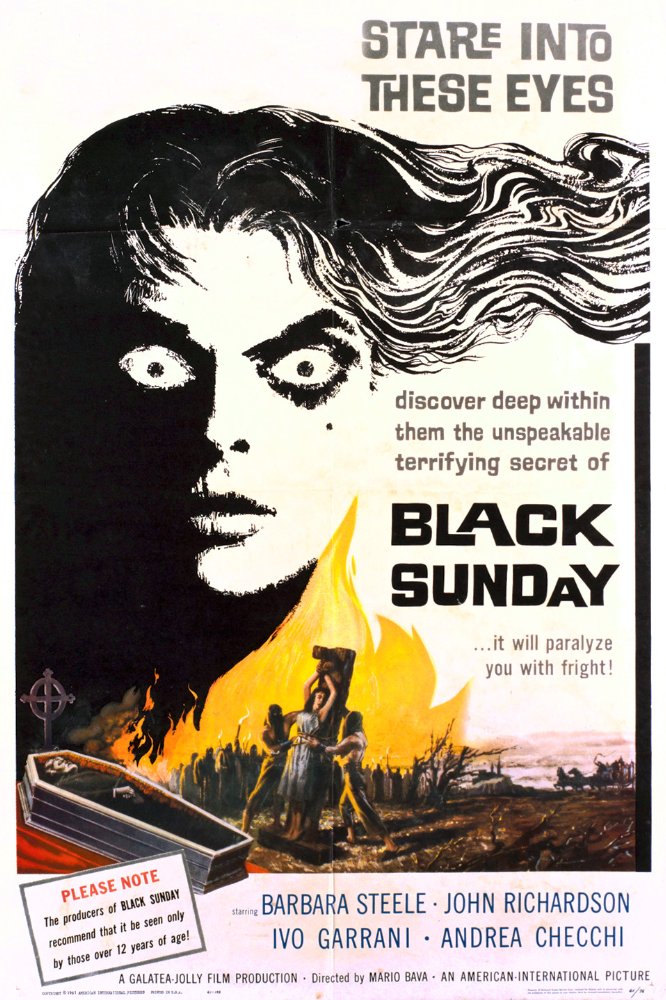
If you can pull yourself away from the maddening, piercing glare of the woman, you’ll notice that this poster has a perfect balance in the way it presents everything on it. Not only that, but the art alone once again tells us everything we need to know about the film, and what it’s about. The colour included at the bottom also blends beautifully with the white of the background and the black of the woman and… those eyes.
They’re staring at you.
They’re waiting.
I’m sure the movie itself doesn’t have such a deep, soul-touching—
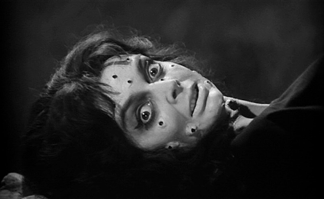
03: CATS! Tomb of Ligeia (1964), Cat O’Nine Tails (1971), The Black Cat (1981)
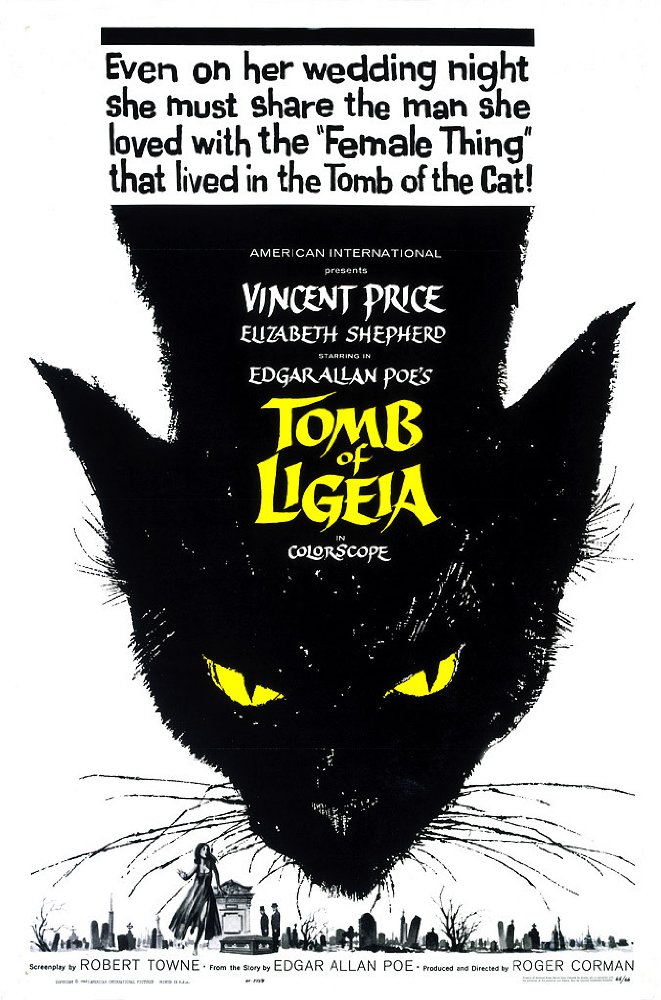
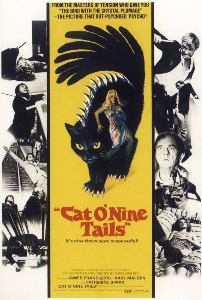
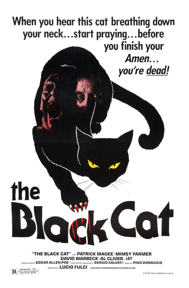
Cats, you guys. They have such a natural look for pieces of art. The way their body moves, kind of like water- sometimes- and the odd ways they can contort themselves make them ripe for interesting and unique ways to set them up. You’re reading this on the internet, so you know all about cats.
Not only do their bodies lend themselves to poses that could be wonderfully exploited, such as in The Black Cat poster, but their head outline works incredibly well at being mesmerizing when utilized properly, too, as seen in the Tomb of Ligeia piece. While the use of black for them is obvious, there’s no denying that it is powerful while also being simple. That married with the slight touches of colour, such as yellow in most and a bit of red in The Black Cat, make it stand out against their white backgrounds. Even something as simple as placing individuals within the bodies of the cat's themselves, thus creating a frame, looks intriguing.
They’re sinister and simple, and so easy to enjoy and love because of it.
02: A Cat In The Brain (1990)
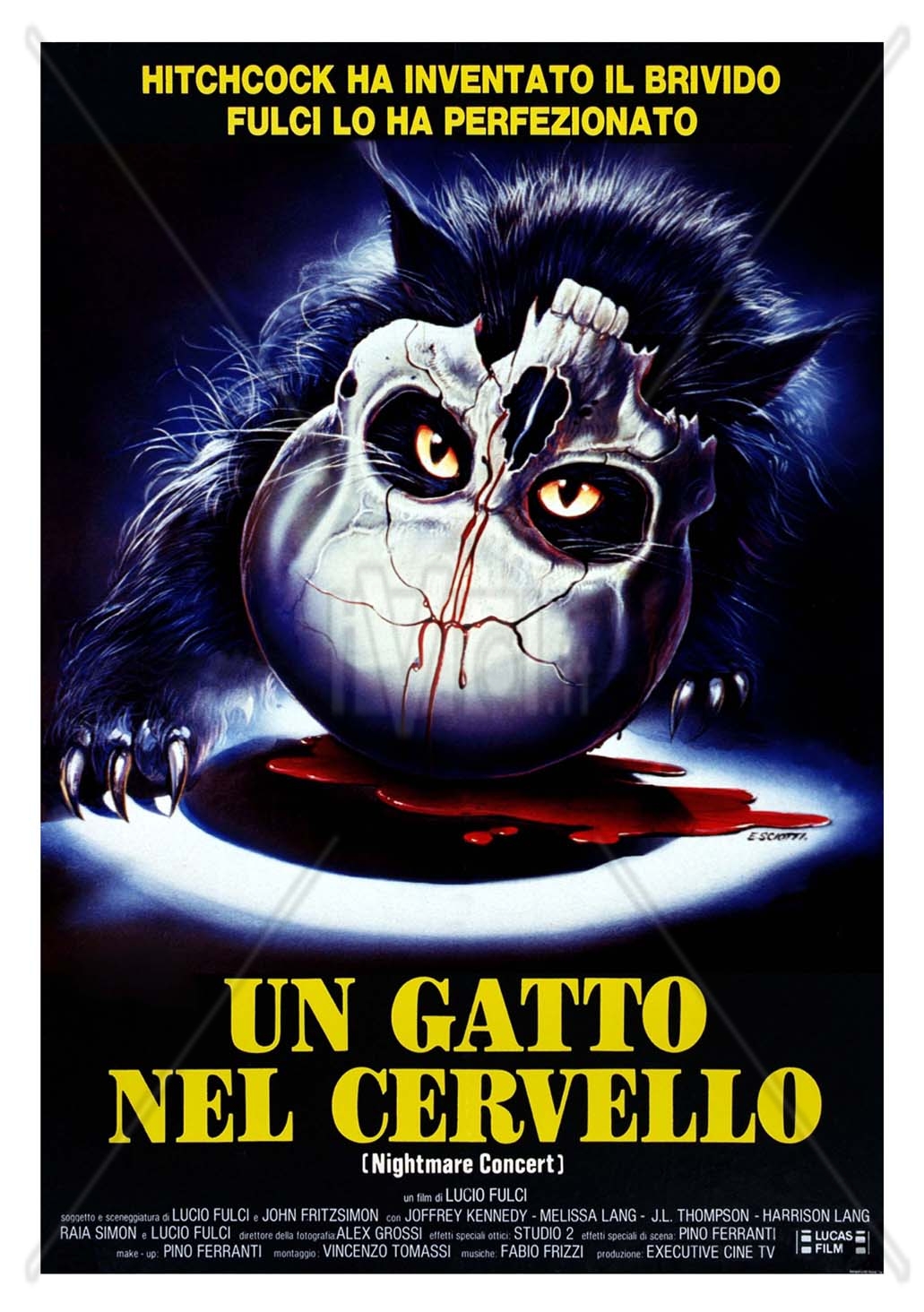
I didn’t put A Cat In The Brain with the other three because those fell into a very obvious pattern of similarity. Here, we get not just the simplicity of design, but—okay, the simplicity of the idea alone is what makes me adore this. I know I’ve used the word ‘simple’ and other varieties multiple times but, damn if this isn’t a wonderful, neat idea.
The cat’s eyes glaring through the eyeholes of the skull is intimidating and terrifying. It brings together the creepy, superstitious factor of black cats that we saw above and connects it with something as common, ordinary, yet still unnerving, like a skull. The red of the blood and yellow of the cat’s eyes are striking, but so is the way that the fur of the animal is presented to us. The detail in the fur makes it feel so alive, like we can simply reach out and touch it.
01: The House on Haunted Hill (1959)
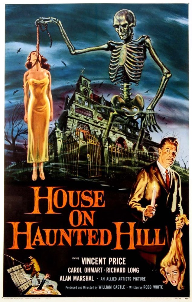
It’s The House on Haunted Hill. I feel awful saying this but, well, I’m not quite sure what there is to say about it. It’s usually heralded as one of the great classic horror posters of all time. From Vincent Price holding a decapitated head by the hair, to the skeleton, the house of the title in the background, the colours, the bats, the fog— it all just has a wonderful, cheeky feel to it. For all intents and purposes, it should be horrifying— especially that skeleton— but it comes off as perfectly epitomizing the sort of movie it is; one that you go to a theater that plays older movies late on a Saturday night, with a group of friends, and have fun with.

January 02, 2014 at 07:39 am /
Lorem ipsum dolor sit amet, consectetuer adipiscing elit. Phasellus hendrerit. Pellentesque aliquet nibh nec urna. In nisi neque, aliquet vel, dapibus id, mattis vel, nisi. Sed pretium, ligula sollicitudin laoreet viverra, tortor libero sodales leo, eget blandit nunc tortor eu nibh. Nullam mollis. Ut justo.
January 18, 2014 at 13:29 am /
Hi There,
Donec nec justo eget felis facilisis fermentum. Aliquam porttitor mauris sit amet orci. Aenean dignissim pellentesque felis.
January 22, 2014 at 03:19 am /
Lorem ipsum dolor sit amet, consectetuer adipiscing elit. Phasellus hendrerit. Pellentesque aliquet nibh nec urna. In nisi neque, aliquet vel, dapibus id, mattis vel, nisi. Sed pretium, ligula sollicitudin laoreet viverra, tortor libero sodales leo, eget blandit nunc tortor eu nibh. Nullam mollis. Ut justo.