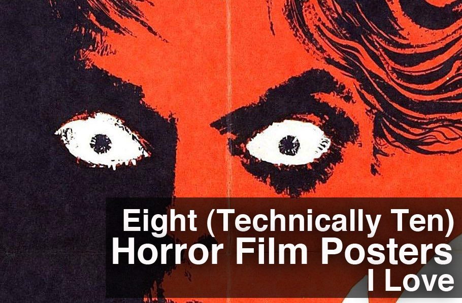
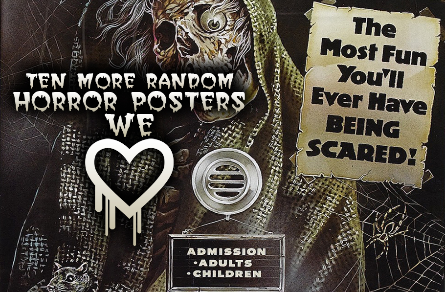
Tis the season again! Though I'm sure the last time we did a list like this it was in March. The spookiest of all seasons...
But I digress, we are going to be taking a look at the posters we really like for ten more horror films to celebrate our favourite month!
10. Paganini Horror (1989)
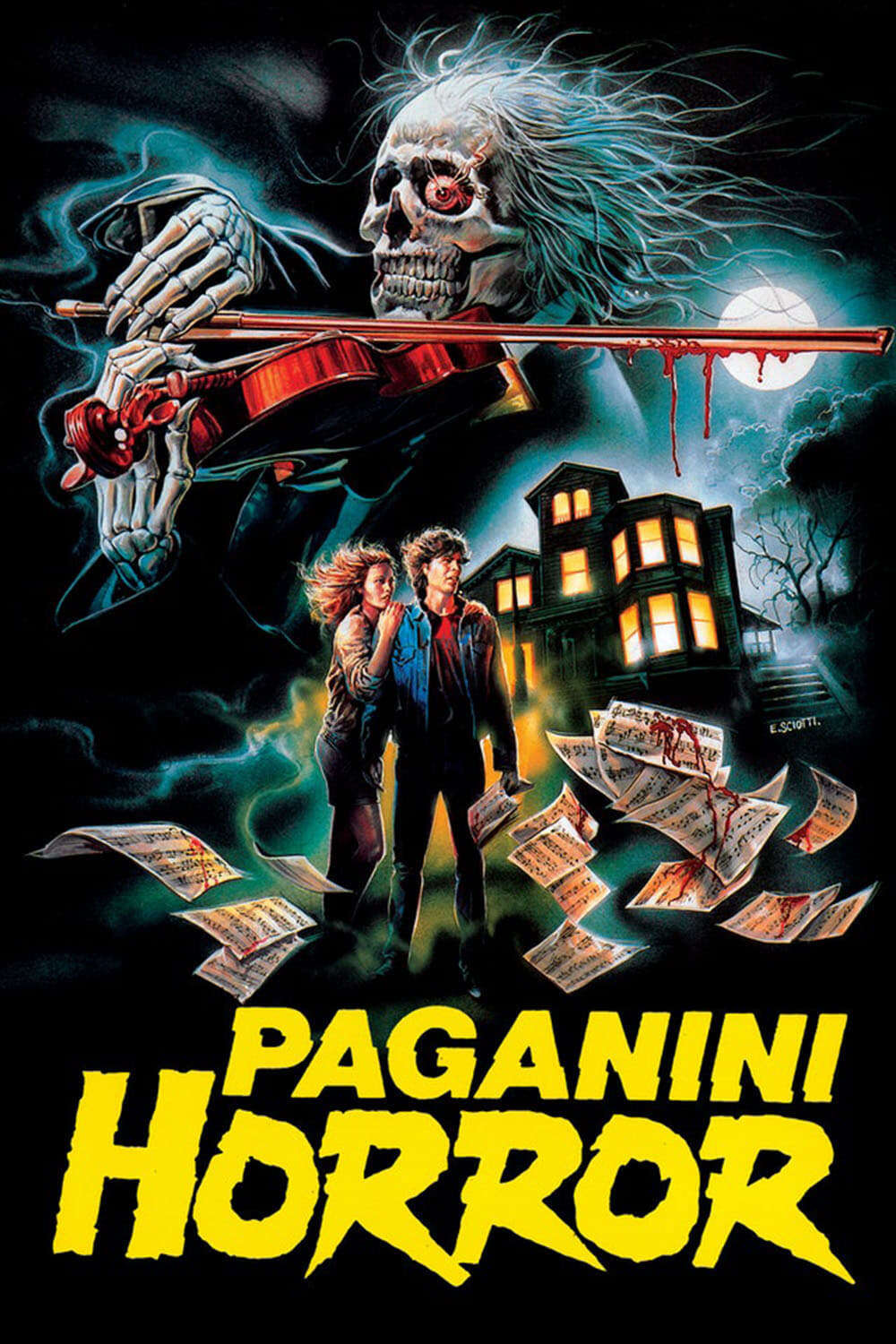
Sometimes you don't have to say much because the poster will do all the talking for you. There's no room for discussions about colour or how space is used or layouts or all that mumbo-jumbo, we're here for a good time, damnit. This is the kind of poster that makes you feel like you shouldn't watch the movie it's for because there isn't a way for it to live up to your expectations.
09. House on Skull Mountain (1974)
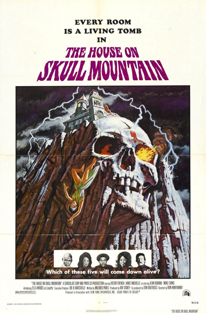
Like Paganini Horror, this one earns it's spot based on pure cheeky greatness. Is skull mountain this fantastic looking in the film? I haven't seen it but I doubt, and I also doubt that it's as fun as the energy that this poster is conveying. This feels like it should be a rollercoaster type movie, something akin to the House on Haunted Hill remake.
Still, it's a great poster with some wonderful little extra touches, like the eyeballs of fire, the lightning, and the woman who has unfortunately lost her footing in her seemingly gravity defying dress. Good, fun stuff.
08. Captain Clegg! (1962)
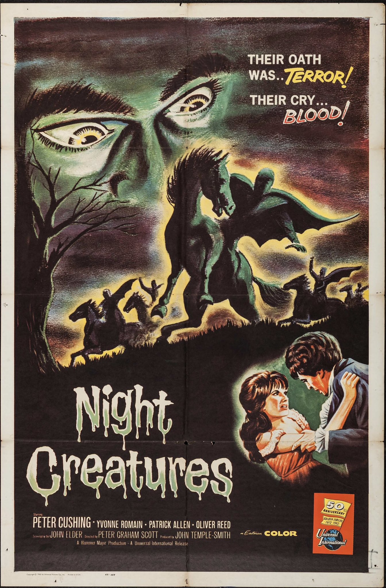
The first time around I littered a position with cats(!) and was able to avoid the temptation to double (or triple) up the last time we had a peek at some artwork. I tried here, I really did, but I had a difficult time choosing over Captain Clegg posters here. It was driving me nuts.
On one hand you have a classic style poster that beautifully uses colour to create a wonderful atmosphere with its beautiful sky, mysterious phantom riders, and the piercing glare of the eyes staring down and observing it all. I am still kind of back-and-forth about whether I like the additional insert at the bottom right, but it doesn't take away from the piece as a whole, and does kind of work to set the mood for what the film may be as a whole.
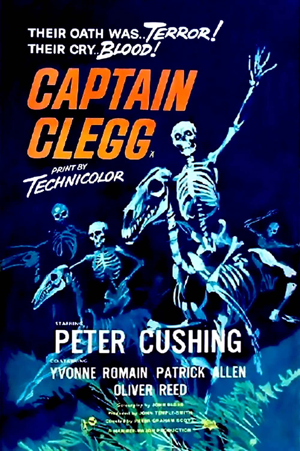
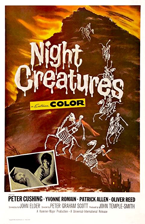
The other two posters have skeletons riding skeleton horses. I think it's easy to see where my difficulties in choosing would come from, though if I were to pick one from the skeleton-horse skeleton-riders, it'd probably the one with the blue background, I think the cool colour just works a bit better.
Skeletons riding skeleton horses.
07. Ghost Story (1981)
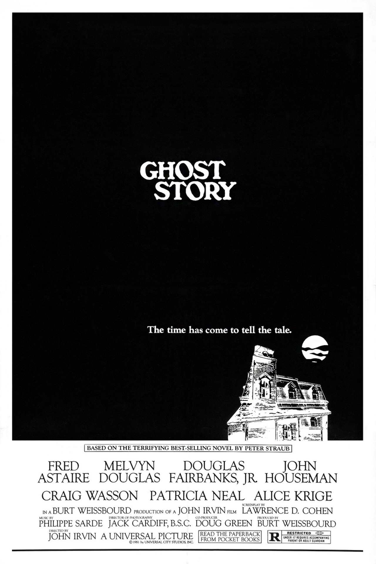
Revisiting this poster made me realize that not only does the use of negative space and the white on black really capture the feeling of being isolated, but that same isolation and simple choice of the house in said negative space does wonders in evoking 'ghost stories'. It does make me feel like this is where you want to be, or how you feel, when you gather with friends for a few drinks and tell some spooky tales, possibly around a candlelight. This would easily feel at home as the cover of an Edgar Allan Poe or short story compilation.
Not only that, it perfectly captures the bleak coldness of winter.
Wolfen (1981)
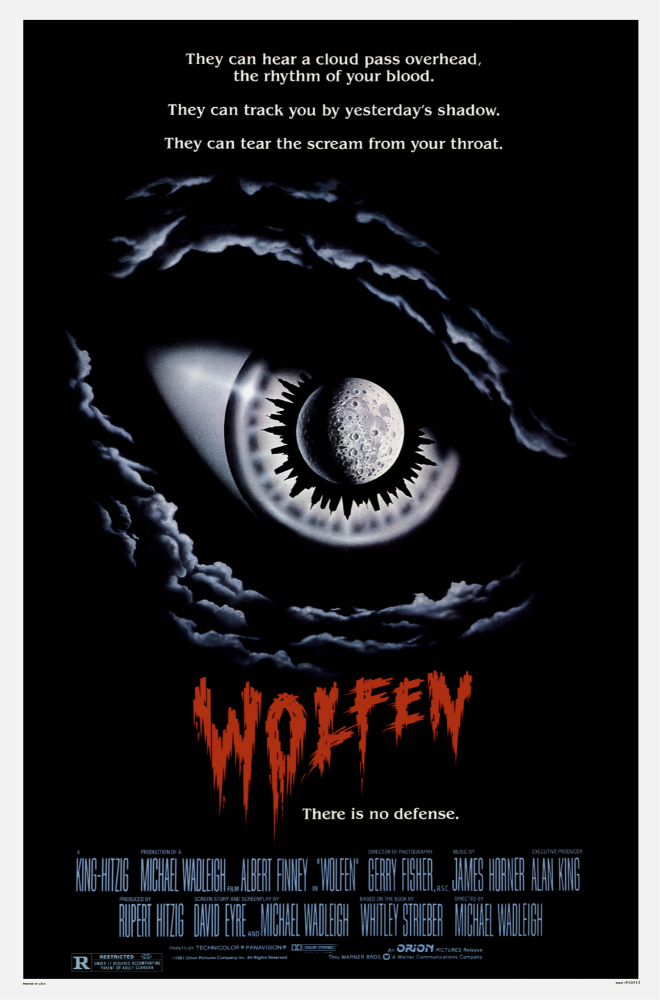
Another poster I love based on its minimal design that has some incredible and wonderful little touches.
I adore the use of the full moon in the eye, and the whole thing is so striking that it might make you miss the fact that the form of the eye is made by clouds. As a matter of fact, I happened to miss it for the longest time. NOt only that, the decision to have the title in red really pops catches your attention, especially since I love the font choice for it, too.
If I were to have a slight nitpick it's that I don't really like the decision to split the tagline between the top of the poster and the line beneath the title. As a matter of fact, you can eliminate one of them and be fine, to the point that I can't help but feel like they had two good ideas for a tagline and couldn't decide which to keep. The blurb works great by itself, and the simple "There is no defense" could also work on its own. Still, nothing major that takes away from my love of the design and overall look.
5. Let's Scare Jessica To Death (1971)
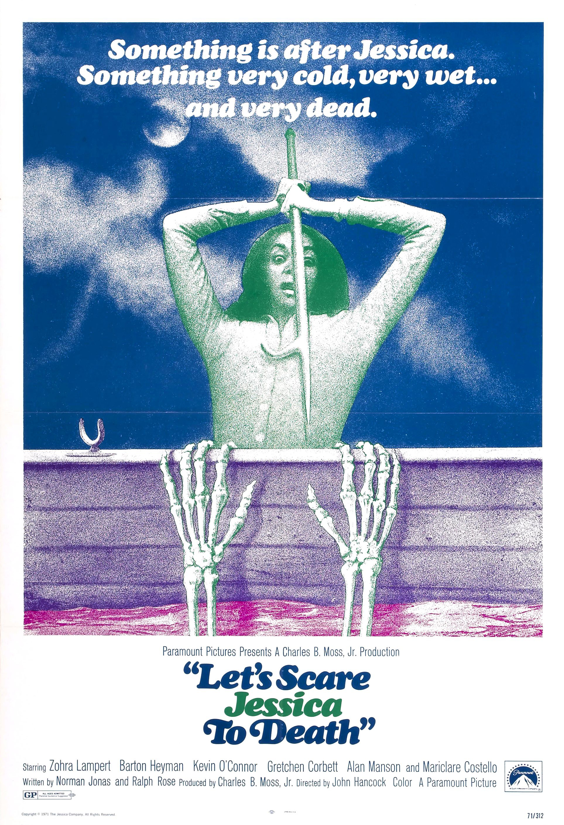
Let's Scare Jessica to Death gets major points for being one of the greatest titles to exist in horror lexicon, and double points for the fact that it's an American title, since it seems like when we talk about great Horror titles the Italians have us beat.
I really dig the use of colours here as it gives the whole look of the poster a feel that matches the film, which is primarily surreal. This, and the title, do have their downside though, since it does make it seem like the movie is going to be more along the lines of something like Evil Dead, which is most definitely is not. But even then, it's a great poster that catches your eye immediately and pulls you in to marvel at it as a whole.
4. The Witch Who Came From The Sea (1976)
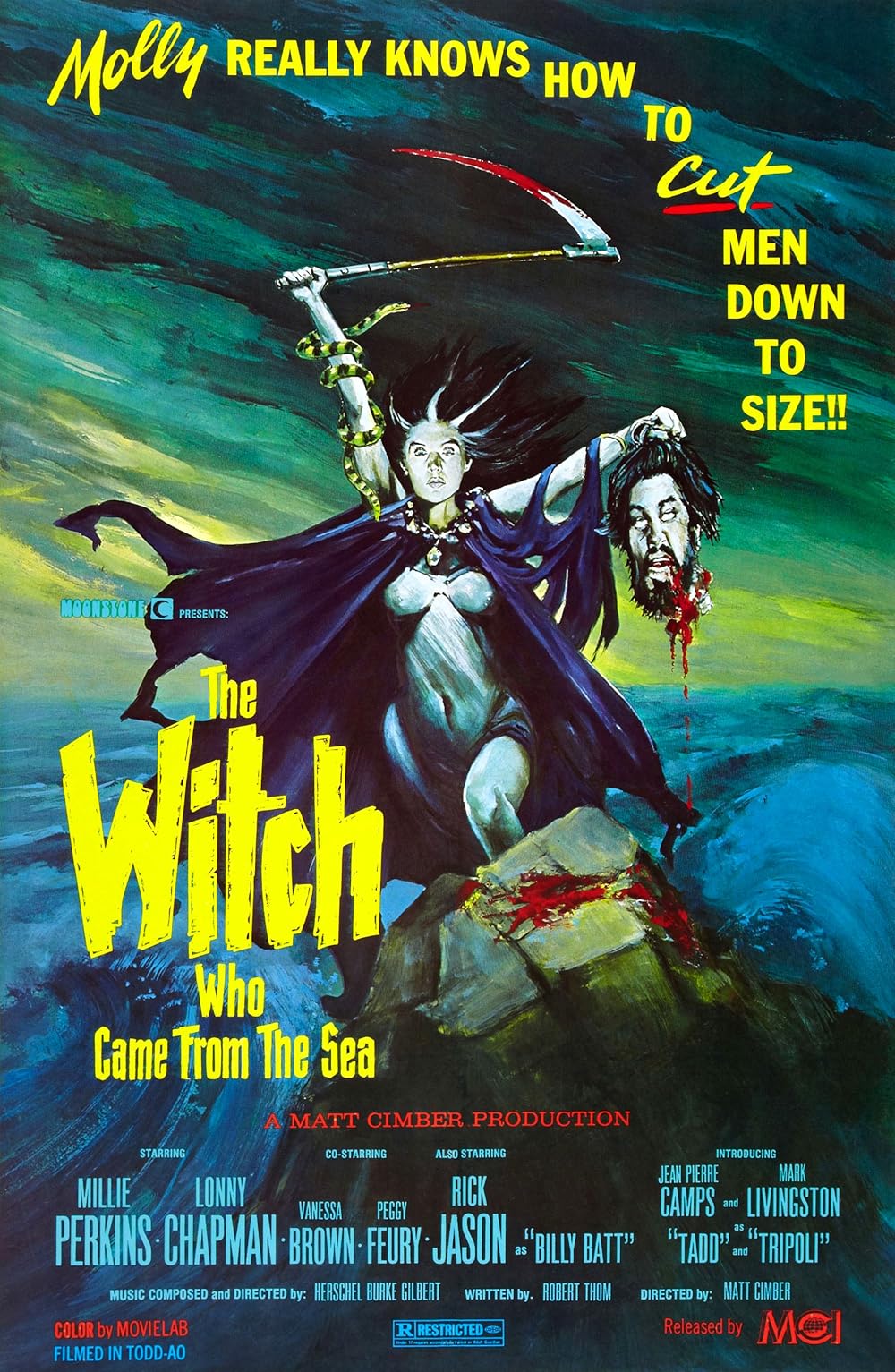
I mean, come on. Come on. Love the colours used, very striking, nice blood dripping, beautiful painting and such, yadda yadda, look at it. This is an awesome poster that would make an awesome album cover. You can't look away.
3. Tenebrae (1982)
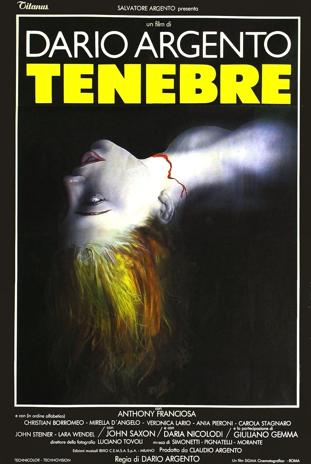
An incredibly simple concept that works so well due to the striking colours used. The grey of the body lends itself to the trickle of blood on the neck and the ever-so-slight use of colour on the lips, but it's the hair that's the real showstopper here and probably my favourite use of colour out of all of the posters we've looked at over the three articles. I don't have much else to say, it's just a piece of art that I absolutely adore in its execution.
2. The Child (1977)
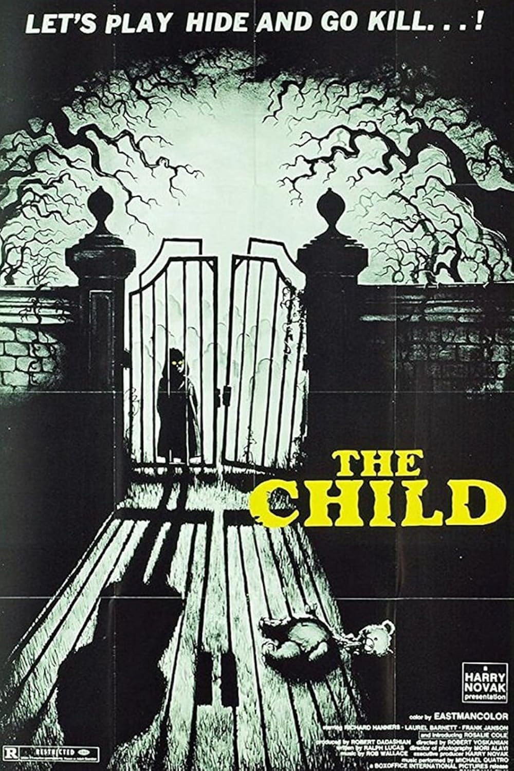
Another poster that uses two simple colours to maximum effect, the blacks and the greenish-white(?) really complement each other well, especially with the child's eyes popping from her dark frame.
There are so many small details here that I love; there's the ominous tree branches, the fact that the gate is slightly broken, the child's shadow, and don't forget the decapitated doll in the foreground. Who doesn't love a creepy, decapitated doll? This feels like it could be the cover of a book from the 70s or 80s, just fantastic stuff.
1. The Abominable Dr. Phibes (1971)
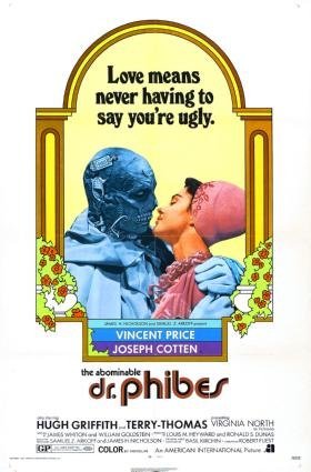
Aw yeah, baby! Three for three!
I do promise that next time we will veer from Mr. Price, but I couldn't move on without leaving some room for Dr. Phibes.
In all honesty, I could easily have put The Child or Tenebrae above it and felt content but, man, Dr. Phibes is so excellent. A wonderful, campy romp of a time that is perfectly captured in this poster. The tagline is a great cheeky knock at Love Story, the framing of Phibes and Vulnavia amidst flowers like some romantic portrait is hilarious, even though they aren't romantic in the film, and I do love the decision to not have a full poster and just center the artwork. This is a poster that perfectly sells the movie, both are brilliant fun and the perfect way to spend an October evening.